LSPS Documentation
You can implement a custom component in Java or in the Expression Language.
When creating a custom form component, you need the following:
Implementation of your form component for the LSPS server
You will need to create it in the Expression Language or as a Java class. When implemented in Java, the custom component class must implement the UIComponent interface to make sure it behaves like standard components. All classes implementing custom components must be registered in the LspsAppComponentFactory class.
Definition of your form component for PDS
You will need to create a custom component definition and in case of Java implementation also the respective Record.
These instructions describe how to implement a custom form component, in this case, a custom slider with binding.
However, they do not contain information on how to implement a custom event for a custom component. For instructions on how to create a custom component with a custom event, refer to Creating Custom Forms with Custom Events.
To implement a custom component, do the following:
Create the custom component class in your application (in the default application, it is recommended to implement custom form components in the <YOUR_APP>.vaadin.util package in the <YOUR_APP>-vaadin project).
The implementation must meet the following:
Implement the com.whitestein.lsps.vaadin.ui.components.UIComponent interface.
Typically, it will extend a class that implements com.whitestein.lsps.vaadin.ui.components.UIComponent. Note that it is not recommended to extend any of the form components of the Standard Library since their methods might change.
Define a constructor with UIComponentData as its input parameter.
The constructor should set the UIComponentData values. Component data are a wrapper of the component Record that also holds values of the record fields.
Implement the getWidget() method, which returns the Vaadin component to be rendered on the client.
This method is useful if you want to use multiple Vaadin components to render a single LSPS custom component. Generally, you want the method to return this.
It implements the refresh() method.
An example Slider Component implementation
public class SliderComponent extends Slider implements UIComponent {

    private final UIComponentData componentData;

    public SliderComponent(UIComponentData componentData) {
        super();
        this.componentData = componentData;
    }

    @Override
    public UIComponentData getComponentData() {
        return componentData;
    }

    @Override
    public AbstractComponent getWidget() {
        return this;
    }

    @Override
    public void refresh() {
        final LspsProperty property = new LspsProperty(this);
        property.setLocalizeBindingValue(true);
        setPropertyDataSource(property);
        getComponentData().getComponentFactory().applyCommonProperties(this);
    }
}
An example Label Component implementation
import com.vaadin.ui.Label;
import com.whitestein.lsps.vaadin.ui.UIComponentData;
import com.whitestein.lsps.vaadin.ui.components.UIComponent;
import com.whitestein.lsps.vaadin.ui.events.UIEvent;
import com.whitestein.lsps.vaadin.util.UIComponents;
import com.whitestein.lsps.vaadin.util.Variant;

public class UIText extends Label implements UIComponent {

    private final UIComponentData uic;

    public UIText(UIComponentData uic) {
        this.uic = uic;
    }

    @Override
    public UIComponentData getComponentData() {
        return uic;
    }

    @Override
    public void refresh() {

        String text = Variant.definitionOf(this).getPropertyValue("text").closure()
    .inScope(this).call().string().valueOrNull();
        text = uic.getScreen().getContextHolder().getAppConnector()
    .getLocalizer().getLocalizedString(text, this);
        setCaption(text);

    }
}
<inherits> XML element.<YOUR_APP>-vaadin-war/pom.xml file and configure the maven Vaadin plugin.@Widgetset("com.whitestein.lsps.vaadin.webapp.MyWidgetSet")<YOUR_APP>-vaadin-war/pom.xml and add maven dependency to the Vaadin component jar file.LspsAppComponentFactory class: uncomment the createComponent method and modify it to return your component when the respective Record is requested.
import com.whitestein.lsps.vaadin.LspsAppConnector;
import com.whitestein.lsps.vaadin.ui.UIComponentData;
import com.whitestein.lsps.vaadin.ui.UIComponentFactoryImpl;
import com.whitestein.lsps.vaadin.ui.components.UIComponent;

public class LspsAppComponentFactory extends UIComponentFactoryImpl {

    public LspsAppComponentFactory(LspsAppConnector connector) throws NullPointerException {
        super(connector);
    }

    @Override
    protected UIComponent createComponent(UIComponentData componentData) {
        final String type = componentData.getDefinition().getTypeFullName();
        switch (type) {
          case "CustomComponentModule::SliderRecord":
            return new SliderComponent(componentData);
          case "CustomComponentModule::TextComponentRecord":
            return new UIText(componentData);
          }
        return super.createComponent(componentData);
    }
}
CustomComponentModule in the example, create the component Records which extend the respective ui::UIComponent record. Add any additional fields which the user needs to populate when they will use the component (make sure these are handled in your implementation properly). 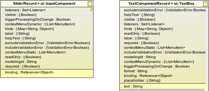
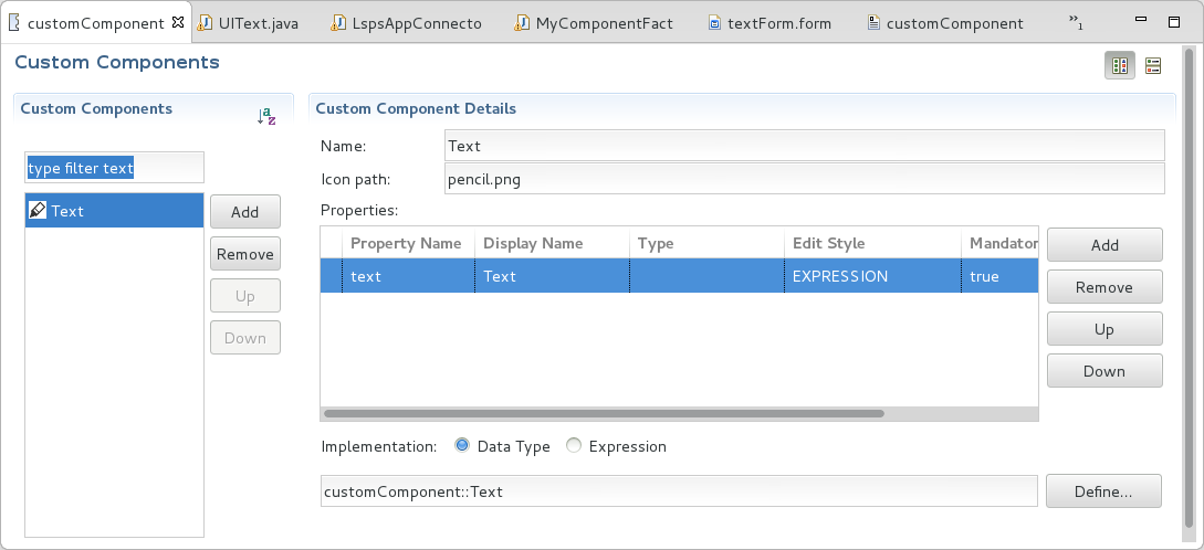
In your model, create a custom component definition in a custom component definition file.
Set the Implementation property of the custom component definition to Data Type and enter the component record (in the example, CustomComponentModule::TextComponentRecord and CustomComponentModule::SliderRecord).
{ -> <parameter_value> }).Displayed in Editor: if set to true, the defined value of the property is displayed in the graphical depiction of the component in the Form editor
Note that only one property can be displayed in the component graphical depiction.
If the custom component extends a non-abstract UIComponent, it is rendered as its UIComponent parent and the Displayed in Editor setting is ignored.
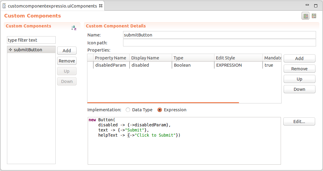
To create a custom component implemented in the Expression Language, do the following:
ui::UIComponent record. Add any additional fields which the user needs to populate when they will use the component.In the Properties area, define the component properties that will be available for editing in the Properties view:
{ -> <parameter_value> }).Displayed in Editor: if set to true, the defined value of the property is displayed in the graphical depiction of the component in the Form editor
Note that only one property can be displayed in the component graphical depiction.
If the custom component extends a non-abstract UIComponent, it is rendered as its UIComponent parent and the Displayed in Editor setting is ignored.
//create checkbox:
def ui::CheckBox cb := new ui::CheckBox();
def Boolean checked;
//bind checkbox to variable checked:
cb.binding := &checked;
//activate immediate mode for checkbox:
cb.triggerProcessingOnChange := true;
//handle value change of checkbox: refresh the checkbox list to have all boxes unchecked:
cb.listeners := {
  new ValueChangeListener(
    refresh -> { a->
      {checkBoxList }
    },
    handle -> { a ->
      if not checked then
        *(checkBoxList.binding) := {};
      end;
    }
  )
};
//return checkbox:
cb;