LSPS Documentation
Important: This tutorial uses the experimental forms module. To use fully supported charts, use the ui module.
You can download an example implementation here. To import it to your workspace, go to Import > Existing Projects into Workspace; select Select archive file and locate the charts.zip file and select ChartTutorial.
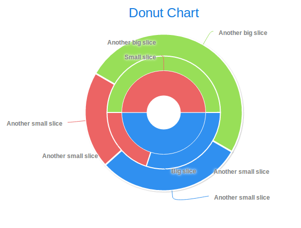
A donut chart is a special case of the pie chart: the pie slice series have the inner size plotting property larger than 0 and a custom size.
To create a donut chart, do the following:
def PieSliceSeries innerSeries := new PieSliceSeries("Inner Slice Series", [
       new forms::PieSlice("Big slice", 10),
       new forms::PieSlice("Small slice", 10)
     ]
  );
def PieSliceSeries middleSeries := new PieSliceSeries("Middle Slice Series", [
       new forms::PieSlice("Another small slice", 30),
       new forms::PieSlice("Another small slice", 20),
       new forms::PieSlice("Another big slice", 50)
     ]
  );
def PieSliceSeries outerSeries := new PieSliceSeries("Outer Slice Series", [
       new forms::PieSlice("Another small slice", 30),
       new forms::PieSlice("Another small slice", 20),
       new forms::PieSlice("Another big slice", 50)
    ]
  );
//The dataseries as rendered in the order (z-index) as in the returned list
//(outerSeries is the lowest):
[ outerSeries, middleSeries, innerSeries ]
...
def PlotOptionsPie middleSeriesPlotting := new PlotOptionsPie(
  //inner border at the perimeter of the chart:
  innerSize -> new AttributeSize("20%"),
  size -> new AttributeSize("60%"),
  startAngle -> 90, borderWidth -> 2);

innerSeries.plotOptions := middleSeriesPlotting;
[ outerSeries, middleSeries, innerSeries ]
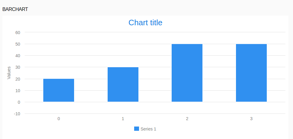
To render a data series as a bar chart, do the following:
plotOptions property of the data series to PlotOptionColumn. myDataSeries.plotOptions := new PlotOptionsColumn(
dataLabels -> new DataLabels(formatter -> "this.y"),
color -> new Color(0, 255, 150));
Note that CategoryDataSeries are plotted as bar charts by default.
Example TimeDataSeries plotted as a bar chart
def TimeDataSeries tds := new TimeDataSeries([
   new TimeDataSeriesItem(now(), 1, 3),
   new TimeDataSeriesItem(now()+seconds(3), -1, 5),
   new TimeDataSeriesItem(now()+seconds(5), 2, 7)]
);
tds.plotOptions := new PlotOptionsColumn(range -> true);
[tds]
To use the category name as the x axis values, set the X Axis to an Axis with category -> []. You can do so directly in the X Axis field on the Detail tab of the Properties view or anywhere with the addXAxis() method of the chart.
c.addXAxis( new Axis(categories -> []))
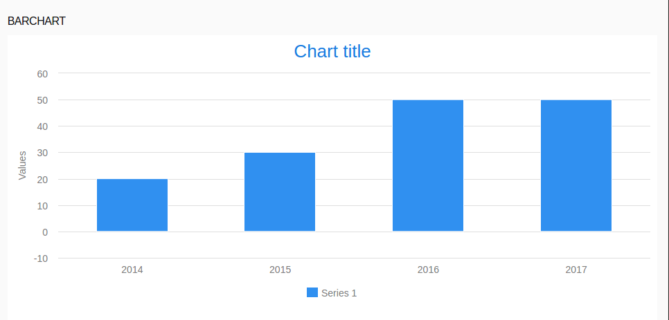
c.addXAxis( new Axis(categories -> ["Year 2014", null , "Year 2016"])) overrides the category names of the first and third item.
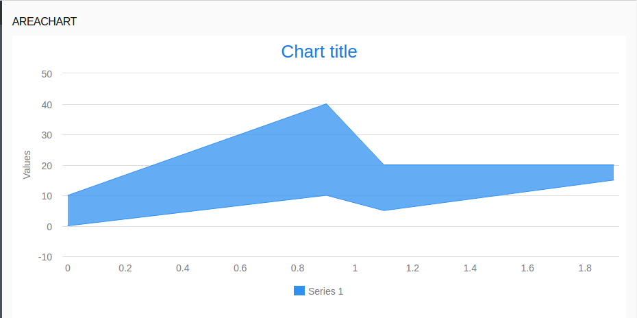
To render a data series as an area chart in the Cartesian Chart, set its plot options to PlotOptionsLineArea.
def CategoryDataSeries cds := new CategoryDataSeries(
  [
     new CategoryDataSeriesItem("first", 1, 4),
     new CategoryDataSeriesItem("second", -1, 2),
     new CategoryDataSeriesItem("third", 0, 3)
  ]
);
cds.plotOptions := new PlotOptionsLineArea(spline -> true, range -> true);
[ cds ]
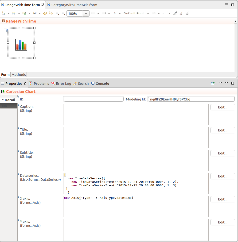
To create an area chart that will have time axis, use the TimeDataSeries in the Cartesian Chart and set the type of the X axis to AxisType.datetime.
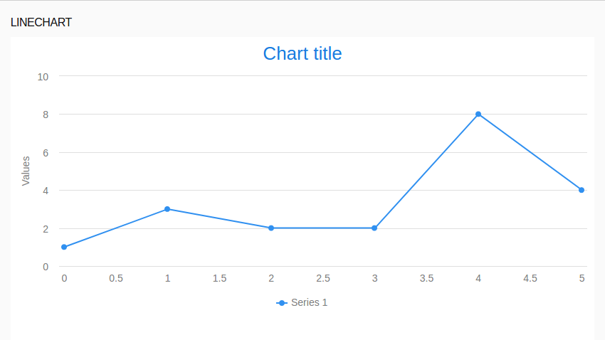
By default, ListDataSeries are rendered as line charts. If you want to plot another series type as a line chart, set its plot options to PlotOptionsLine.
cds.plotOptions := new PlotOptionsLine(spline -> true);
[ cds ]