LSPS Documentation
Action components produce an action event when clicked.
The Button component renders as a button. On click the button produces an action event. The component can have an ActionListener that defines how the event should be handled.
It produces the events of the following types:
Disabled: availability of the button
If true, the button is grayed out and cannot be clicked.
Note: You can define the Help text on the Help Text tab in the Properties view.
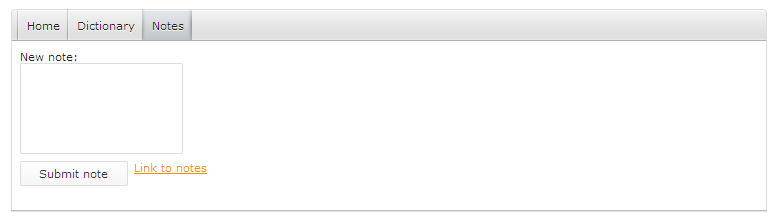
The Action Link component renders as a clickable link. On clicking the link produces an action event. The component can have an ActionListener that defines how the event should be handled. The handling typically involves navigation action.
It produces the events of the following types:
Note: You can define the Help text on the Help Text tab in the Properties view.
The Navigation Link component renders as a hyperlink; when clicked, it redirects the user to navigation target.
new UrlNavigation(url -> "http://www.whitestein.com")