LSPS Documentation
Input components serve to acquire input from the user: When the user provides input, the component produces a value change event, which can be caught by a value change listener and processed in the next response-request cycle.
The Text Box component (  ) is rendered as single-line input field.
It produces events of the following types:
AsynchronousValueChangeEvent whenever the user inserts or removes a character
Note that the binding of the Text Box does not have to change immediately due to possible validation; hence binding of the Text Box might appear to be out-of-date.
The Text Box component has the following properties:
Important: The property does not provide any validation whether the field contains a value and the user will be able to submit a null value unless an additional validation mechanism is defined. Such a validation can be implemented on a listener, possibly as a validation expression.
Binding: reference to a slot that holds the text value (for example, a form variable or global variable)
If a Text Box binds to a Date type, it is rendered as the Date Picker: for the Date Picker you can define the format of the date the Date Picker will accept in the Format property. The available formats are defined in the additional formats hint.
Format: required input format for values such as, date, integer, etc. defined as a string; it follows the rules of java.util.Pattern, java.text.SimpleDateFormat, and java.text.DecimalFormat
If the entered value does not follow the format pattern, a validation mark is displayed next to the Text Box.
Read-only: editability of the text
If true, the text renders as grayed out and cannot be edited.
Immediate: setting of Immediate mode
If true, the immediate mode is active: the value change event triggers request-response cycle on focus change.
To add a suffix to a Text Field component, such as, PCS, define on the Text Field the suffix Hints with the value of the suffix in a String. You can do so on the Presentation Hints tab of the Properties view.
The Text Area component (  ) renders as multi-line text input Area to allow the user to provide longer text input.
It produces events of the following types:
AsynchronousValueChangeEvent whenever the user inserts or removes a character
Note that the binding of the Text Area does not have to change immediately due to possible validation; hence binding of the Text Area might appear out-of-date.
The Text Area component has the following properties:
Important: The property does not provide any validation whether the field contains a value and the user will be able to submit a null value unless an additional validation mechanism is defined. Such a validation can be implemented on a listener, possibly as a validation expression.
Immediate: setting of the Immediate mode
If true, the immediate mode is active: the value change event triggers request-response cycle on focus change.
Placeholder: input prompt (text displayed in the text area if the value of the Binding reference is null)
If true, the text area is grayed out and cannot be edited.
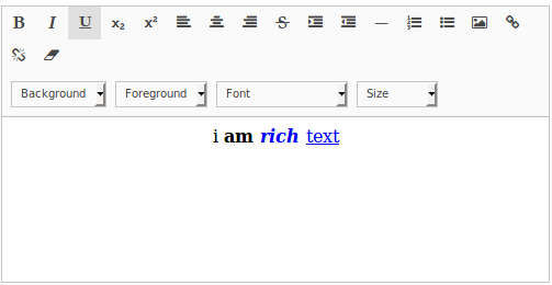
Is Rich Text: if true, the Text Area is rendered with a formatting toolbar
The input text is translated into html.
Important: Unlike Text Areas, Rich Text Areas don't produce AsynchronousValueChangeEvents.
The Check Box component (  ) renders as a check box with a Label and allows the user to provide a Boolean value.
It produces events of the following types:
The Check Box component has the following properties:
Read-only: editability of the check box
If true, the check box renders as grayed out and cannot be edited.
Immediate: setting of the Immediate mode
To process the ValueChangeEvent at the moment the user clicks the check box, set the Immediate property to true.
The Combo Box component (  ) allows the user to select one option from a set of options available in a drop-down list. The selected option is stored and taken from the binding of the combo box.
Note: If the value stored in the binding is not in the current options, the value is not displayed.
It produces events of the following types:
The Combo Box component has the following properties:
Important: The property does not provide any validation whether the field contains a value and the user will be able to submit a null value unless an additional validation mechanism is defined. Such a validation can be implemented on a listener, possibly as a validation expression.
Read-only: editability of the combo box
If true, the combo box renders as grayed out and no option can be displayed or selected.
Immediate: setting of the Immediate mode
To process the ValueChangeEvent at the moment the user select an option, set the Immediate property to 'true'.
Options: list of options
The list items are displayed in the drop-down. Make sure the defined expression resolves to an object of type List<ui::Option>.
Note that the Option data type has the value and label field so that you can define the label displayed in the drop-down list that represents the given value.
collect(
  literals(type(AssetType)),
  { e ->
    new ui::Option(
       value -> e,
       label -> literalToName(e)
    )
  }
)
Create new option: closure that is called if the user enters a custom value
When the user enters a custom value in the text field of the combo box, the closure is called with the value as its argument. The closure returns an object that is set to the binding value.
Important: An event that creates a new option is created only when the user presses ENTER after they input the new value.
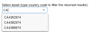
The Lazy-Loading Combo Box  component allows the user to select one option from a set of options available from a drop-down list, just like the regular Combo Box. However, unlike in the Combo Box component, the options in the drop-down are paged and queried as the user enters parts of the option so the component is useful if you need to select an item from many options.
It produces:
When creating a Lazy-Loading Combo Box component, define the following properties:
Important: The property does not provide any validation whether the field contains a value and the user will be able to submit a null value unless an additional validation mechanism is defined. Such a validation can be implemented on a listener, possibly as a validation expression.
Read-only: editability of the combo box
If true, the combo box renders as grayed out and is disabled.
Immediate: setting of the Immediate mode
To process the ValueChangeEvent at the moment the user clicks an option, set the Immediate property to 'true'.
Options: list of options
The closure returns a List<Object>, where each list object represents an option. What is actually displayed as a label for the option is defined in the Formatter property.
The closure has the following input parameters:
value in the text field (the value is a String and can serve to filter out the options in the drop-down list)
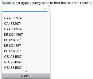
Option count: count of displayed options
Make sure the defined closure returns an Integer value. Typically you want to use a count query.
{code -> getCurrencies_count(code, null, null)}
Formatter: closure that returns a string that is displayed in the drop-down list
The string represents the respective object from the Options.
{c:Currency -> c.currencyCode}
Create new option: closure that is called when the user enters a custom value
If the user enters a custom value in the combo text field of the combo box, the closure accepts the value as its parameter and returns it to the binding entity.
Typically, a lazy-loaded combo box offers the available options as the user inputs characters: in the background, the options need to be loaded in batch required by the combo box.
{
userInput, firstPageItem, batchSize ->
   getCurrenciesContaining(userInput, firstPageItem, batchSize)
}
currentCurrency.code like userInput +"*"firstPageItem and batchSize{userInput -> getCurrenciesCountForFiltered(userInput)}
{ c:Currency -> c.code }
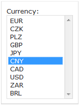
The Single-Select List component (  ) is a form component that displays a list of options and allows the user to select exactly one option.
It produces events of the following types:
Important: The property does not provide any validation whether the field contains a value and the user will be able to submit a null value unless an additional validation mechanism is defined. Such a validation can be implemented on a listener, possibly as a validation expression.
Options: list of options
The options are displayed as a vertical list. Make sure the defined expression resolves to an object of type List<ui::Option> object.
Note that the Option data type has the value and label field so that you can define the label displayed in the drop-down list that represents the given value.
Read-only: editability of the Single Select List
If true, the list renders as grayed out and no option can be selected.
Immediate: setting of the Immediate mode
To process the ValueChangeEvent at the moment the user selects an option, set the Immediate property to 'true'.
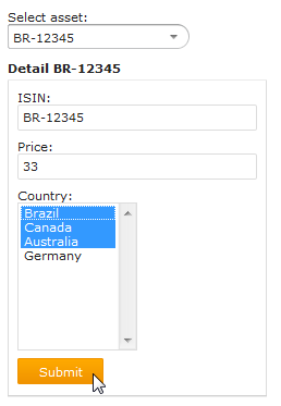
The Multi-Select List component (  ) is a form component that displays a list of options and allows the user to select multiple options.
It produces events of the following types:
Important: The property does not provide any validation whether the field contains a value and the user will be able to submit a null value unless an additional validation mechanism is defined. Such a validation can be implemented on a listener, possibly as a validation expression.
Options: list of options
The list is displayed in the drop*down menu. Make sure the defined expression resolves to an object of type List<ui::Option>.
Read-only: editability of the Multi Select List
If true, the list renders as grayed out and no option can be selected.
Immediate: setting of the Immediate mode
To process the ValueChangeEvent at the moment the user selects an option, set the Immediate property to 'true'.
The Check-Box List component is a form component that displays a list of options with check boxes and allows the user to select multiple options using the check boxes.
It produces events of the following types:

Important: The property does not provide any validation whether the field contains a value and the user will be able to submit a null value unless an additional validation mechanism is defined. Such a validation can be implemented on a listener, possibly as a validation expression.
Options: list of options
The list is displayed as entries in the check list. Make sure the defined expression resolves to an object of type List<ui::Option> object.
Read-only: editability of the Check Box List
If true, the list renders as grayed out and no option can be selected.
Immediate: setting of the Immediate mode
To process the ValueChangeEvent at the moment the user selects an option, set the Immediate property to 'true'.
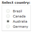
The Radio-Button List component is a form component that displays a list of options and allows the user to select exactly one option by clicking a radio button.
It produces events of the following types:
Important: The property does not provide any validation whether the field contains a value and the user will be able to submit a null value unless an additional validation mechanism is defined. Such a validation can be implemented on a listener, possibly as a validation expression.
Options: list of options
The options are displayed as a vertical list with radio buttons on the left. Make sure the defined expression resolves to an object of type List<ui::Option>.
Read-only: editability of the Radio Button List
If true, the radio button list renders as grayed out and no option can be selected.
Immediate: setting of the Immediate mode
To process the ValueChangeEvent at the moment the user selects an option, set the Immediate property to 'true'.
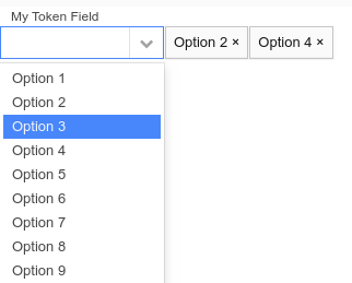
The Token Field component (  ) serves for selection of multiple options. Whenever the user selects or removes an option, the component fires a ValueChangeEvent.
The component is rendered by default as a combo box, so the user can click the arrow on the combo box to display the options. However, you can render the Token Field as a Text Field by setting its html-class presentation hint to tokentextfield.
Important: The property does not provide any validation whether the field contains a value and the user will be able to submit a null value unless an additional validation mechanism is defined. Such a validation can be implemented on a listener, possibly as a validation expression.
Binding: reference to a slot that holds the selected options
Typically a form variable of the collection type that holds the same type as the option value, for example, Set<String>; mind that validation does not Check the object type in the set.)
Read-only: editability
If true, the token field is grayed out and no option can be selected.
Immediate: setting of the Immediate mode
If true, the Immediate mode is active: any value changes are processed immediately.
Options: list of options
Option expression
collect(
  1..10,
  { x:Integer -> new Option(label -> "Option " + x, value -> "Value " + x) }
)
The options are displayed when the user enters characters that appear in one of the option values.
Help text: tooltip text
Define the Help text on the Help Text tab in the Properties view.
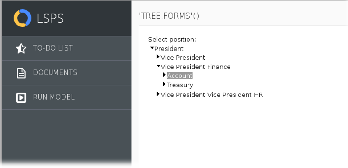
The Tree component (  ) allows the user to select a node from a expandable tree structure. The node is defined as a TreeItem object and can be expandable: When expanded, the Tree component produces a TreeEvent and tries to render child nodes:
null, the Tree calls the closure defined in the Children property to acquire the child nodes.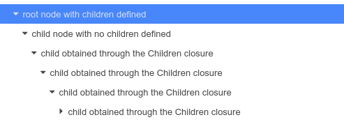
It produces events of the following types:
Important: The property does not provide any validation whether the field contains a value and the user will be able to submit a null value unless an additional validation mechanism is defined. Such a validation can be implemented on a listener, possibly as a validation expression.
Read-only: editability
If true, the tree renders as grayed out and no option can be selected. The selection uses the value of the binding slot.
It is called if the children property of a TreeItem is null.
Immediate: the setting of the immediate mode of ValueChangeEvents
To process the ValueChangeEvent at the moment the user selects a node, set the Immediate property to 'true'.
The File Upload component allows the user to upload a file to the server. It renders as an input field for a file path and a Browse and Upload button.

FileUploadEvent produced when file has been uploaded
Since file upload is an asynchronous process, on runtime, the component produces an ActionEvent when the upload button is clicked and an FileUploadEvent when the uploading finishes.
Important: The property does not provide any validation whether the field contains a value and the user will be able to submit a null value unless an additional validation mechanism is defined. Such a validation can be implemented on a listener, possibly as a validation expression.
Read-only: editability of the File Upload
If true, the component is disabled and grayed out and no file can be selected.
Immediate: setting of the Immediate mode
To process the ValueChangeEvent at the moment the user selects a node, set the Immediate property to 'true'. In immediate mode, the Browse button is no longer be available and the user is prompted to select the file when they click the Upload button. When they select the file, the file is uploaded immediately.
Important: This option is currently not supported since native HTML forms do not allow selecting multiple files in one window.
false.