LSPS Documentation
You can download an example implementation here. To import it to your workspace, go to Import > Existing Projects into Workspace; select Select archive file and locate the charts.zip file and select ChartTutorial.
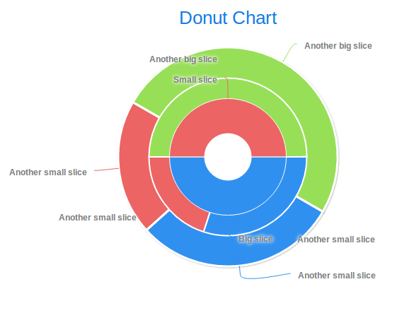
A donut chart is a special case of the pie chart: the pie slice series have the inner size plotting property larger than 0 and a custom size. Therefore, to create a donut chart, we will start from the pie chart.
To create a donut chart, do the following:
def PieSliceSeries innerSeries := new PieSliceSeries("Inner Slice Series", [
       new forms::PieSlice("Big slice", 10),
       new forms::PieSlice("Small slice", 10)
     ]
  );
def PieSliceSeries middleSeries := new PieSliceSeries("Middle Slice Series", [
       new forms::PieSlice("Another small slice", 30),
       new forms::PieSlice("Another small slice", 20),
       new forms::PieSlice("Another big slice", 50)
     ]
  );
def PieSliceSeries outerSeries := new PieSliceSeries("Outer Slice Series", [
       new forms::PieSlice("Another small slice", 30),
       new forms::PieSlice("Another small slice", 20),
       new forms::PieSlice("Another big slice", 50)
    ]
  );
//The dataseries as rendered in the order (z-index) as in the returned list
//(outerSeries is the lowest):
[ outerSeries, middleSeries, innerSeries ]
....
def PlotOptionsPie middleSeriesPlotting := new PlotOptionsPie(
  //inner border at the perimeter of the chart:
  innerSize -> new AttributeSize("20%"),
  size -> new AttributeSize("60%"),
  startAngle -> 90, borderWidth -> 2);

innerSeries.plotOptions := middleSeriesPlotting;
[ outerSeries, middleSeries, innerSeries ]
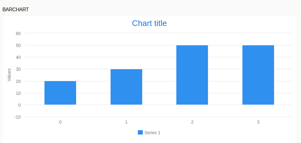
To render a data series as a bar chart, do the following:
plotOptions property of the data series to PlotOptionColumn.
myDataSeries.plotOptions := new PlotOptionsColumn(
          dataLabels -> new DataLabels(formatter -> "this.y"),
          color -> new Color(0, 255, 150));
Note that CategoryDataSeries are plotted as bar charts by default.
Example TimeDataSeries plotted as a bar chart
def TimeDataSeries tds := new TimeDataSeries([
   new TimeDataSeriesItem(now(), 1, 3),
   new TimeDataSeriesItem(now()+seconds(3), -1, 5),
   new TimeDataSeriesItem(now()+seconds(5), 2, 7)]
);
tds.plotOptions := new PlotOptionsColumn(range -> true);
[tds]
To use the category name on the x axis as values, set the x axis to an axis with category -> []. You can do so directly in the X Axis field on the Detail tab of the Properties view or anywhere by calling the addXAxis() method of the chart.
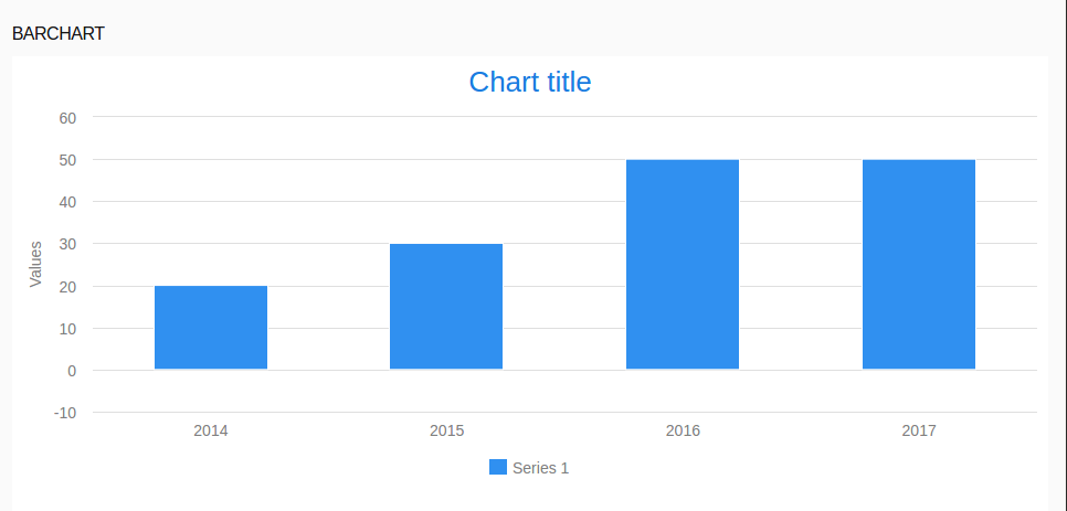
c.addXAxis( new Axis(categories -> ["Year 2014", null , "Year 2016"])) overrides the category names of the first and third item.
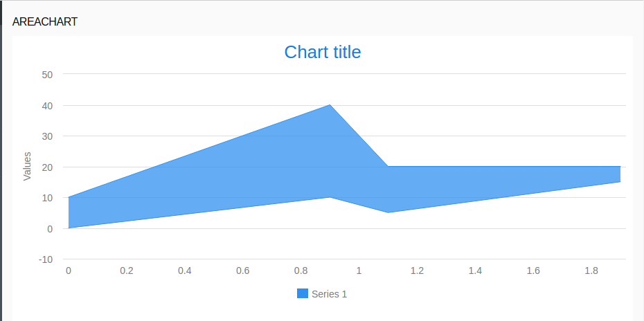
To render a data series as an area chart in the Cartesian Chart, set its plot options to PlotOptionsLineArea.
def CategoryDataSeries cds := new CategoryDataSeries(
  [
     new CategoryDataSeriesItem("first", 1, 4),
     new CategoryDataSeriesItem("second", -1, 2),
     new CategoryDataSeriesItem("third", 0, 3)
  ]
);
cds.plotOptions := new PlotOptionsLineArea(spline -> true, range -> true);
[ cds ]
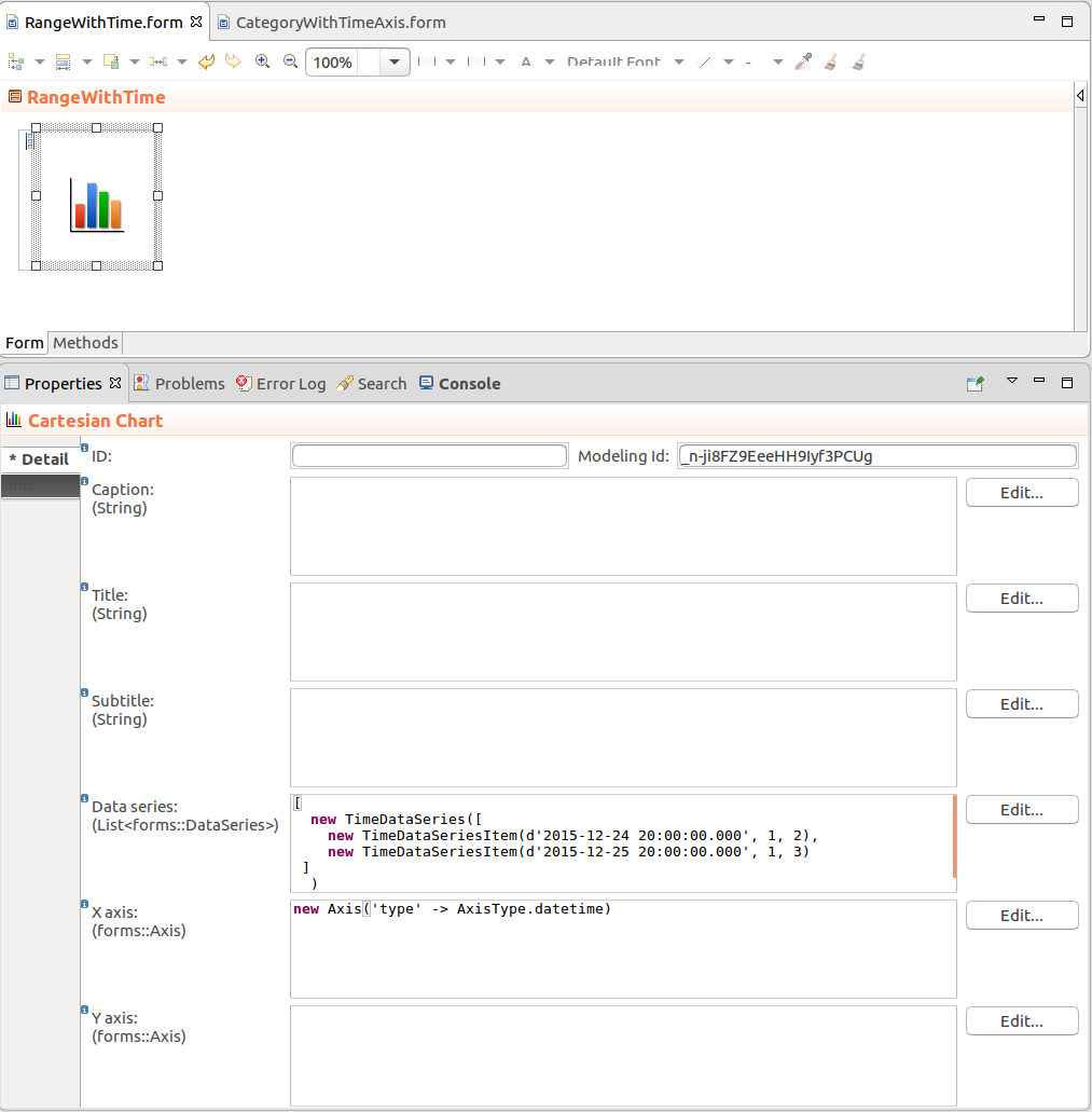
To create an area chart that will have time axis, use the TimeDataSeries in the Cartesian Chart and set the type of the x axis to AxisType.datetime.
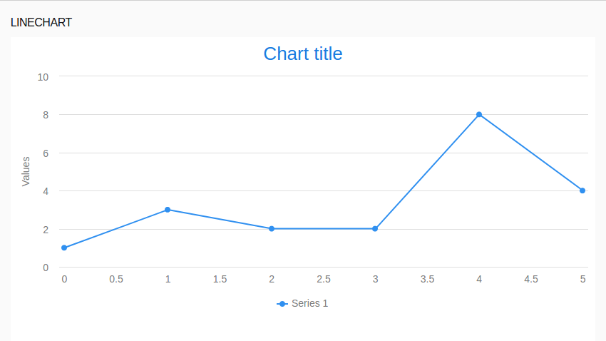
By default, ListDataSeries are rendered as line charts. If you want to plot another series type as a line chart, set its plot options to PlotOptionsLine.
cds.plotOptions := new PlotOptionsLine(spline -> true);
[ cds ]