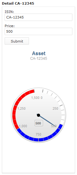
The Gauge Chart component renders as a chart with a circular Y-axis and a rotating pointer.
It produces events of the following types:
- InitEvent when the component is initialized or displayed if previously hidden
- ChartClickEvent when the user clicks a chart with information about the clicked data series

Form with the Asset gauge chart displaying asset price
Gauge Chart Properties
- Title: gauge chart main title
- Subtitle: gauge chart subtitle
- Value: value displayed by the pointer (needle)
- Value name: value name displayed in the pointer tooltip along with the Value
- Axis: gauge axis that defines the gauge chart scale, label, properties of the scale, bands, and chart position: The gauge axis constructor takes the following arguments:
- min and max: minimal and maximal values on the gauge scale
- label: label displayed directly on the gauge chart
- opposite: position of the axis (if true, the axis is displayed on the edge of the gauge circle; if false, the axis is displayed inside the gauge circle)
- bands: plot bands (shown white, blue, and red in the gauge chart figure above; CCS color definitions are supported)
- startAngle and endAngle: start and end angle of the gauge axis
- centerY: horizontal positioning of the gauge chart middle in percent (“50” places the chart directly under its title with no gap in between)
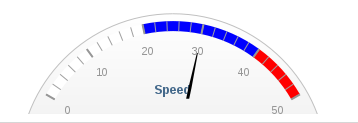
Example Axis definition
new ui::GaugeAxis(
    min -> 0,
    max -> 80,
    label -> "axis label",
    opposite -> null,
    bands -> [
        new PlotBand(from -> 0, to -> 20, color -> "#FFFFFF"),
        new PlotBand(from -> 20, to -> 40, color -> "blue"),
        new PlotBand(from -> 40, to -> 50,  color -> "red")],
    startAngle -> 300,
    endAngle -> 420,
    centerY -> 120)

Rendered gauge chart with the axis as defined above
- Show legend: visibility of the chart legend
This property is not applicable for the gauge chart component.


