Important: Chart components are based on Vaadin Charts, which are developed by a third party. Before designing your charts, make sure to obtain the respective licenses for Vaadin Charts.
Chart components render data as defined by their plotting options; hence you need to define these:
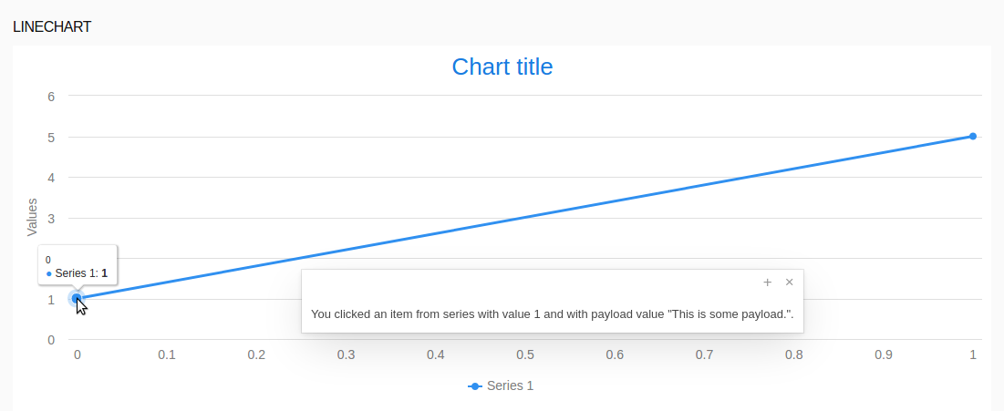
All charts can be redrawn on request and trigger an action, when the user clicks a data point in the chart.
To redraw a chart, call the refresh() method on the chart.
To handle a click on a chart item, define the onPointClick property of the chart with its setter method setOnPointClick(). The property is a closure with the ChartPointClickEvent produced by the click as its input parameter.
Typically, you will define the action on the Init tab of the component so the clicks are processed from the moment the chart is displayed.
myChart.setOnPointClick(
  {
    click:ChartPointClickEvent ->
      clickedSeries.setCaption(click.series)
  }
);
If you need to pass further data about the data item, define payload on the data series items: The payload is passed as the payload property of the ChartPointClickEvent.
[
  new ListDataSeries(
    [
       new ListDataSeriesItem( 1 , "This is some payload."),
       new ListDataSeriesItem( 5 , "This is also some payload.")
    ]
  )
]
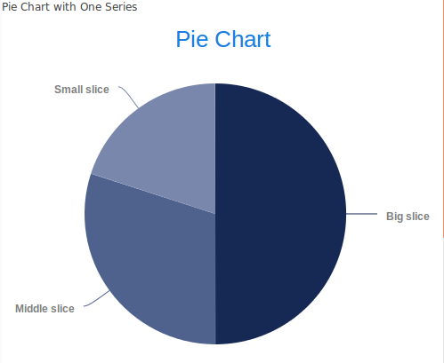
The Pie Chart  component is plotted as a pie chart; its data is defined in a list of
 PieSliceSeries. Each PieSliceSeries is plotted as its own pie with a set of PieSlices with the data. The pies are stack on each other in the order they are arranged in the data set. Mind that in such cases you will like need to adjust the plotting of the data series in order to make the pies visible.
To create a pie chart, do the following:
or using the addPieSliceSeries() method on a pie chart
Data for a pie chart with a single series
def PieSliceSeries mySeries := new PieSliceSeries("My only series", [
         new forms::PieSlice("Big slice", 50, "Business data", new Color("#162955")),
         new forms::PieSlice("Middle slice", 30, "Business data", new Color("#4F628E")),
         new forms::PieSlice("Small slice", 20, "Business data", new Color("#7887ab"))
]);
[ mySeries ]

To add a data series when the user or the system performs some action, run the addPieSliceSeries() method on the chart from the appropriate location, such as, Click Listener of a button.
{ e -> myAlreadyRenderedPeiChart.addPieSliceSeries(myPieSliceSeries)}
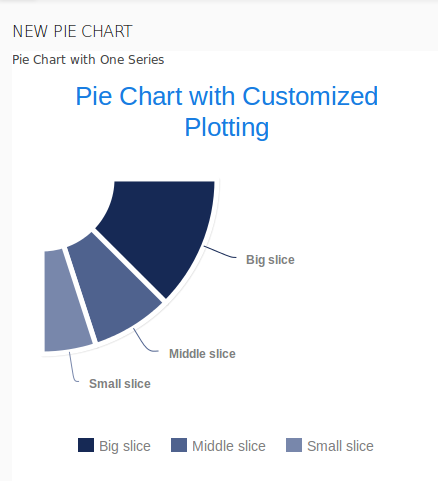
To define how individual pie slice series are presented, define their plotting options as a PlotOptionsPie object and assign it to the series.
In the PlotOptionsPie object, you can define the following properties:
innerSize: distance of the inner border from the center (size of the "hole" in the donut chart)
You can define it either in percent relative to the pie size or in pixels as Integer value.
startAngle: rotation of the chart series (angle where the first slice starts)
0 is the top; 90 is right;
size: perimeter of the chart series
You can define it either in percent relative to the plot area or in pixels as Integer value.
endAngle: degree that marks the end of the chart
0 is the top; 90 is right; null and the default value result in startAngle + 360.
def PlotOptionsPie mySeriesPlotting := new PlotOptionsPie(
                      //inner border is at 40% of the perimeter size:
                      innerSize -> new AttributeSize("40%"),
                      //rotation:
                      startAngle -> 90,
                      //chart series size:
                      size -> new AttributeSize(350),
                      shadow -> true,
                      borderWidth -> 5,
                      //position of the series:
                      center -> new AttributeCenter(0, 0),
                      endAngle -> 180,
                      showInLegend -> true);
mySeries.plotOptions := mySeriesPlotting;

To define formatting of data labels on data series of Pie Charts, define the dataLabels property on the pie data series as a PieDataLabels object.
Formatting expression can access the following variables:
format: label template that overrides formatter
From format, the variables are available on point object, for example {point.percentage}.
dataLabels -> new PieDataLabels(
    //javascript code used as label:
    formatter -> "'Percentage: ' + this.percentage +
    '<br>Point name: '+ this.point.name +
    '<br>Series: ' + this.series.name +
    '<br>Total: ' + this.total +
    '<br>x: ' + this.x ",
    //formatter -> "'this.x'",
    //rotation in degrees counterclockwise:
    rotation -> 45,
    format -> "Name: {point.name} Percentage: {point.percentage} Y: {point.y}",
    enabled -> true,
    color -> new Color(8, 8, 8),
    //Distance of the data label from the slice edge; can be also negative:
    distance -> 150)
Cartesian Charts serve to plot data as line, bar, area, or bubble charts.
The charts can plot multiple data sets, called data series, with different plotting. Data series are groups of related data that represent one graph.
When creating a data series, pick the data series type depending on the data values:
The data in a series is defined as a list of data-series items. Each type of data series can work only with data items of the respective type: CategoryDataSeries can contain only CategoryDataSeriesItems; DecimalDataSeries can contain only DecimalDataSeriesItems; ListDataSeries can contain only ListDataSeriesItems.
The data series items can hold ranges or values where applicable:
new ListDataSeriesItem(0.21); the value is the y value and x is the index of the item in the list.new CategoryDataSeriesItem("Greenland", 56196)new CategoryDataSeriesItem("Greenland", 56196, 56239).new DecimalDataSeriesItem(2, 5)new DecimalDataSeriesItem(7, 3, 8)new TimeDataSeriesItem(now() + seconds(1), 7)new TimeDataSeriesItem(now(), 1, 3)Each data series defines its plotting options; hence, each data series can be plotted differently from the others: override the plot options if you want to change the plotting.
Example data series
new CategoryDataSeries (
  [
    new CategoryDataSeriesItem("Greenland", 56196, 56239),
    new CategoryDataSeriesItem("China", 1388232693, 194202093),
    new CategoryDataSeriesItem("India", 1342512706, 1358354355),
    new CategoryDataSeriesItem("USA", 326474013, 328857273)
  ]
);
To add a data series when the user or the system performs some action, run the addDataSeries() method on the chart from the appropriate location, such as, Click Listener of a button.
{ e -> myRenderedChart.addDataSeries(myCatesianSeries)}
To add a data series item to a data series when the user or the system performs some action, run the addItem() method on the data series from the appropriate location, such as, Click Listener of a button.
{ e -> myAlreadyRenderedDataSeries.addItem(new ListDataSeriesItem(5, "This is new item with value 5."))}
To use another data series in a Cartesian chart, call the setDataSeries() method on the chart.
Each type of data series has default plotting which depends on the data in their items. Note that data series items can define their default plot options:
If you are not happy with the default plotting, you can adjust plotting of individual series, by setting the plotOptions property of the data series.
Note that some plotting options apply only to some types of data series item: for example, if you are working with series items that have decimals values only, it is not possible to use the Bubble plotting since this plotting requires a range to define the size of the Bubble marker.
You can plot the series items as the following:
PlotOptionsColumn: bar chart plotting
It applies to items with a single value and CategoryDataSeriesItems with a range.
PlotOptionsBubble: bubble chart plotting (requires range data series items; items with values are ignored)
It applies to items with ranges.
PlotOptionsScatter: scatter chart plotting (requires value data series items; items with ranges are ignored)
It applies to items with values.
PlotOptionsLine: line chart plotting
It applies to items with values.
PlotOptionsLineArea: line-area chart plotting (area below the line is filled)
It applies to items with values.
Defining plotOptions property of a data series
myDataSeries.plotOptions := new PlotOptionsLineArea(spline -> true, range -> true)
To change the plotting of point markers on Scatter, Line and Line Area Charts, set the marker property of the plot options:
//changing marker plotting:
myDataSeries.plotOptions := new PlotOptionsScatter(marker -> Marker.diamond);
//"smoothing" out the graph line:
itemListDataSeries.plotOptions := new PlotOptionsLine(spline -> true);
//setting graph line color:
itemListDataSeries.plotOptions.color := new Color(0,0,0);
//to interrupt the flow of the graph, set the item where to interrupt to null:
def ListDataSeries dataSeries := new ListDataSeries([1, 2, 3, 2, null, 4, 6]);
//to stack bars of a bar chart on the y axis behind each other,
//set the plotOptions.stacked to true:
def forms::PlotOptionsColumn plotOptionsColumn := new forms::PlotOptionsColumn();
plotOptionsColumn.stacked := true;:
Since Polar chart is a special case of the Cartesian chart, the uses the same types of data series just like in the Cartesian Chart and has the same plotting options.
To create a polar chart, insert the component to your form and define its data series. Any other required properties will use their default values.
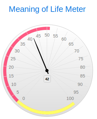
The Gauge Chart component has a single decimal as its value.
To define an action to double-clicking the point, set the onPointClick field of the Gauge Chart with the setter method:
c.setOnPointClick({ e:ChartPointClickEvent -> doSomething()})
To create a gauge chart, do the following:
Note that ticks have by default 0 length and are hence not displayed.
Example axis definition
new Axis(
  min -> 0,
  max -> 100,

  tickLength -> 0,
  tickInterval -> 5,
  tickWidth -> 2,
  tickColor -> new Color(0, 100, 100, 1),

  plotBands -> [
    new forms::PlotBand(from -> 180, to -> 240, color -> new Color(255, 51, 102, 0.8)),
    new forms::PlotBand(from -> 130, to -> 180, color -> new Color(255, 255, 102, 1))
  ]
);

gridLineWidth to 0.
Axes are rendered in some default way for each type of data series in your chart
To change the range of the chart axis, set its min and max properties.
//new axis with its maximum and minimum set:
new Axis(
min -> 0,
max -> 240)
By default, both the axes display decimals as their values: This is intuitive for the y axis: after all, we are visualizing numbers, but might not be the required values for your x axis.
Note that the following values are used on the x axis by default:
These properties can be overridden in the axis properties or with the addXAxis() or addYAxis() method of the chart.
If you want to change the values on an axis, define a new axis in the axis properties or with the addXAxis() or addYAxis() method of the chart.
new Axis('type' -> AxisType.category, categories -> ["My first name", null, "My third name"])
If you want to change only the value types on the axis, it is enough to change the AxisType. For example, if you want to display Date object as dates on the axis, define a new axis of the datetime type: `new Axis('type' -> AxisType.datetime)`.
You can add multiple axes to you chart with the addXAxis() or addYAxis() method: by default such axes are rendered next to each other. You might want to render one of the Axis on the opposite side of the chart: to do so, set its opposite property to true.
def forms::Axis yAxisTemperature := new forms::Axis();
yAxisTemperature.labels := new forms::ChartLabels(format -> "{value} °C");
yAxisTemperature.title := "Temperature";
yAxisTemperature.max := 20;
yAxisTemperature.min := -55;
chart.addYAxis(yAxisTemperature);

def forms::Axis yAxisPressure := new forms::Axis();
yAxisPressure.labels := new forms::ChartLabels(format -> "{value} kPa");
yAxisPressure.opposite := true;
yAxisPressure.title := "Pressure";
yAxisPressure.max := 102;
yAxisPressure.min := 20;
chart.addYAxis(yAxisPressure);