LSPS Documentation
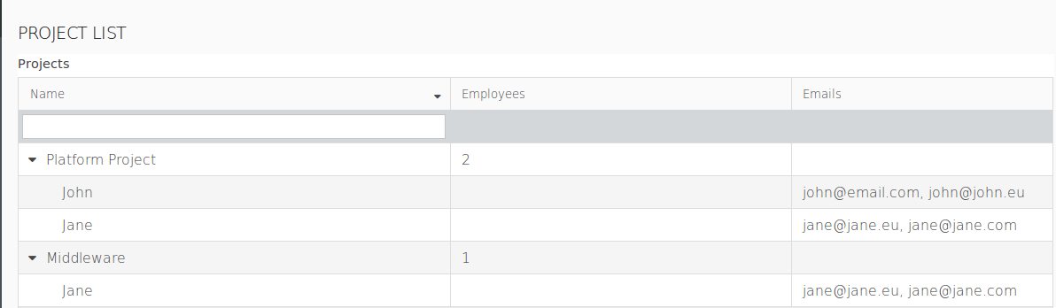
The Tree Table component allows you to display data in an expandable tree hierarchy. The nodes in the tree are identified by a special ID; Hence, one item can appear in multiple nodes of a tree.
To design a Tree Table in your form, do the following:
ClosureTreeDataSource: the input object of the closure is the clicked node and it returns a list of objects that represent the data source;
Example ClosureTreeDataSource
new ClosureTreeDataSource(
     {
     node ->
       //returns the list of root nodes on load (object stored in the home variable):
       if node == null then
         [home]
       else
         //what to return when the user clicks a node:
         //if the user clicked a Folder, return the list of its files and folders:
         if node.getType() == Folder then
           (node as Folder).items;
         //if the user clicked a file, do not return anything:
         else
           [];
         end;
       end;
     }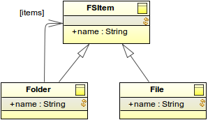
)SimpleTwoLevelTreeDS: two-level tree
Example SimpleTwoLevelTreeDS data source:
def SimpleTwoLevelTreeDS tree := new SimpleTwoLevelTreeDS(
        [ "eva" -> ["climbing", "painting"], "juraj" -> ["reposing", "windsurfing"] ]
     )
Insert Table Column components (  ) into the Table.
The column operates over the Data Source objects, so that on every column you can define what of the object is displayed.
Define the iterator type: the type is the type of the Value Provider
The iterator type is always the same as the type of the Value Provider object: since it is not possible to infer the type of Value Provider object without possible inaccuracies (for example, if the Value Provider is defined by a closure), the user always needs to set the iterator type explicitly.
To enable or disable filtering on Tree Tables, use the setFilteringEnabled(Boolean) call on the component: The method hides or displays the filtering row.
To create a Tree Table with nodes that are of different data types, do the following:
Define the data source as a SimpleTwoLevelTreeDS or ClosureTreeDataSource.
Check the type of the clicked node: typically you will cast the node to its type to be able to return the list of its child nodes. Note that on load, no node has been clicked yet, so the input object is null: make sure to handle this situation in the closure.
Insert the Table Column into the Tree Table and define the Value Provider type and the value provider expression below.
Make sure that the Value Provider returns values of simple data types: Objects of another type cause a runtime exception since it is not possible to produce their filter and sort feature.
{
   clickedNode:FSItem ->
   clickedNode.name;
}
FSItem.name
To allow the user to select an item in a tree table and obtain the selection, do the following:
MyTreeTable.setSelectable(true)
MyTreeTable.setSelectionChangeListener( {e:forms::ValueChangeEvent ->
   //set the value in the selected row as caption of a Label:
   Selection.setCaption(
       toString(
          //e.source returns the TreeTable; getSelection the selected object:
          (e.source as forms::TreeTable).getSelection())
       )
    }
)To enable sorting on a Grid or Table, select the sortable flag in the Sorting properties of the respective column: the user will be able to sort the displayed values by clicking the column header.
On a Table, if you do not want to use the column provider for sorting, define the sorting value provider below.
Important: When applying sorting on large collections (the Data Source of the Grid or Table is set to Collection), sorting and filtering actions might cause performance issues: consider using other data sources such as shared Type data sources.
Important: Filters on Columns of Tables and Tree Tables support only the Boolean, String, Integer, Decimal, Date, and Enumeration data types.
To enable filtering on a column of a Table, Tree Table, and Grid, do the following:
setFilteringEnabled method and is enabled by default.setFilterConfig() method.new OptionsFilterConfig(multiselect -> true, options -> [
new SelectItem(label -> "label of 1", value -> 1),
new SelectItem(label -> "label of 2", value -> 2)
])// numeric filter with default values:
new NumericFilterConfig(equal ->50, moreThan -> 10, lessThan -> 90)
new DateFilterConfig(
  resolution -> uicommon::DateTimeResolution.Month, formatPattern -> "YYYY MMMM"
)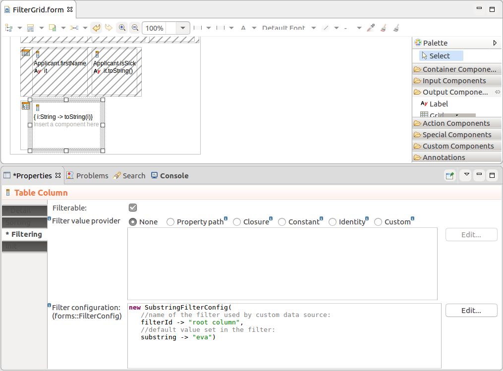
Important: When applying filtering on large Collections (the Data Source is set to Collection), sorting and filtering actions might cause performance issues: consider using other data sources such as shared Type data sources.
To enable or disable filtering on Tables and Tree Tables dynamically, use the setFilteringEnabled(Boolean) call on the component: The method hides or displays the filtering row.
To enable row selection on a Tree Table, set the tree table as selectable: MyTable.isSelectable() or MyTable.setSelectable(true). You can then use the setSelectionChangeListener() to listen for user Selection and acquire the selected row with use the getSelection() method.
You can use the select() method to select a row from the Form.
c.setSelectable(true);
c.setSelectionChangeListener({ e -> selected := c.getSelection().toString(); SelectedLabel.refresh()})
To add a Grid Column, Table Column, or a Tree Table Column to the parent component Dynamically, for example, on button click, call the addColumn() method on the parent component.
Adding a column on button click (Click Listener):
{e -> Vocab.addColumn(
   new forms::TableColumn(
       data -> null,
       modelingId -> null,
       filtrable -> false,
       generator -> null,
       sortable -> false,
       valueProvider -> new PropertyPathValueProvider(Unit.svk))
   )
}To enable row selection on a Tree Table set it as selectable: MyTreeTable.isSelectable() or MyTreeTable.setSelectable(true). You can then use the setSelectionChangeListener() to listen for user Selection and acquire the selected row with use the getSelection() method.
You can use the select() method to select a row from the Form.
c.setSelectable(true);
c.setSelectionChangeListener({ e -> selected := c.getSelection().toString(); SelectedLabel.refresh()})
Columns of tabular components can be collapsed from the front-end by the user as well as programatically. You can also enable or disable the feature.
By default, Columns can be collapsed:
setCollapsible(false) method on the Column of a Tree Table or Table.setCollapsed(Boolean) method on the Column of a Tree Table or Table.