LSPS Documentation
When you change a value not related to the underlying data source in your form, such as a caption, table and column width, etc. the component in the client browser is refreshed instantly.
However, if you change the related data, such as the data source, you need to call the refresh() method on the component to have the component rendered with the modified data. The refresh() call causes refresh of all child components as well: the binding is reloaded, the data source is refreshed, and component validation triggered.
You do not need to call refresh() if you use the setValue() calls to modify the component data since it is called automatically.
A visible component is included in the form: by default, all components apart form the Popup are visible. If you set a component as not visible, it is excluded from the form hierarchy.
setVisible(Boolean visible*): set the component visibilityisVisible(): returns the component visibilitygetCaption() returns the component captionsetCaption() sets the component caption The setCaption() call localizes any localization identifiers automatically; hence there is no need to include the localize call.Important: The caption of the Text Field is rendered by the parent layout component. Hence if you create a form with a sole Text Field component, the form will be rendered without its caption text. This is due to limits of the Vaadin framework.
All form component can define their icon:
c.setIcon(FileResource.fromModule("form_components", "action/img/person.png"));
Note that the font Awesome has its Resource record, hence you can use its icon directly from the setIcon() call: c.setIcon(new FontAwesome("minus-square"))
Currently it is not possible to set the icon size: use bitmap files with the correct size or adjust the style with your CSS files.
Important: The icon of any component is rendered by the parent layout component. Hence if you set icon on the root component, the form will be rendered without the icon. This is due to limits of the Vaadin framework.
When a component is in read-only mode, the user cannot change the value of the component. The mode does not influence other functionalities of components.
Every component defines its default size settings (height and width) which you can change with the size-related methods setWidth(), setHeight(), and setSize().
Size can be defined as follows:
Consider two special values:Note: This space is restricted restricted by the parent layout component and can be adjusted with the Expand Ratio methods.
100% referred to as full since it sets the component to fully fill its slotnull referred to as wrap since it sets the component to take the minimum size required to accommodate its content.m sizex size When you define absolute size of your component, make sure it does not overflow its component slot if this is not required. SUch situations can lead to overlapping content.All components have their default sizes used if you do not specify their size explicitly:
Width is set to 100% or full: the width is set to the width of the parent component (identical to 100%)
The exception are all Input Components, Horizontal Layout, and Popup which wrap their content by default.
Height is set to null or wrap.
The only exception is the Map component that has a fixed height of 400px.
When setting component size, use the setter methods setWidth() and setHeight(): the methods take parameters in the format [number][units], such as 100%, 10em, 25px.
You can get the current size with the getWidth() and getHeight() methods.
To make a component wrap its content, call the respective setter method with the null parameter, for example, c.setWidth(null) or one of the wrap methods:
Note that if the size is set to wrap, it is considered null.
To set the size of a component to fill its component slot, call a full method on the component.
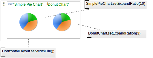
Expand ratio sets the size of the component slot in proportion to the parent component size. Mind it does not set the size of the component itself.
Layout components allocate to their children component slots of equal sizes; the child components fill the slot as defined by their properties:
Important: When you set absolute size on a component, note that this does not influence the size of the component slot and might result in content overlap.
The ratio expand applies only to child elements of Horizontal, Vertical, and Grid layouts since only these components allow you to change the slot size:
When the Layout component is calculating the component slot sizes, first it gives the required space to components that wrap their content (the slot adopts the size of the component); then it calculates the size of the remaining available space and distributes this space either equally or according to the defined expand ratio numbers.
You can align the component with its slot: the alignment impact depends on the size of the component: if the Component is as wide as its slot, bottom and top alignment will have no effect.
Note: You can only add style names to form components from a GO-BPMN model: To create custom SCSS style rules, implement them in the style sheets of the Application User Interface.
To add a style name, that is the style name to the class attribute, of a component, use one of the following methods:
addStyleName(selector1, selector2) adds the selectors to the class attribute to the component. This call does not modify the classes the component already has. The call triggers the RepaintRequestEvent on the component which you can handle if necessary.
By default the following selectors are available: l-border-none, l-border-left, l-border-top, l-border-right, l-border-bottom, l-highlighted, l-emphasized, l-grayed, l-border.
Note: For all your classes, under the hood, the system creates their copy with the name
v-<component_type>-<class_name>so you can style the component either in the class<class_name>orv-<component_type>-<class_name>in your SCSS file.
setStyleName(selector1, selector2) replaces the class attributes of a component with the values passed in the parameters.You can work with style name using the following methods:
getStyleName() returns the class attributes of the component.
The method returns only the attributes that you added with the setStyleName() method: classes set by the system are ignored.
removeStyleName() removes the class values passed in the parameters.
You can remove only the class attributes that you created with the setStyleName() and removeStyleName() calls: classes set by the system cannot be removed.
For information on how to add your style and style rules, refer to Add Style Name to a Form Component.
A disabled component has the disabled style. Disabled components cannot be modified or updated in any way.
To display a tooltip, when the user hovers over a component, set the description of your component with the setDescription() method.
Important: The description is handled as HTML; hence make sure no injection and XSS vulnerabilities can be exploited.
myLabel.setDescription({ r:MyRecord ->
             "Status of row object: " + m.status + #10 + m.id});
To display a notification, use the notify() function.
The displayed notification can be of the type:
MyTextField.setOnChangeListener(
  {e->
    notify(
      caption -> "Notification on Value Change", "" + MyTextField.getValue(),
      ntype -> NotificationType.Info)
  }
);
Each form component can define its context menu which is displayed when the user right-clicks the component.
The menu contains a list of menu items, which trigger an action when clicked: the action is defined by their onClick parameter.
To define a context menu on a component, use its setContextMenuItems() method.
Example context menu with one item
c.setContextMenuItems(
  [
    new forms::MenuItem(
       caption -> "Show Details",
       onClick -> { ->
         showPatDetail(somePatient).setVisible(true);
       }
    )
  ]
)
Menu items in the context menu can have child menu items. Note that the onClick closure on a menu item with a submenu is ignored (only clicks on leaf menu items can be handled).
Example context menu
c.setContextMenuItems(
  [
    new forms::MenuItem(
       //This onClick closure is ignored
       //since the item has a submenu:
       onClick -> { ->
         c.setValue("You just clicked the Menu Item option");
         c.refresh();},
       subMenu -> [
         new forms::MenuItem(
           onClick -> { ->
             MyText.setValue("You just clicked the Submenu Item option");
             MyText.refresh()},
           caption -> "Submenu Item")],
           caption -> "Menu Item"),
         new forms::MenuItem(
           onClick -> { ->
             MyText.setValue("You just clicked the Menu Item option");
             MyText.refresh()},
           caption -> "Another Menu Item"
    )
  ]
)
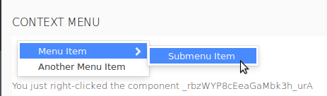
To handle a right-click on a component and possibly build a context menu dynamically, use the setContextClickHandler() method.
c.setContextClickHandler(
  { x:ContextClickEvent ->
     eventText.setValue("You just right-clicked component " + x.source.modelingId);
  }
)
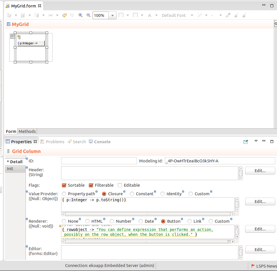
Value provider defines the content of the cell in the row. Its value is based on individual object return gradually from the Data Source; it is used to define what value a column of a Table, Tree Table, Grid or Combo components should display.
Important: Value Provider must return values of a simple data type: If it returned Objects of another type, it would not be possible to filter and sort them.
You can define the following Value Provider types:
Person.name
Closure: a closure that returns the value for the cell with the Value Provider object as its input
The Closure Value Provider is typically used for calculated fields (note that when calculating fields, you will need to refresh the entire Grid when one of the relevant values changes).
{ person -> person.firstname + person.surname}
Integer