LSPS Documentation
The components described in this section are deprecated and will be removed in the next release.
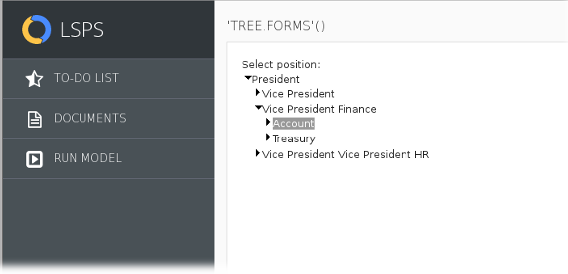
The Tree (  ) component renders as a tree of nodes. The nodes are expandable unless they are leaf nodes, that is, they do not have any children. Whenever a node is expanded its child nodes are lazy-loaded. To acquire the child nodes, the Tree component calls the closure defined in the Children property. The closure returns a List<TreeItem> objects.
The TreeItem objects define the following:
The Tree component serves as a picker of exactly one option (node). Once the user selects a node, the selection is stored in the Binding slot.
Required: compulsoriness of the tree component
If true, a mark indicating that the value is required is rendered in the component. > Important: The property does not provide any validation: the user > will be able to submit a null value even if it is set to true. To prevent > the submit, define a form validation on a listener.
{ parent:Position, depth:Integer ->
    compact(
      collect(
        positions,
        { p:Position ->
          p.parent := parent ? new TreeItem (
            data ->p,
            expanded ->false,
            label -> p.name) : null
         }
      )
   )
}
Read-only: editability
If true, the tree renders as grayed out and no option can be selected. The selection uses the value of the binding slot.
Immediate: setting of immediate mode
If true, the Immediate mode is active: any value changes are processed immediately.
Note: You can define the Help text on the Help Text tab in the Properties view.
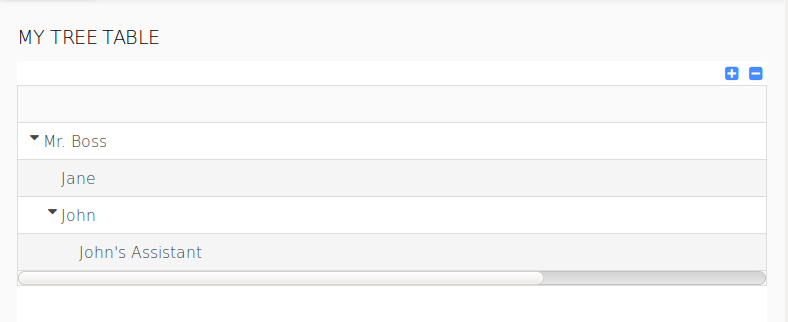
The Tree Table component renders as a table with rows organized in a tree structure with rows as tree nodes. Hence, child rows can be collapsed.
The component works similarly to the Table component. However while a table operates directly over business data types, the tree table component wraps the business data in the TreeTableItem data type objects. The object holds the along with business data also additional information. Based on the additional information, the tree table either expands the node that represents the business data or keeps it collapsed.
The tree table component iterates through a List<TreeTableItem> object. The TreeTableItem objects content can be then further processed (for example, displayed or provided for editing) in the table's columns.
The TreeTableItem objects define the following:
Iterator: reference to an object of the business data type
The object is used as iterator for the table tree items.
Important:The iterator is not of the TreeTableItem type but of the type of your business data: the List<TreeTableItem> holds TreeTableItem objects, while the TreeTableItems objects hold the business objects in data and serve to provide the additional expanded property.
Note: You can define the Help text on the Help Text tab in the Properties view.