LSPS Documentation
To modify presentation properties of a form component, such as, its size, position, alignment, or possibly properties of a custom form component, use presentation hints. In the Application User Interface, hints translate into classes of the element.
You can use the hints defined in the Standard Library or you can define your custom hints.
Important: Any hint assigned to a component is inherited by its child components. Note that some hints are defined implicitly and are not visible in the Form editor; for example, layout components have their width set to 100% by default and their children therefore have the width set to 100% as well. To ignore inherited hint values, override the hint value on the child component with another value or the
nullvalue if you want to erase the value.
The ui module comes with a set of default presentation hints stored in the in the ui::ui.hints file in the Standard Library.
To assign a form component a hint from the Standard Library, do the following:
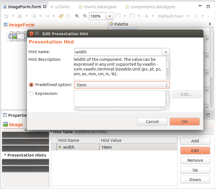
Hints can be defined either directly on a form component or in a hints definition file. The hints defined in a hints definition file are available in the entire parent module.
Make sure that the component implementation accepts and processes the hint. Otherwise, the hint is ignored.
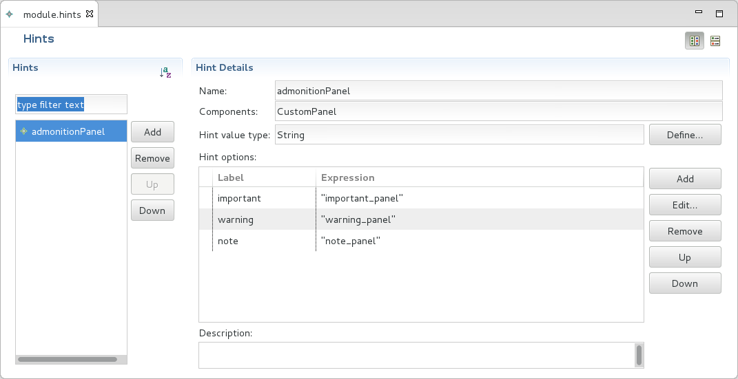
To define hints that can be used by all forms in the module, do the following:
To assign a form component a custom hint or a standard-library hint, do the following:
["myhint" -> "My Hint Value" + varString]).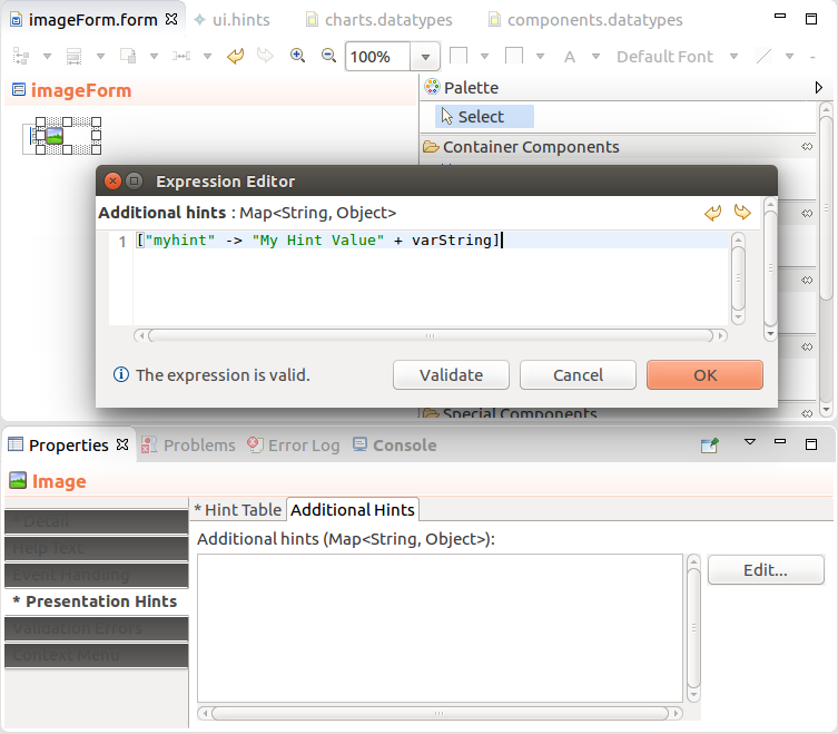
To define alignment of child components in the Vertical, Horizontal, and Grid Layout, and table Column, use the align hint. Note that the top, middle, and bottom align settings are simply ignored.
On a table Column, the alignment is applied also on the column header. If necessary, you can override the setting with the header-align hint.
Component size is defined by the height and width component hints. Where applicable, the size hints are defined implicitly. However, you can be override them with an explicit hint definition.
Hint values can be defined in the following units:
m sizex sizerelative size to the parent: component size in relation to the size of the immediate parent
You can use the predefined values:
fillparent: identical to 100%,wrapcontent: component size is set to the sum of sizes of children componentsexpand: Sets the expand ratio for a component. If there is only one component with an expand ratio, the component will be expanded to the maximum possible size within its parent. This hint can only be applied to a table Column or the direct child of a Vertical or Horizontal Layout. Form Layout is unsupported.Form components define implicitly presentation hints with default values. These values are applied unless you define another value for the hint.
Note that the default values might be in conflict. As a result, the rendered form might not meet your requirements or render at all. For example, consider a table in a vertical layout:
wrapcontent so it checks the size of its child components and sets its width to the maximum child width.fillparent so it uses the parents' width.Hence there is no setting for the table or the layout and you need to explicitly set to one of the widths to a required value.
Default Widths and Heights
| Component | Default Width | Default Height |
|---|---|---|
| Container Components | fillparent | wrapcontent |
| Grid Layout | fillparent | wrapcontent |
| Form Layout | fillparent | wrapcontent |
| Text Box | wrapcontent | wrapcontent |
| Text Area | wrapcontent | wrapcontent |
| Check Box | wrapcontent | wrapcontent |
| Combo Box | wrapcontent | wrapcontent |
| Lazy-Loading Combo Box | wrapcontent | wrapcontent |
| Form Layout | fillparent | wrapcontent |
| Single-Select List | wrapcontent | wrapcontent |
| Multi-Select List | wrapcontent | wrapcontent |
| Check-Box List | wrapcontent | wrapcontent |
| Radio-Button List | wrapcontent | wrapcontent |
| File Upload | wrapcontent | wrapcontent |
| Output Text | fillparent | wrapcontent |
| Table | wrapcontent | wrapcontent |
| Calendar | fillparent | fillparent |
| Action Button | wrapcontent | wrapcontent |
| Browser Frame | fillparent | wrapcontent |
| Button | wrapcontent | wrapcontent |
| Cartesian Chart | fillparent | 400px |
| Gauge Chart | fillparent | 400px |
| Pie Chart | fillparent | 400px |
| Polar Chart | fillparent | 400px |
| Conditional | fillparent | wrapcontent |
| Dashboard | fillparent | fillparent |
| Dashboard Widget | 0, 0, 200, 300 | overrides DashBoard |
| File Download | wrapcontent | wrapcontent |
| Geolocator | invisible | invisible |
| Horizontal Layout | wrapcontent | wrapcontent |
| Image | wrapcontent | wrapcontent |
| Lazy Table | wrapcontent | wrapcontent |
| Tree Table | wrapcontent | wrapcontent |
| Map Display | fillparent | 400px |
| Message | fillparent | wrapcontent |
| Navigation Link | wrapcontent | wrapcontent |
| Panel | fillparent | wrapcontent |
| Popup | fillparent | wrapcontent |
| Repeater | wrapcontent | wrapcontent |
| Tabbed Layout | fillparent | wrapcontent |
| Table Column | counted by the table | counted by the table |
| Tree | wrapcontent | wrapcontent |
| Vertical Layout | fillparent | wrapcontent |
| View Model | fillparent | wrapcontent |
With the html-class hint, you can define the presentation of a component, such as, border rendering, highlighting, emphasis, overflow, disabling of text, etc. Refer to the hints documentation in the Standard Library documentation.
To add a class attribute to the rendered component, use the html-class hint.
Note that the class must be defined in the Application User Interface. For instructions on how to add new style sheets, refer to Custom Application User Interface Guide.
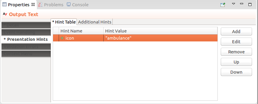
To add an icon from the Awesome font to your component class, assign the icon presentation hint to your component and insert the name of the icon as its value.
The TextBox and TextArea components can define the max-text-size hint, which defines the maximum length of the text the user can enter. If the component is bound to a shared record field, the size must take into account the size of the underlying database column, that is the column to which the field is mapped.
You can hence generate the hint for TextBox and TextArea components that are bound to shared record fields. Note that the hint generation is applied on all open GO-BPMN projects of your workspace. Close any projects you want to exclude.
To generate or adjust the max-size-hint for all TextBox and TextArea components in all open GO-BPMN projects, do the following:
Important: If a max-text-size hint contains a non-integer value, the hint is invalid.