
Tabular components include the Table and Tree Table components which share common features: they serve to display data in a tabular manner and have the Column components as their immediate children. Both work with the same types of data sets and support ordering and filtering of their content.
The Table component displays the data of its data set in the child components of the table's columns: The system iterates through individual objects of the data set and each object becomes the data iterator value for a row. The iterator is then used by the child components of table columns to access the data object.
It supports ordering, filtering, and grouping of the data.
The way the data set is acquired and the way the table is rendered is defined by the table type:
The data set itself can be defined as the following:
Type: shared record or a shared record field
The system fetches all shared record instances from the database.
Query: query that returns a collection of objects
The table iterates through the collection objects.
Collection: collection of the data object
The table iterates through the collection objects.
Data: parametric closure that returns the collection of data objects
The first parameter holds the index of the first entry; The second parameter is the count of entries per load or page. You will use this option typically when integrating with other systems, for example, {currentIndex, count -> getEntryBatch(currentIndex, count)}.
This data kind requires the Data count property, expression that returns the total amount of entries to be loaded.
Generic: an Object that results in any of the above on runtime
The setting is used for generic reusable tables when the user wants to fill the same table with different data queried in different ways, typically when reusing the form in other forms.
A simple Table is rendered as a table on a single page with all its items.
To create a simple Table, do the following:
Important: The data iterator can be used solely as the table iterator: Using the iterator out of the Table only when creating the table dynamically. The practise is generally discouraged and results in a validation problem.
TableType.simpleA paged table data is rendered on pages with the number of rows defined by the initial-page-size presentation hint and page navigation at the bottom. It can be set to load a particular page using the Show Index property.
A paged table produces the TablePageSizeChangeEvent when the user changes the size of the table page.
To create a paged Table, do the following:
TableType.pagedImportant: The data iterator can be used solely as the table iterator: using the iterator out of the Table results in a validation Error.
initial-page-size presentation hint.A lazy table is rendered as scrollable table with the number of rows defined by the initial-page-size presentation hint.
To create a Table, do the following:
TableType.lazyImportant: The data iterator can be used solely as the table iterator: using the iterator out of the Table results in a validation Error.
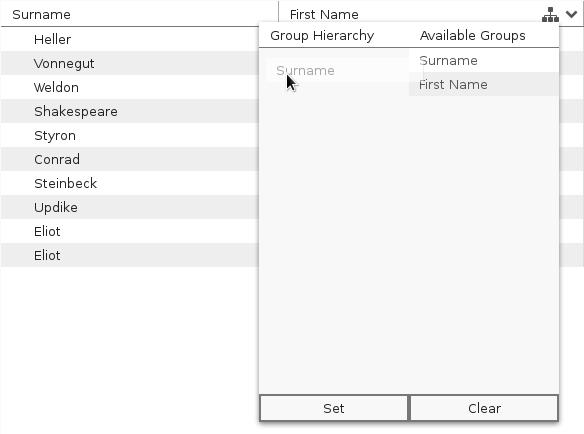
Groups serve to group the items in a table on multiple levels according to their properties in a tree-like way, for example, a list of songs according to their interpret and then according to the album.
Note that grouping takes place on the data set and renders the table type setting irrelevant.
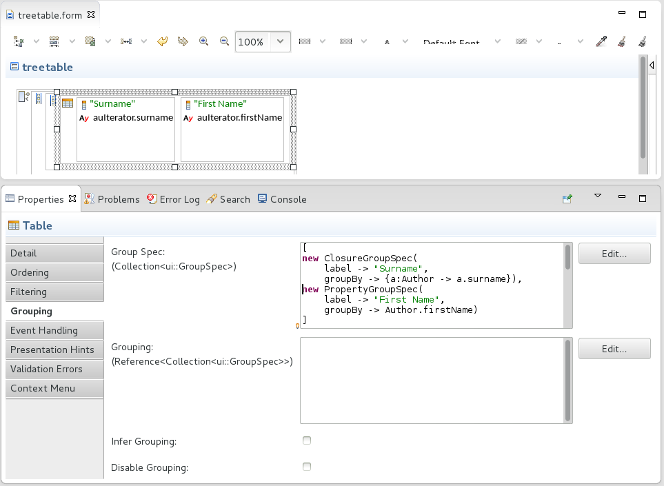
The groups are defined as a subtype of the abstract GroupSpec record and that as one of the following:
[
//first-level grouping:
new PropertyGroupSpec (
    label -> "Surname",
    groupBy -> Author.surname),
    //second-level grouping:
    new PropertyGroupSpec
          (label -> "First name",
          groupBy -> Author.firstName)
]
[new ClosureGroupSpec(
   label -> "Surname",
   groupBy -> {a:Author -> a.surname}
   )
]
[new OptClosureGroupSpec(label -> "Surname",
      groupBy ->
        { c:Collection<Author > ->
        def Set<String> surnames := toSet(collect(c, {a:Author -> a.surname}));
        //creates map with surname as the key and collection of authors as value
        map(surnames, {surname:String -> select(c, {a:Author -> a.surname = surname})})}
    )
]
Alternatively, if you are using the Type data kind, you can infer grouping: The system will "guess" the applicable groups. The Group Spec then becomes a collection of all bindings of child components of all columns. Therefore, grouping is inferred only on columns with one Input component with binding set to a simple data type entity.
To define grouping on a table, do the following:
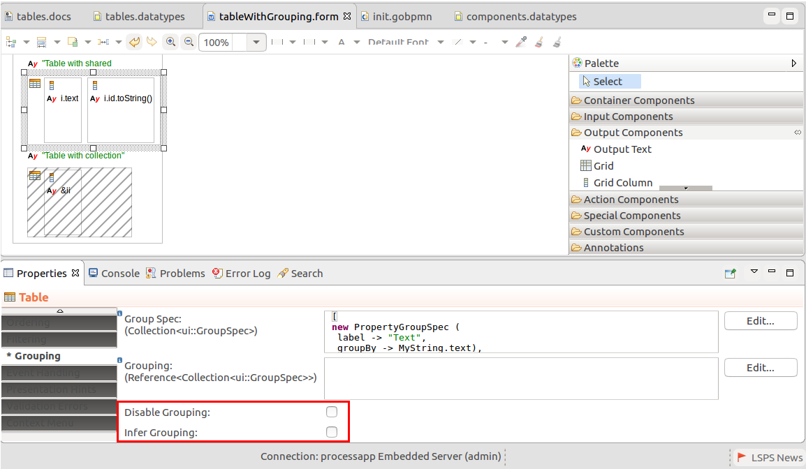
To disable grouping on a table, do the following:
Unselect Disable Grouping to disable grouping altogether.
For the Columns with inferring of grouping, the inferring will be disabled. Other Grouping settings will be applied.
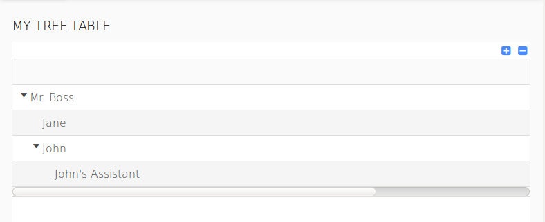
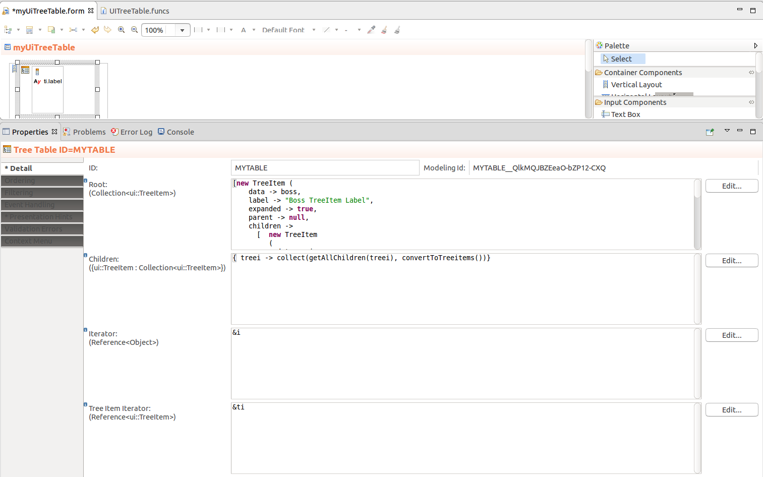
The Tree Table ( ![]() ) component renders as a table with rows organized in a tree structure. The rows of the collapsible tree nodes are loaded on expand.
) component renders as a table with rows organized in a tree structure. The rows of the collapsible tree nodes are loaded on expand.
Individual nodes are represented by TreeItem objects, which hold the business data and information about the tree node and its child elements: The tree table component iterates through a collection of the root <TreeItem> objects. If a root object defines children, it iterates also through the child elements. Every element becomes the object for a row.
Tree Tables support ordering and filtering of their content.
The TreeItem objects define the following:
You can access the data through the iterator or tree item iterator: the iterator holds only the business data object, while the tree item iterator holds its TreeItem object.
Children: closure that returns a list of tree table items that are loaded when a node is expanded
The closure is called when the children in the Root expression are null; note that when children is an empty collection, the node is considered a leaf and the closure is not called.
Iterator: reference to an object of the business data type
The iterator will hold the data object of the given row so it has to be able to hold any business data type used in the Tree Table: if the table uses different records, consider using the Record type or another parent data type.
Important: The data iterator can be used solely as the table iterator: using the iterator out of the Table results in a validation Error.
Tree Item Iterator: reference to an object of the TreeItem type
It will hold the TreeItem object of the current row.
Important: The iterator can be used solely as the table iterator: using the iterator out of the Table results in a validation Error.
To create a Tree Table, do the following:
[new TreeItem(
//business object
    data -> boss,
    label -> "Boss",
    expanded -> true,
    parent -> null,
    children -> [
        new TreeItem(
            data -> employee,
            label -> "Employee",
            expanded -> true,
            parent -> null,
            //if children is null, like below, then the Children property is used to retrieve child nodes:
            children -> null)
    ]
  )
]
The Table Column component can represent column of a Table or a Tree Table. It defines table column properties, including ordering and filtering options. Its children are components that can operate over the Table business data.
To define how children of a column are aligned use the align presentation hint: note that the hint is applied on the header as well.
Warning: Note that refreshing a table column does not refresh its underlying data set: only its header, hints, and any data not related to the data set, such as global variable references, are recalculated. This is justified by the fact that if you managed to refresh only the data set for a column, the table could be populated with inconsistent data. To refresh the underlying data set of a column, either refresh the parent table or the content of the column child components.
The Table Column component has the following properties:
Visible: visibility of the table column
If false, the column is not visible or available in the column picker.
The expression is evaluated whenever the column's parent component is refreshed.
To hide a Table Column, that is to display it collapsed, set the hidden presentation hint to true: this setting will be applied when the form is initialized.
To save the column width in a table and the collapsed state of a table when a document or a to-do is saved, call the getColumnStates(<MYTABLE>) function and store the returned column states. When applicable, call the restoreColumnStates(<MYTABLE>, <COLUMNSTATE>) function to restore the column widths and collapsed states.
Tables and Tree Tables support
The features are enabled on the Table and Tree Table components; however, since their logic applies to Columns, that is where they are actually defined.
All the features allow their inferring, that is, setting up the feature automatically as best effort for the given Column data.
Ordering is defined on the Column components in Tables or Tree Tables. By default, Columns are set to infer ordering so the feature is automatically set up. However, inferring is applicable only on Columns with exactly one input component and with their binding set to a simple data type. For columns with multiple or other than input components, the inferring of ordering is not supported. Also, if the data set is obtained as Data, you will need to define the ordering manually.
Note: Ordering cannot be applied on columns with enumeration values. If you want to order a table according to an enumeration, use a query to acquire the data set already sorted. You can then define the enumeration as the sorting property on table columns.
To define ordering on a table, do the following:
Define the ordering properties on the Ordering tab of the Table or Tree Table:
Infer ordering: if checked, inferring of ordering on the table is enabled (Columns can infer filtering).
Ordering can be inferred only on tables that define a shared Record type as its data kind and that only on columns that contain exactly one input component (the infer guess is performed based on the binding reference of the component).
Once you have defined ordering properties on the table, you will need to define ordering on table columns.
Infer: no Group By expression applies. Inferring is applied only on the particular column.
If setting the value to Infer, make sure inferring of ordering is enabled on the parent table or tree table.
To track and programatically change the ordering of a Table or Tree Table, define the Ordering expression on the Ordering tab of the component properties. The value is a reference to a map and will be set to values in the form [ORDER_BY -> ORDER_DIRECTION], for example [MyForm::MyRecord.id -> ui::OrderDirection.Ascending].
Other model resources can use the variable value to detect the current ordering. Also, if you set the reference to an expression, the expression will be evaluated when the component is visualized in the front-end application and used as default ordering on the Table or Tree Table.
Filtering on Tables and Tree Tables is by default enabled and Columns are set to infer the filtering settings: by default your Tables and Tree Tables have filtering set up: However, inferring is applicable only on Columns with exactly one input component with binding to a simple data type. For columns with multiple or other than input components, you need to define filtering manually.
To define filtering on a table, do the following:
Note: Filtering can be inferred only on table columns that contain exactly one input component. The guess is performed based on the binding reference.
new ui::SubstringFilterUI(substring -> "default substring"), new ui::RegExpFilterUI(regexp -> "default regex")).Infer: no Filter By expression applies. Filtering is applied only on the particular column.
If setting the value to Infer, make sure Inferring of Filtering is enabled on the parent component.
no-data-message presentation hint: the hint value will be displayed in the Tables when it is empty.To disable filtering, or ordering on a table, do the following: