LSPS Documentation
Important: This feature is experimental and its API might change in future releases. To create fully supported forms in this LSPS version, use the ui module of the Standard Library. If you decide to use this feature, you might want to read about the differences between forms and ui.
When creating a custom form component, you will need to create the following:
In addition to a custom form component, you can also implement a custom Grid renderer: a Grid renderer allows you to define how the data in a cell of a Grid Column is rendered.
To create a custom form component based on an existing component, use the expression in a custom component definition: Like this, you can, for example, define a custom component that returns a Vertical Layout with a set of components inside.
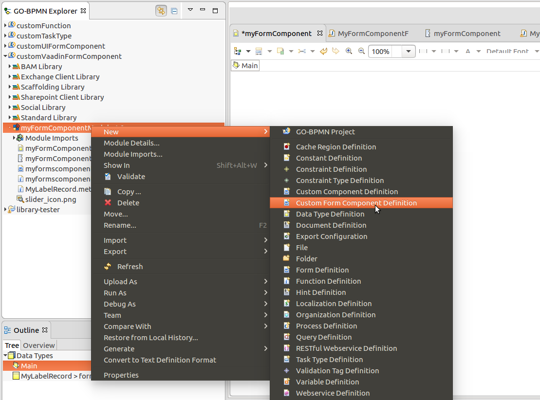
To create a custom component implemented in the Expression Language, do the following:
forms::FormComponent record as its parent: Pick a component that is the closest to what you require, and add the additional fields for new properties of the components. 
{ -> <parameter_value> }).
If an existing form component does not cut it, you can either import an existing Vaadin component or implement your custom Vaadin component from scratch and import your implementation:
W: For the forms::TextArea record, the implementation is com.whitestein.lsps.vaadin.forms.WTextArea class. This makes sure your connector class implements all the inherited methods of your component.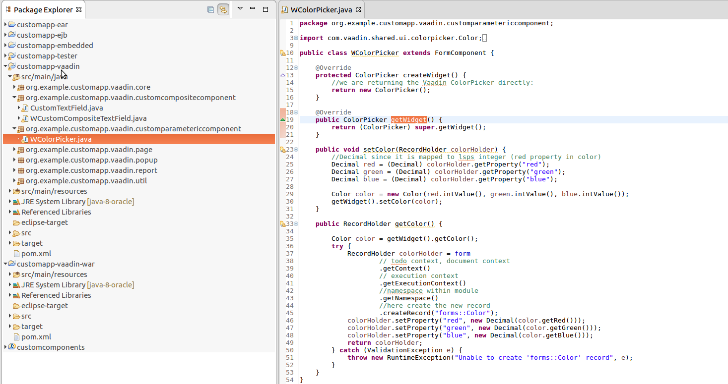
import com.vaadin.shared.ui.colorpicker.Color;
import com.vaadin.ui.ColorPicker;
import com.whitestein.lsps.lang.Decimal;
import com.whitestein.lsps.lang.exception.ValidationException;
import com.whitestein.lsps.lang.exec.RecordHolder;
import com.whitestein.lsps.vaadin.forms.FormComponent;

public class WColorPicker extends FormComponent {

  @Override
  protected ColorPicker createWidget() {

    return new ColorPicker();
  }

  @Override
  public ColorPicker getWidget() {
    return (ColorPicker) super.getWidget();
  }

  public void setColor(RecordHolder colorHolder) {
    //Decimal since it is mapped to lsps integer (red property in color)
    Decimal red = (Decimal) colorHolder.getProperty("red");
    Decimal green = (Decimal) colorHolder.getProperty("green");
    Decimal blue = (Decimal) colorHolder.getProperty("blue");

    Color color = new Color(red.intValue(), green.intValue(), blue.intValue());
    getWidget().setColor(color);
  }

  public RecordHolder getColor() {
    Color color = getWidget().getColor();
    RecordHolder colorHolder = getNamespace().createRecord("forms::Color");
    colorHolder.setProperty("red", new Decimal(color.getRed()));
    colorHolder.setProperty("green", new Decimal(color.getGreen()));
    colorHolder.setProperty("blue", new Decimal(color.getBlue()));
    return colorHolder;
  }
}
The supertype of the Record must be the forms::FormComponent record or its child Record: this will typically be the same component as your Vaadin implementation extends. If your Vaadin component extends the com.vaadin.ui.CustomComponent class as in the case of composite components, your record should have forms::FormComponent as its super type.
It is not recommended to add any additional record fields since the record serves to reflect a Vaadin component in LSPS; Vaadin components are intended for presentation, not for business logic.
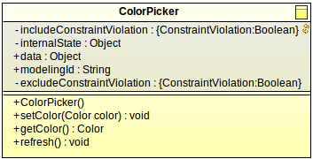
call() to call the method on its Vaadin implementation. When implementing a layout component, that is, components that can hold child components, your record should implement the HasChildren interface. ColorPicker {
public void setColor(Color color){
//calls the setColor(color) method on the Vaadin implementation:
call("setColor", [color]);
}
public Color getColor(){
//calls the getColor(color) method on the Vaadin implementation:
call("getColor",[]) as Color;
}
public void refresh() {
getColor(); // make sure that at least ObjectReference is set as a property
call(#"refresh", null)
}
}
new MyLabel(text). Implement handling of the properties in the Expression. 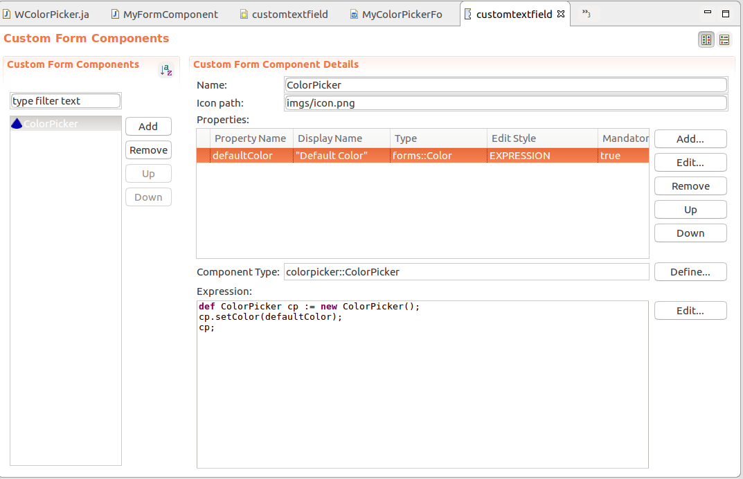
MyFormComponentFactory class to return the LSPS implementation when the Record of your component is requested. @Override
public FormComponent create(Variant.RecordVariant def) {
final String type = def.getTypeFullName();
//modified code (returns the WColorPicker for the record ColorPicker):
if (type.equals("colorpicker::ColorPicker")) {
return new WColorPicker();
}
return super.create(def);
}
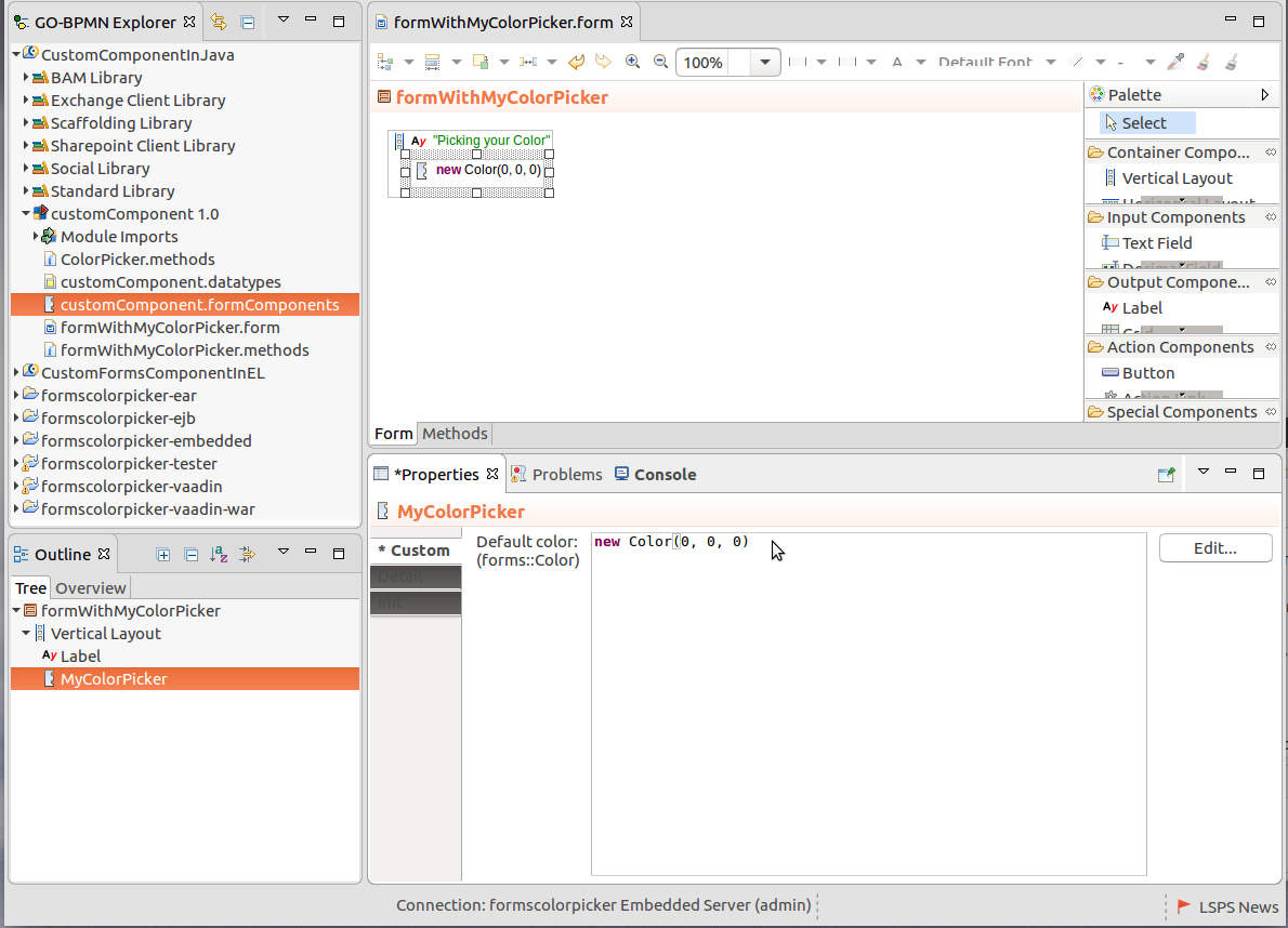
You can now use the custom components in your forms and distribute it to other users as part of a library.
In the LSPS Application, the user can save a to-do or document with a ui form for later editing. To include data of your custom component when a to-do or a document is saved, you need to include the data on save and recover it when required:
private static final String STATE_CURRENT_COLOR = "ColorPicker_currentColor";
writeInternalState() so it saves these properties in the internal state of the component record. @Override
protected void writeInternalState(Map<String, Object> state) {
super.writeInternalState(state);
state.put(STATE_CURRENT_COLOR, getWidget().getColor());
}
restoreInternalState() so it applies the properties on restore: @Override
protected void restoreInternalState(Map<String, Object> state) {
super.restoreInternalState(state);
Color color = (Color) state.get(STATE_CURRENT_COLOR);
if (color != null) {
getWidget().setColor(color);
}
}
writeInternalState(): @Override
protected void writeInternalState(Map<String, Object> state) {
super.writeInternalState(state);
writeChildComponents(state);
}
protected void writeChildComponents(Map<String, Object> state) {
state.put(STATE_COMPONENTS, getComponents());
}
public ListHolder getComponents() {
final List<Object> children = new ArrayList<>(getWidget().getComponentCount());
for (FormComponent child : getChildren()) {
children.add(form.getDef(child).get());
}
return form.getContext().getExecutionContext().getNamespace().createList(children);
}restoreInternalState() so the saved data has a component which it can populate. protected void restoreInternalState(Map<String, Object> state) {
super.restoreInternalState(state);
restoreChildComponents(state);
}
protected void restoreChildComponents(Map<String, Object> state) {
final LspsContextHolder context = form.getContext();
ListHolder children = (ListHolder) state.get(STATE_COMPONENTS);
for (Object child : children) {
RecordHolder recordHolder = (RecordHolder) child;
Variant.RecordVariant record = Variant.wrap(recordHolder, context).record();
form.createComponent(record);
addComponent(recordHolder);
}
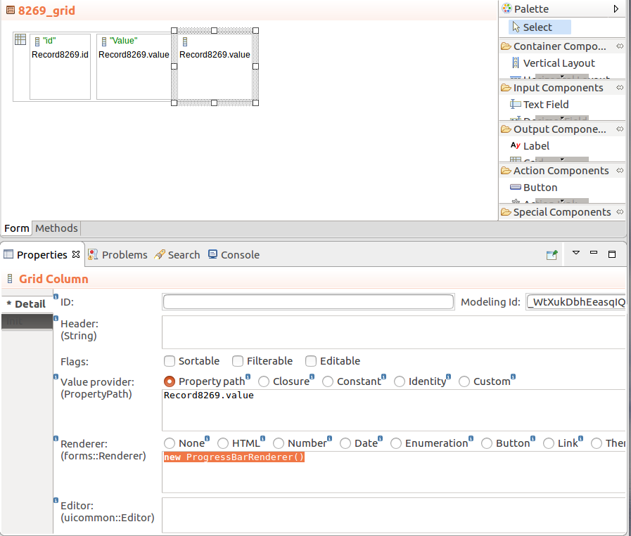
}Columns of the Grid component define a renderer which is used to render the data in each row of the Column. While a variety of renderers are available by default, you can define your own renderer if necessary.
To implement your custom Grid renderer, do the following:
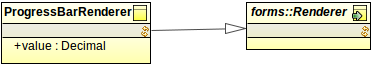
In a GO-BPMN module, create a record that will represent your renderer: The supertype of the record must be the forms::Renderer record or its child record.
Switch to Java perspective to work with the Java part of the implementation:
Example renderer class:
public class WProgressBarRenderer extends ProgressBarRenderer {

  private final WGrid grid;

  public WProgressBarRenderer(WGrid owner, RecordVariant rendererDef) {
    grid = owner;
    rendererDef.checkSubtypeOf("gridModule::ProgressBarRenderer");
  }
}createRenderer() method of MyFormComponentFactory class to return the LSPS implementation when the renderer record is requested: public Renderer<?> createRenderer(WGrid owner, Variant.RecordVariant rendererDef) {
//add the if with the renderer record and the call to return the progress bar via the connecting renderer class:
if (rendererDef.getTypeFullName().equals("gridModule::ProgressBarRenderer")) {
return createProgressBarRenderer(owner, rendererDef);
} else {
return super.createRenderer(owner, rendererDef);
}
}
protected Renderer<?> createProgressBarRenderer(WGrid owner, Variant.RecordVariant rendererDef) {
return new WProgressBarRenderer(owner, rendererDef);
}
//This is example implementation of a converter of
public class DoubleToDecimalConverter implements Converter<Double, Decimal> {

  /**
   * serialVersionUID
   */
  private static final long serialVersionUID = 1L;

  @Override
  public Decimal convertToModel(Double value, Class<? extends Decimal> targetType, Locale locale) throws com.vaadin.data.util.converter.Converter.ConversionException {
    return value == null ? null : new Decimal(value);
  }

  @Override
  public Double convertToPresentation(Decimal value, Class<? extends Double> targetType, Locale locale) throws com.vaadin.data.util.converter.Converter.ConversionException {
    return value == null ? null : new Double(value.toString());
  }

  @Override
  public Class<Decimal> getModelType() {
    return Decimal.class;
  }

  @Override
  public Class<Double> getPresentationType() {
    return Double.class;
  }
}
createConverterForRenderer() method in the MyFormComponentFactory() class. @Override
public Converter<?, ?> createConverterForRenderer(WGrid owner, Variant.RecordVariant rendererDef) {
if (rendererDef.getTypeFullName().equals("gridModule::ProgressBarRenderer")) {
//return new StringToDecimalConverter();
return new DoubleToDecimalConverter();
} else {
return super.createConverterForRenderer(owner, rendererDef);
}
}
You can now use the custom renderer in your grid columns. Consider distributing the renderer as part of a Library.