LSPS Documentation
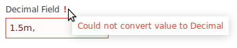
Input components serve to acquire input from the user. When the user enters an input, the component automatically validates the value: if it is not valid, for example, a Decimal Field does not contain a valid number, the field is marked as invalid and no further processing takes place. If the value is valid, the system updates the binding value.
addValidator() callInput components hold a value and allow the user to enter a value: when this happens, the components executes the action defined by its value change listener. The input values are stored in the target object defined by their binding.
Text components, that is, Text Field, Text Area and Password Field, allow the user to enter free-text input with the following additional options:
c.setMaxLength(20)
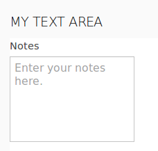
c.setHint("Enter your notes here.");
setExpandable(true) method callThe Text Field component (  ) is rendered as a single-line text field that allows entering text input.
Important: The caption of the Text Field is rendered by the parent layout component. Hence if you create a form with a sole Text Field component, the form will be rendered without its caption text. This is due to limits of the Vaadin framework.
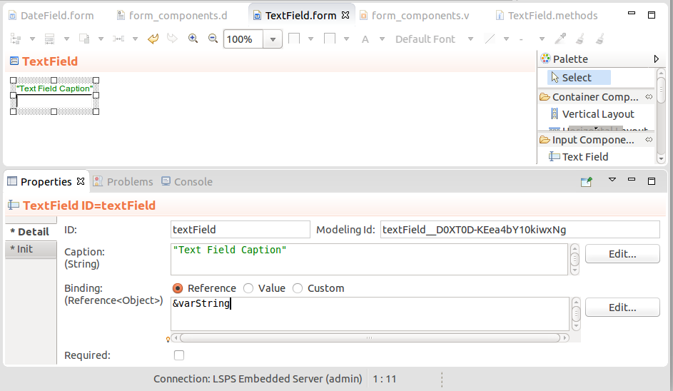
textField := new forms::TextField("Text Field Caption", new forms::ReferenceBinding(&varString));
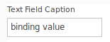
textField.setValue("Binding value in the reference string object");
textField.setMaxLength(10);
textField
The Text Area component (  ) is rendered as a multi-line free-text field.
If you want to set the height, that is, the number of lines in the text area:
setMaxRows() and setMinRows().setRows(Integer rows) method.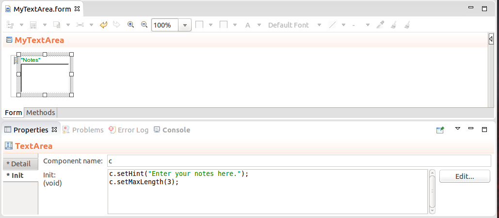
Important: The caption of the Text Field is rendered by the parent layout component. Hence if you create a form with a sole Text Area component, the form will be rendered without its caption text. This is due to limits of the Vaadin framework.
Expression that returns a Text Area
myTextArea.setHeight("4")
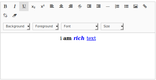
The Rich Text Area component (  ) enables the user to enter formatted text. You can also set the area to hold a formatted text from your form: use HTML formatting:
MyRichText.setValue("i <b> am <font color=""blue""> <i>rich </i> </font> </b> <font color=""blue""> <u>text</u> </font>")
The Password Field component (  ) is a single-line text field that hides the input.
When implementing password fields the component only prevents the displaying of the input. To secure the provided data, make sure the form uses the HTTPS protocol.
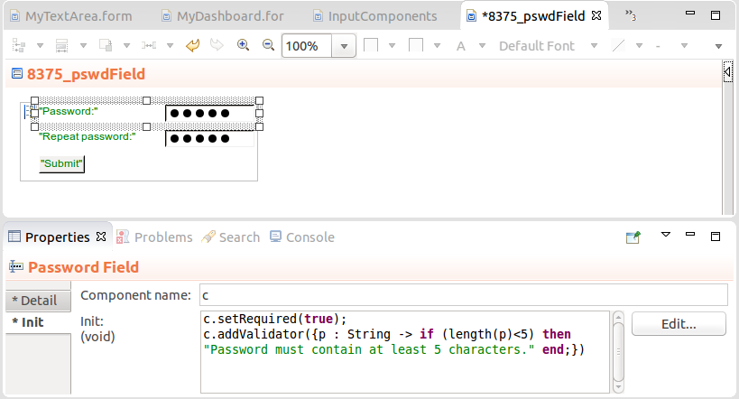
Important: The caption of the Password Field is rendered by the parent layout component. Hence if you create a form with a sole Password Field component, the form will be rendered without its caption text. This is due to limits of the Vaadin framework.
Expression that returns a Password Field
def PasswordField p := new PasswordField("Password:", &password);
p.focus();
p.isRequired();
p
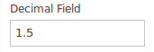
The Decimal Field component (  ) is rendered as a single-line field that allows the user to enter a decimal value. The format of the decimal value is by default set to user's locale: You can refine the allowed format with the setNumberFormat method.
Important: The caption of the field is rendered by the parent layout component. Hence if you create a form with a sole Text Field component, the form will be rendered without its caption text. This is due to limits of the Vaadin framework.
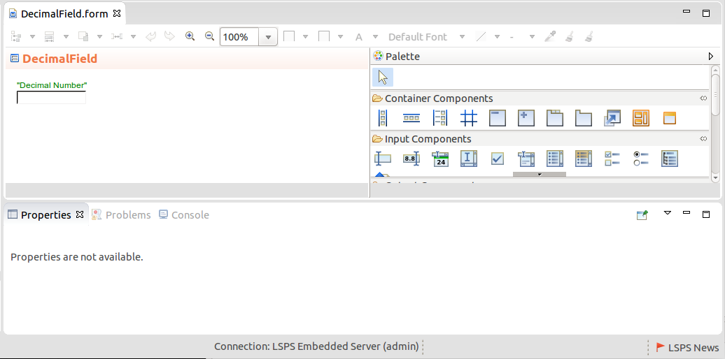
new forms::DecimalField("Value", &varValue);
To define the format of the decimal value in a Decimal Field, use setNumberFormat():
def forms::DecimalField df := new forms::DecimalField("Value", &value);
df.setNumberFormat("#,##0.00;(#,##0.00)");
df.setOnChangeListener({
   changeevent ->
      def Integer rounded := roundUp((df.getValue() as Decimal));
      value := rounded;
      df.setValue(rounded)
    }
);The Date Field component (  ) is rendered as a single-line text field that allows entering a Date input either using the calendar picker or entering a date in one of the allowed date formats.
def Date meetingTime :=  now();
def DateField myDateField := new DateField("Meeting", &meetingTime);
myDateField.setDateFormat("yyyy.MM.dd' at 'HH:mm:ss z");
myDateField.addValidator ({dateValue ->
                    if
                      (dateValue as Date) > date(2016, 3, 3)
                    then
                         null
                    else
                        "The meeting must occur later than March 3, 2016."
                    end
               });
myDateField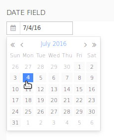
To define the format of the date in the Date Field, use the setDateFormat() to set a single supported date format or setDateFormats methods to support multiple date formats: the format parameter is defined as a String with the possible values of the java SimpleDateFormat (refer to http://docs.oracle.com/javase/6/docs/api/java/text/SimpleDateFormat.html).
To use the default application format for a date, set the format to date to use the application's dateFormat or to dateTimeFormat to use the default date-and-time format via the LspsAppConnector.getApplicationMessage().
The Check Box component (  ) is a simple check box with Boolean Binding: its caption renders next to the check box.
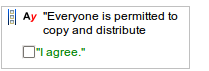
new forms::CheckBox("I agree", &varAgree)

Example Change Listener on a Check Box component
confirmationCheck.setOnChangeListener(
   { e ->
      if confirmationCheck.getValue() = true
        then c.setEnabled(true)
      end
    }
)The Select components provide the user options which they can select and include such component as combo box, radio button list, etc.
By default, the select components contain an option with no value the user can select: to disable this no-value option, call setNullSelectionAllowed(false) on the component.
You can define the options available in a select component either in the Properties view or with the component methods:
The options defined in the Options property of the component are loaded when the form is loaded.
map(findAll(Region), { region:Region -> region.name })The labels are calculated by calling the toString() function over the objects, for example,findAll(Region)`.
collect(findAll(Region),
{ r:Region -> new SelectItem(value -> r, label -> r.name)}
)
The options set with the setOptionsDataSouce() or setOptions() method load the options from anywhere in the form and you are hence not restricted to the moment when the component is created. The options are then lazy-loaded: they are being loaded as you display them.
Setting options on a Select component with method calls
  //various calls that set the options in a combo box:
  myCombo.setOptionsDataSource(new TypeDataSource(User), new PropertyPathValueProvider(User.name));
  myCombo.setOptions(allValues, new IdentityValueProvider(String));
  myCombo.setOptions({ 1, 2, 3 })
Important: If you set options of a component in both ways, that is, using the Options property and the setOptionsDataSouce() or
setOptions()call, the latter takes precedence: when troubleshooting an incorrect option set, right-click the form, select Display Widget Expression, and examine the code for loaded options.
The Combo Box component (  ) renders as a single-line text field with a drop-down list of options: The user can select one option in the drop-down menu.
Options can be defined as a Map or a Collection, or an OptionsDataSource. To define an action when the user selects or unselects an option, use the setOnChangeListener() method.
The Search Combo Box component (  ) renders as a single-line text field with a drop-down list of options: The user can select one option in the drop-down menu and the options are filtered out as the user enters a value.
The value of the filter is passed as a SubstringFilter to the data source: if you are using your custom data source, make sure that the data source processes the filter value correctly.
//Example getData() method of a custom data source (record implements forms::DataSource):
  public List<Object> getData(Integer startIndex*, Integer count*, Collection<forms::Filter> filters, Set<Sort> sortSpecs){
     if filters.isEmpty() then
        getAll(startIndex, count)
     else
        //value in the filter:
        def String currentFilter := cast(filters[0], SubstringFilter).value;
        getMyDataFromMyDS(currentFilter)
     end
  }
Options can be defined as a Map or a Collection, or an OptionsDataSource. To define an action when the user selects an option, use the setOnChangeListener() method.
In addition, you can set the following:
setMinimalFilterLength() methodsetPageLength() methodsetFilterTimeout() method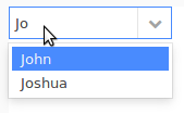
To allow the user to enter a value that is not available in the options in a combo box component, use the setNewItemHandler() method.
c.setNewItemHandler(
   {
     newValue:String ->
     newValue
   }
)
Note that the closure has void as return value, the user will not be able to enter a custom value:
c.setNewItemHandler(
   {
     newValue:String ->
     //The closure returns void so the user will be able to enter only one the option values:
     debugLog({ -> "User entered a new value: " + newValue}, INFO_LEVEL);
   }
)
If you enable this feature on a combo component, typically you will need to add the new option to the options of the combo component: use the setOptions() method to implement this behavior. Also, if you working with options that are persisted while new options are not persisted, consider defining the ValueProvider parameter: ValueProvider defines how to display the options and that possibly including your new option. For example, you could handle a new option as follows:
c.setNewItemHandler(
   {
     newValue:String ->
     options := add(options, new SelectItem(label -> newValue, value -> newValue));
     c.setOptions(options);
     //the value returned when you request value of the combo component:
     newValue
   }
);
To modify the added options, you can preprocess the options in the setOptions() method with a value provider:
c.setNewItemHandler(
   {
     newValue:String ->
     options := add(options, new SelectItem(label -> newValue, value -> newValue));
     c.setOptions(options, new ClosureValueProvider({ newOption:String -> newOption}));
     //the value returned when you request value of the combo component:
     newValue
   }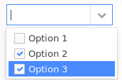
);The Multi-Select Combo Box component (  ) renders as a single-line text field with a drop-down list of options. The user can select multiple options in the drop-down menu.
Options can be defined as a Map or a Collection, or an OptionsDataSource. To define an action when the user selects or unselects a combo box option, use the setOnChangeListener() method.
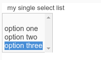
The Single-Select List component (  ) displays a list of options from which the user can select one option. You can set a limit to the number of displayed options using setRowCount(Integer): if more options are available that the set limit, the list of options becomes scrollable.
To define the action performed when select or unselect of an item, use the setOnChangeListener() method.
def String selectedValue;
def SingleSelectList singleSelect := new SingleSelectList("My Single Select", &selectedValue);
singleSelect.setOptions([ "value" -> "displayed key", "another value" -> "another displayed value" ]);
singleSelect.setOnChangeListener( {_ -> myText.setValue(singleSelect.getValue())});
singleSelect.setRowsCount(2);
singleSelect.setNullSelectionAllowed(false);
singleSelect;
The Multi-Select List component (  ) displays a list of options from which the user can select multiple options.
It can define the number of displayed Options using setRow(Integer): if more options are available that the set limit, the list of options becomes scrollable.
To define an action when the user selects or unselects an item, use the setOnChangeListener() method.
Example expression that returns a multi select list
def MultiSelectList msl:= new MultiSelectList("", &selectedItems);
msl.setOptions([ "value1" -> "displayed option 1", "value2" -> "displayed option 2"]);
msl.setOnChangeListener( { _-> selection.refresh() });
msl.setNullSelectionAllowed(false);
msl.setRows(2);
msl;
The Check Box List (  ) component is a form component that displays a list of options with check boxes and allows the user to select multiple options using the check boxes. To define an action when the user selects or unselects an option in the list, use the
 setOnChangeListener() method.
Example expression that returns a check box list
def CheckBoxList cbl:= new CheckBoxList("", &selectedItems);
cbl.setOptions([ "value1" -> "displayed option 1", "value2" -> "displayed option 2"]);
cbl.setOnChangeListener( { _-> selection.refresh() });
cbl.setNullSelectionAllowed(true);
cbl;
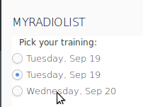
The Radio Button List component (  ) is a form component that displays a list of options and allows the user to select exactly one option by clicking a radio button. To define an action when the user selects or unselects an option in the list, use the
 setOnChangeListener() method.
Example expression that returns a radio button list
def RadioButtonList rbl:= new RadioButtonList("");
rbl.setOptions([ "value1" -> "displayed option 1", "value2" -> "displayed option 2"]);
rbl.setBinding(&selectedItem);
rbl.setOnChangeListener( { _-> select.refresh() });
rbl.setNullSelectionAllowed(true);
rbl;
The Token Field component (  ) serves for selection of multiple options. It is rendered as a combo box by default with the options displayed based on users input in its drop-down box: the component searches for the options with labels that contain the entered characters. The user then selects the option by clicking the proposed option or entering the entire values and hitting Enter. They can remove the selected option by clicking the X icon in the option. Whenever the user selects or removes an option, the component fires a ValueChangeEvent.
The component is rendered by default as a combo box, so the user can click the arrow on the combo box to display the options. However, you can render the Token Field as a Text Field by calling its addStyleName("tokentextfield") method.
By default, selected Tokens are no longer proposed in the drop-down menu. You can deactivate and activate this behavior with the setExcludeSelectedTokens(Boolean excludeSelectedTokens) method and check the current setting with the isExcludeSelectedTokens() method.
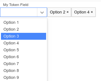
Example expression that returns a token field
def TokenField tf:= new TokenField("");
tf.setOptions([ "value1" -> "displayed option 1", "value2" -> "displayed option 2"]);
tf.setBinding(&selectedItems);
tf.setOnChangeListener( { _-> select.refresh() });
tf;
The Tree (  ) component serves as a picker of one item from an expandable tree hierarchy.
The tree hierarchy is defined by the data source and what is displayed as node labels for the tree objects is defined by the caption provider.
ClosureTreeDataSource: the input object of the closure is the clicked node and it returns a list of objects that represent the data source;
Example ClosureTreeDataSource:
new ClosureTreeDataSource(
  { node:Object ->
       def List<Object> result;
       if node == null then
         result := getAllApplicants();
       else
         if (node.getType() == Applicant and (node as Applicant).address != null) then
           result := [(node as Applicant).address];
         else
           result := [];
         end;
       end;
     result;
  }
)
SimpleTwoLevelTreeDS: two-level tree
Example SimpleTwoLevelTreeDS data source:
    def SimpleTwoLevelTreeDS tree := new SimpleTwoLevelTreeDS(
       [ "eva" -> ["climbing", "painting"], "juraj" -> ["reposing", "windsurfing"] ]
    )
The tree identifies the node based on designated IDs. Therefore an object can appear multiple times in a tree. The select(<VALUE>) call on the tree, selects the first occurrence of the object.
new ConstantValueProvider("Constant node label")
new ClosureValueProvider(
  { x:Object ->
    if typeOf(x) == type(Applicant) then
       (x as Applicant).name + (x as Applicant).surname;
    else
      if x != null then
       (x as Address).country;
      else
        null
      end
    end
  }
)
Where the selected value is stored is defined by the Binding property. To set and get the selected value programatically, use the setValue() and getValue() methods.
Setting a selected node in a Tree component
//Data source:
//def SimpleTwoLevelTreeDS tree := new SimpleTwoLevelTreeDS(
//      [ "eva" -> [climbVar, "painting"], "juraj" -> [ "windsurfing"] ]
//   )
//setting climbVar as the selected value in the tree:
c.setValue(climbVar);
The Upload component  allows the user to upload a file to the server. It renders as an input field for a file path and a Browse and upload button.
Since file upload is an asynchronous process, on runtime, the component produces an ActionEvent when the upload button is clicked and a FileUploadEvent when the uploading finishes.
Example expression that returns an Upload component
def Upload up := new Upload();
//only presets the file type in the Browse popup:
up.setAcceptedMimeTypes("text/plain");
up.setUploadResultListener(
   { f:File, m:String ->
      if f==null then
      uploadOutcomeMessage.setValue("upload failed")
      else
        uploadedFile := f;
        uploadOutcomeMessage.setValue("upload success");
      end
   }
);
up
The Slider component  serves to take a single input value of type Decimal from a value range. It is rendered as a bar with movable handle, with the bar representing the range and the handle the input value.
The bar range is set with the setMin() and setMax() methods. If unset, minimum is set to 0 and maximum to 100. Use getMin() and getMax() to get the set values.
The number of decimal places that the value is set to is set with the setDecimalPlaces() method.
The slider can be rendered horizontally or vertically: set the orientation with the setOrientation() method; for example, c.setOrientation(Orientation.Vertical)
Example expression that returns a Slider component
def Slider sl := new Slider("Value Select");
sl.setBinding(&decVar);
sl.setMin(0);
sl.setMax(10);
sl.setDecimalPlaces(2);
sl.setOrientation(Orientation.Vertical);
sl.setOnChangeListener( { _->select.refresh()});
sl