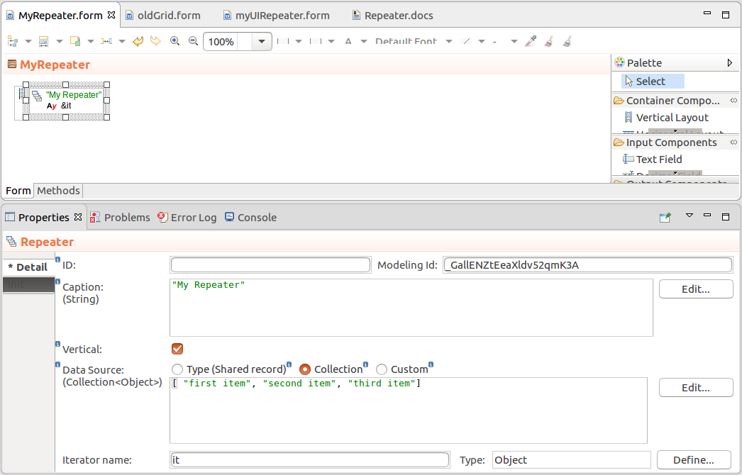
The Repeater component serves to display the same component repeatedly over a set of data defined by Repeater's data source. Note that unlike Tables, TreeTables, and Grids, Repeaters do not load their data source objects lazily.
To create a Repeater with your content, do the following:
Note: When applying filtering and sorting on large collections, sorting and filtering actions might cause performance issues: consider using other data sources such as shared Type data sources.
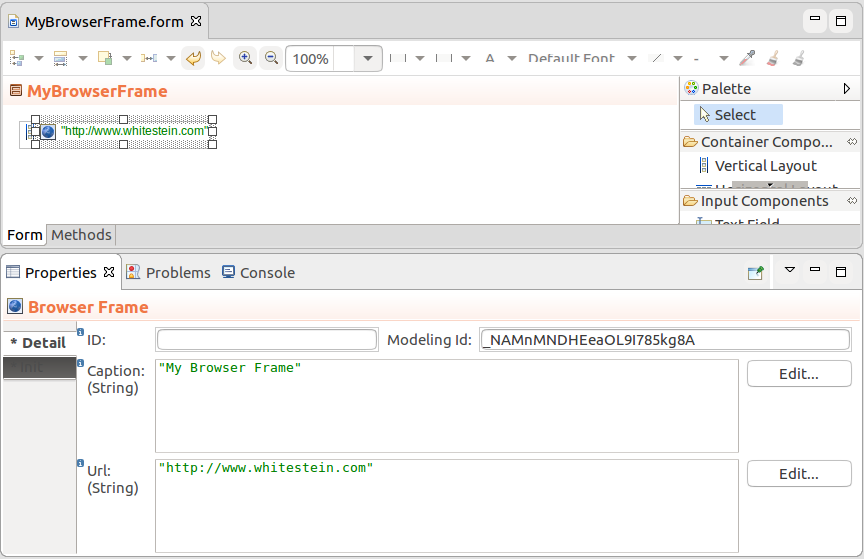
The Browser Frame renders as a view with the URL content. The target URL is defined in the URL property as a String, for example "http://www.whitestein.com".
To URL is loaded when the frame is initialized; to refresh the Browser Frame, call its setURL() method.
The Image (  ) component is renders an image, which is define as a
 DownloadableResource object, that is either ThemeResource which defines a file from the current CSS schema; FileResource with a file uploaded with your modules; or ExternalResource with an external URL.
Note that the component does not check the type of the resource.
To display an image in your form, do the following:
 ) component into your Form.
setSource() method.Note that the component does not check the type of the source. If you serve it a source of an incorrect type, it might result in a runtime exception or the content might not be displayed.
Expression that adds an Image component to a Vertical Layout
def Image image := new forms::Image();
image.setSource(new FileResource({ -> getResource("image", "resource/picture.jpg")}));

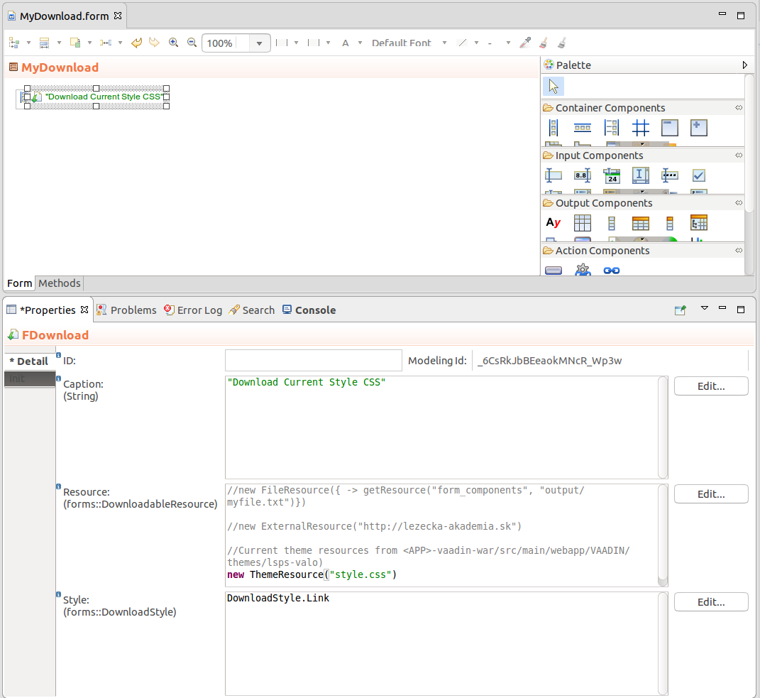
myVerticalLayout.addComponent(image);The Download (  ) component is rendered as a link or button, which downloads a resource when clicked. The resource can be a file uploaded with your modules, an external URL resource, or a file from the current application schema.
Downloads define the following type of data sources:
To create a Button or Link that starts a file download when clicked, do the following:
 ) component into your Form.
Expression that returns a Download component
new Download(
  "Download",
  new FileResource({ ->
    getResource("form_components", "output/myfile.txt")
  }),
  DownloadStyle.Link)
The Calendar  component serves to display and manage event data. The calendar API required that the event data be wrapped in CalendarItems.
Calendar can be rendered in the month, week, and day mode.
Calendar entries are defined as a list of CalendarItems returned by the calendar item provider, that can be either a ClosureCalendarItemProvider or a ListCalendarItemProvider.
new ClosureCalendarItemProvider(
  { from, to ->
    collect(
      //get data of event that occur within the displayed period:
      select(
        tripEvents,
        {e:TripEvent ->
            e.startDate <= to || e.endDate >= from
        }
      ),
      //Create CalendarItems over the data:
      {e:TripEvent ->
        new forms::CalendarItem(
          allDay -> true,
          data -> e,
          endDate -> e.endDate,
          caption -> e.description,
          startDate -> e.startDate)
      }
    )
  }
)
In the component, you can handle the following events:
TripCalendar.setCreateListener (
  { x:forms::CalendarCreateEvent ->
     //display popup for event creating (event is created on button click
     //in the popup and added to the business data):
     createPopup(x.from, x.to).show();
     TripCalendar.refresh()
  }
);
  TripCalendar.setEditListener({
  x:forms::CalendarEditEvent -> createPopup().show();
  TripCalendar.refresh()
});
TripCalendar.setRescheduleListener({
  x:forms::CalendarRescheduleEvent ->
  def TripEvent te := x.data as TripEvent;
  te.startDate := x.from;
  te.endDate := x.to;
  TripCalendar.refresh();
});
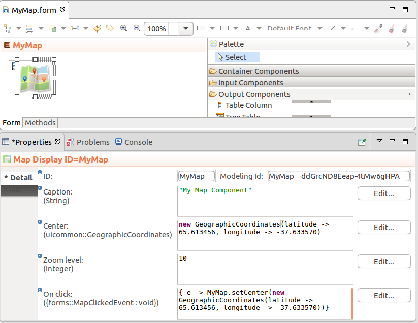
The Map Display  component renders as an OpenStreetMap with the defined center location, zoom, and one or multiple markers. You can work with map markers with the maps methods addMarker(), removeMarker(), onMarkerClick(), and onMarkerDrag().
Note: To work with the client GPS coordinates, use the Forms.detectLocation() method.
Map Properties
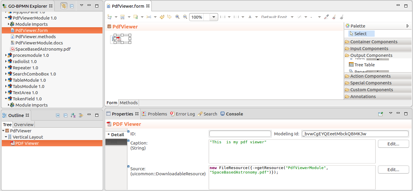
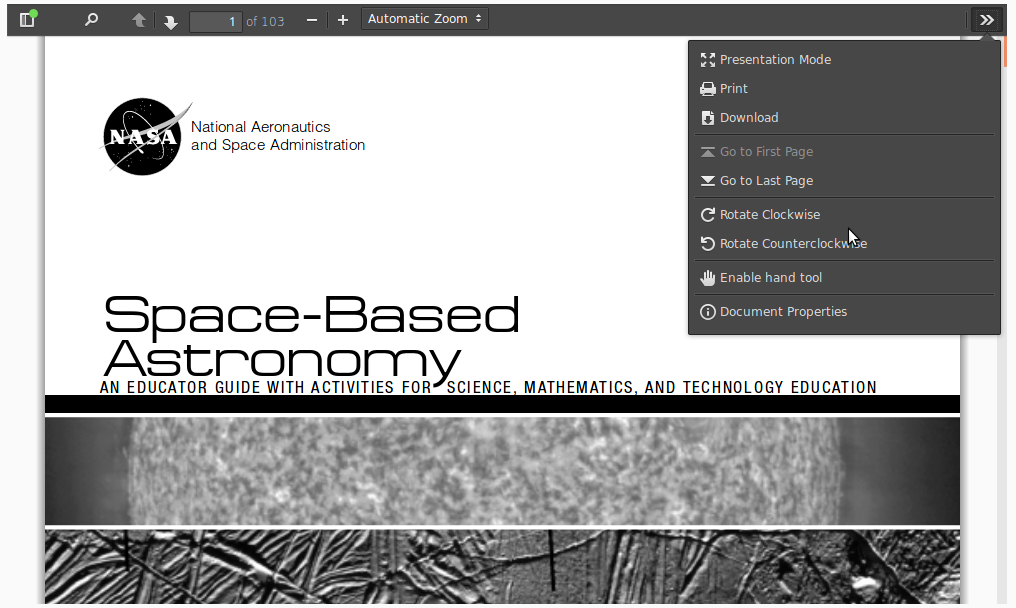
The PDF Viewer component, PDFViewer,  displays a PDF defined as a FileResource.
Note: Make sure to set the width and height of the PDF Viewer component: The default width and height are 0.
