LSPS Documentation
The Table (  ) component displays the data of the data source in a Table with every data item in a single row.
Note that Table columns can contain other components: while this option provides a high level of flexibility, Tables with many components in their columns might perform poorly. If you are displaying a lot of data in a Table, consider using Grid.
Tables support sorting and filtering out-of-the-box.
To design a Table, do the following:
Collection: items of the Collection
The Collection is calculated only when the form is initialized: the data source remains unchanged on refresh: To reload the data, use the setDataSource() method on the component.
Note: When applying filtering and sorting on large collections, sorting and filtering actions might cause performance issues: consider using other data sources such as shared Type data sources or queries.
Custom: custom data source which realizes the forms::DataSource interface.
When creating a custom data source that realizes the DataSource interface, you will need to implement the following methods:
getCount returns the number of displayed entries; note that you need to take the filters applied on the data into account. The filters are passed as input arguments.getData returns the data for the table; note that you will need to filter, sort, and page data;The ID of the filters in individual columns is set in the FilterConfig: new FilterConfig(filterId -> "nameColumnFilter")
supportFilter called when the user enter the filter value;supportsSort called when the user sorts the sort value; ) into Table and define its properties:
Set the iterator type to the type of the value provider:
The iterator type must be always identical with the type of the Value Provider object: the user needs to set the iterator type explicitly since it is not always possible to infer the type of Value Provider object (for example, if the Value Provider is defined by a closure).
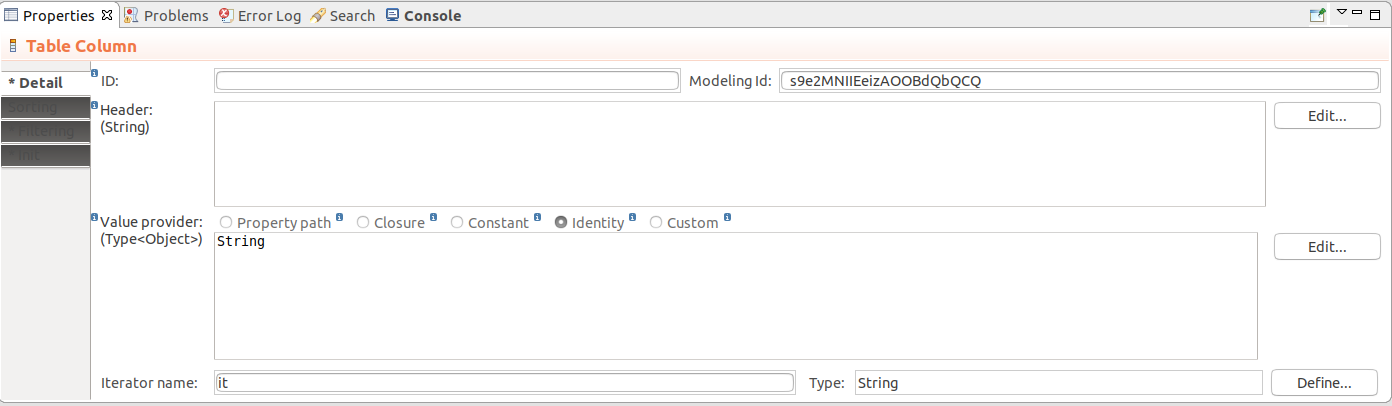
To create a column in your Table, do the following:
) into Table.Set the iterator type to the type of the value provider:
The iterator type must be always identical with the type of the Value Provider object: the user needs to set the iterator type explicitly since it is not always possible to infer the type of Value Provider object (for example, if the Value Provider is defined by a closure).
Alternatively, you can add a column programatically with the addColumn() method of Table. This allows you to add columns dynamically on runtime, for example, on button click.
{e -> Vocab.addColumn(
   new forms::TableColumn(
       data -> null,
       modelingId -> null,
       filtrable -> false,
       generator -> null,
       sortable -> false,
       valueProvider -> new PropertyPathValueProvider(Unit.svk))
   )
}Columns of tabular components can be collapsed from the front-end by the user as well as programatically. You can also enable or disable the feature.
By default, Columns can be collapsed:
setCollapsible(false) method on the Column.setCollapsed(Boolean) method on the Column.To allow drag-and-drop of table columns, use the setColumnReorderingAllowed(true) table call.
Sorting is defined per Table Column: the data is sorted depending on which column the user calls the sorting. To enable it, do the following:
Important: When applying sorting on large collections (the Data Source is set to Collection), sorting actions might cause performance issues: consider using other data sources such as shared Type data sources.
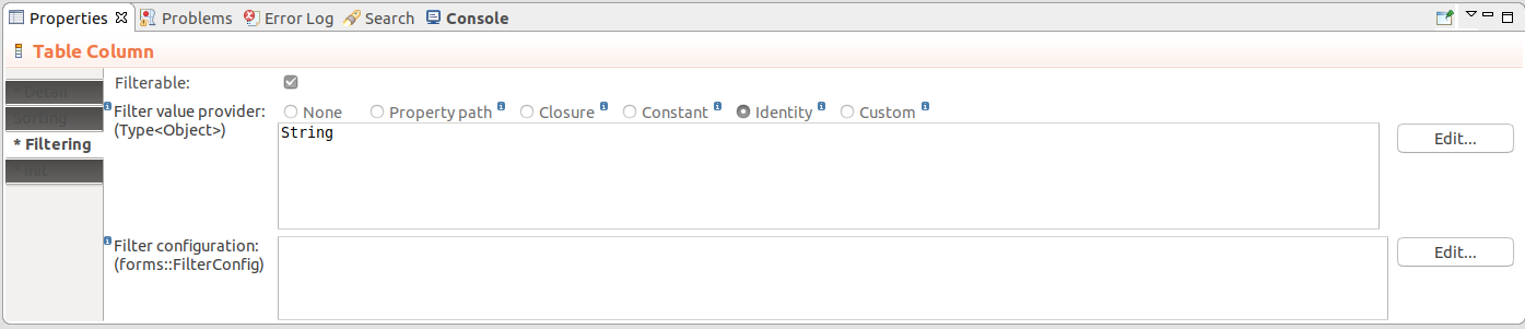
Table filtering is defined per Table Column: the data is filtered depending on which column the user enters the filter. Note that only filtering of Boolean, String, Integer, Decimal, Date, or Enumeration values is supported by the table filter.
Important: Filters on Columns of Tables support only the Boolean, String, Integer, Decimal, Date, and Enumeration data types.
To enable filtering on a Table Column, do the following in the Properties view of Table Column:
None: the column value provider is used
Make sure that the provider expression on the Detail tab is set to return the same data type as the iterator data type.
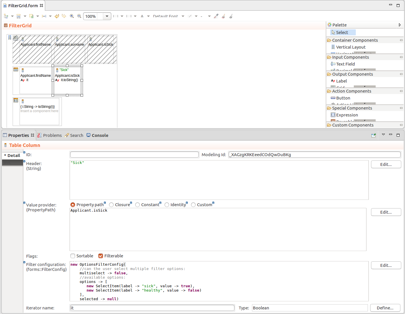
Patient.diagnosis.code.{ p:Patient -> p.reports.size()} will add an integer filter for the number of reports of the Patients in the table.Identity: the identity passed from the row
Make sure to enter the type of the identity below, such as, String, Integer, Decimal, Date, etc.
setFilterConfig() method. Also if you are designing a table with a custom Data Source, it will allow you to identify the filters with set values using the filter id.new OptionsFilterConfig(multiselect -> true, options -> [
new SelectItem(label -> "label of 1", value -> 1),
new SelectItem(label -> "label of 2", value -> 2)
])
// numeric filter with default values:
new NumericFilterConfig(equal ->50, moreThan -> 10, lessThan -> 90)
new DateFilterConfig(
  resolution -> uicommon::DateTimeResolution.Month, formatPattern -> "YYYY MMMM"
)
setFilteringEnabled(true) method and is enabled by default.Important: When applying filtering on large Collections (the Data Source is set to Collection), sorting and filtering actions might cause performance issues: consider using other data sources such as shared Type data sources.
To enable or disable filtering on Tables dynamically, use the setFilteringEnabled(Boolean) call on the component: The method hides or displays the filtering row.
To enable row selection on a Table, Grid, or Tree Table, set the table as selectable: MyTable.isSelectable() or MyTable.setSelectable(true). You can then use the setSelectionChangeListener() to listen for user Selection and acquire the selected row with use the getSelection() method.
c.setSelectable(true);
c.setSelectionChangeListener({ e -> selected := c.getSelection().toString(); SelectedLabel.refresh()})
You can use the select() method to select a row programatically.
Example table-row select that selects the user who was created first in the table
myUserTable.select(
    myUserTable.getDataSource().getData(
       startIndex -> 0,
       count -> 0,
       filters -> null,
       sortSpecs -> {new Sort(User.created, false)}).getFirst()
);
To define the size of the data batch of a table, use the setPageLength() method: the data is loaded in these batches as you scroll down the table.
c.setPageLength(3)
If Table height is not set or is set to wrap, it adopt the page length height.
If you want to always adapt the height of Table to its content, you can query the data source of Table for its size, for example:
c.setPageLength(c.getDataSource().getCount([]))
To set the message that is displayed in Table when it is empty, call the setNoDataMessage(<String>) method.
To add a style to table rows, call the setRowStyleGenerator() method on your table: the method had a closure input parameter with the row object as its input and the CSS class that is added to the row /
element as its return value.
Note that the css class is automatically prefixed with v-table-row- unlike in grid where the class name is passed as is.
//"label" will become "v-table-row-":
c.setRowStyleGenerator({a:Applicant -> "label"});
To remove the previously added styles, set the closure to return null, for example, table.setRowStyleGenerator({a:Applicant -> null});.
To define horizontal alignment in Table Columns, call the setAlignment() method on the column.