LSPS Documentation
Important: Before you design charts, make sure to purchase the Vaadin Charts license. Use of forms with charts in your Application User Interface does not require additional licenses.
The Pie Chart  component renders as a circular chart that depicts data values as sections. When clicked, it produces a ChartClickEvent with data about what was clicked so the system can process the click as required.
It produces events of the following types:
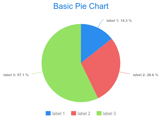
Slices: pie chart sections (a list of slices displayed in the pie chart)
The slices define their label and value: the Slice value is defined as a decimal value and represents the mutual ratio of individual slices.
collect(
  getCurrentAssets(),
  {asset ->
    new ui::PieSlice(
      label -> asset.ISIN,
      value -> asset.currentAmount)
  }
)The Gauge Chart component renders as a chart with a circular Y-axis and a rotating pointer.
It produces events of the following types:
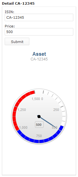
Example Axis definition
new ui::GaugeAxis(
  min -> 0,
  max -> 80,
  label -> "axis label",
  opposite -> null,
  bands -> [
    new PlotBand(from -> 0, to -> 20, color -> "#FFFFFF"),
    new PlotBand(from -> 20, to -> 40, color -> "blue"),
    new PlotBand(from -> 40, to -> 50,  color -> "red")],
    startAngle -> 300,
    endAngle -> 420,
    centerY -> 120)
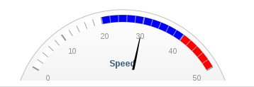
This property is not applicable for the gauge chart component.
The Cartesian Chart renders as a multi-dimensional chart with an arbitrary number of x and y axes. The rendering of the x axis depends on the given data series, while the y axis displays the value connected to the x value defined as a data point.
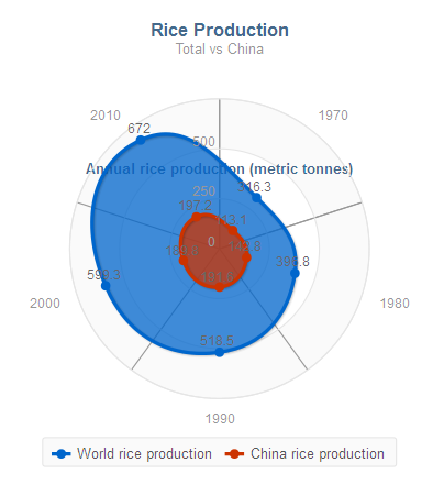
The Polar Chart is a variation of the Cartesian chart. It is rendered as a circle with the x axis on its circumference and its radius is the y axis. Just like the Cartesian chart, it is multi-dimensional chart, that is, it can have n arbitrary number of x and y axes. However, though this option is functional, the y axes are overlaid over each other in a single radius.
The charts produce events of the following types:
ChartClickEvent when the user clicks into the chart
The event holds data about the clicked data point: a listener can use this data, for example, to drill down into the chart or visualize details related to the clicked data point.
Cartesian and Polar Chart Properties
X axes: list of x chart axes
You can define multiple x axes. The axes are arranged underneath or next to each other depending on their orientation.
Y axes: list of y chart axes
You can define multiple y axes. The axes are arranged underneath or next to each other depending on their orientation.
Axes for Cartesian and Polar chart define the following properties:
Rotate axes: Boolean value that defines whether the x and y axes are rotated (for example, if true, chart bars can be displayed horizontally)
This option is not available for the Polar Chart component.
Data series defines a set of data points that are displayed as values in the chart. It also defines general properties of the data series:
label: the data series label in the legend and tooltip of the plotted data seriesoptions: plotting optionsxAxisIndex: index of the x axis the data series usesyAxisIndex: index of the y axis the data series uses
Since chart axes are defined as lists, the xAxisIndex and yAxisIndex are defined as integers with the first defined axis being indexed 0.
Important: The ui::DataSeries record is abstract: Define the Data Series as one of its sub-types.
One chart can display multiple data series of different types. The type of a data series defines the way its x axis renders (note that a chart may contain multiple x or y axes):
ListDataSeries: the x axis values are integers.
Values are defined as a list of data points (List<DataPoint>) and are distributed evenly as depicted below.
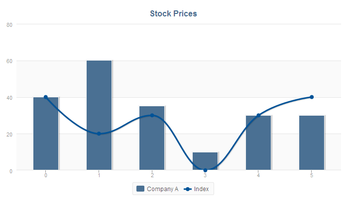
def List<DataPoint> companyAPriceList:=
[
   new DataPoint(value -> 40, value2 -> null, payload -> null),
   new DataPoint(value -> 60, value2 -> null, payload -> null),
   new DataPoint(value -> 35, value2 -> null, payload -> null),
   new DataPoint(value -> 10, value2 -> null, payload -> null),
   new DataPoint(value -> 30, value2 -> null, payload -> null),
   new DataPoint(value -> 30, value2 -> null, payload -> null)
];
def List<DataPoint> indexPriceList:=
[
   new DataPoint(value -> 30, value2 -> null, payload -> null),
   new DataPoint(value -> 90, value2 -> null, payload -> null),
   new DataPoint(value -> 45, value2 -> null, payload -> null),
   new DataPoint(value -> 15, value2 -> null, payload -> null),
   new DataPoint(value -> 34, value2 -> null, payload -> null),
   new DataPoint(value -> 10, value2 -> null, payload -> null)
];
[
   new ListDataSeries(
      label -> "Company A",
      options -> null,
      xAxisIndex -> null,
      yAxisIndex -> null,
      values -> companyAPriceList
      ),
   new ListDataSeries(
      label -> "Index",
      options -> null,
      xAxisIndex -> null,
      yAxisIndex -> null,
      values -> indexPriceList
      )
]CategoryDataSeries: the x axis values are arbitrary string values.
Values are defined as a map of Strings and DataPoints (Map<String, DataPoint>): the String is used as the value on the x axis and the data point defines the values on the y axis.
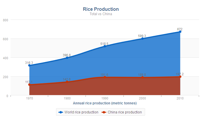
def Map<String, DataPoint> worldData :=
[
"1970"-> new DataPoint(value -> 316.3),
"1980"-> new DataPoint(value -> 396.8),
"1990"-> new DataPoint(value -> 518.5),
"2000"-> new DataPoint(value -> 599.3),
"2010"-> new DataPoint(value -> 672)
];
def Map<String, DataPoint> chinaData :=
[
"1970"-> new DataPoint(value -> 113),
"1980"-> new DataPoint(value -> 142),
"1990"-> new DataPoint(value -> 191),
"2000"-> new DataPoint(value -> 189),
"2010"-> new DataPoint(value -> 197)
];
[
new CategoryDataSeries(
label -> "World rice production",
options -> new PlotOptionsArea(
color -> "#0066CC",
stacked -> false,
marker -> Marker.circle,
lineStyle -> LineStyle.solid,
lineWidth -> 3,
spline -> true,
range -> null,
opacity -> null),
xAxisIndex -> null,
yAxisIndex -> null,
values -> worldData
),
new CategoryDataSeries(
label -> "China rice production",
options -> new PlotOptionsArea(
color -> "red",
stacked -> false,
marker -> Marker.circle,
lineStyle -> LineStyle.solid,
lineWidth -> 3,
spline -> true,
range -> null,
opacity -> null),
xAxisIndex -> null,
yAxisIndex -> null,
values -> chinaData
)
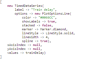
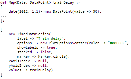
]TimedDataSeries: the x axis values are points in time.
Values are defined as a map of Dates and DataPoints(Map<Date, DataPoint>): the date is used as the value on the x axis and the data point defines the values on the y axis.
DecimalDataSeries: the x axis values are decimal numbers.
Values are defined as a map of Decimals and DataPoints (Map<Decimal, DataPoint>): the decimal is used as the value on the x axis and the data point defines the values on the y axis.
Plotting options define how a set of data renders. They are defined in the options property of every data series so that every data series in a chart can be plotted differently. If undefined, the default plotting properties for the given data series are applied.
The following plotting options are available:
PlotOptionsArea: the data series is rendered as an area.PlotOptionsBar: the data series is rendered as a set of bars.PlotOptionsBubble: the data series is rendered as a bubble. Note: This plotting option is currently not supported.
PlotOptionsScatter: the data series is rendered as a set of dots (scatter).PlotOptionsLine: the data series is rendered as a line.