LSPS Documentation
The Grid component displays single-line text data in a table layout and enables editing of the persistent data out-of-the-box.
The Grid data is lazy-loaded, which prevents potential performance issues. Unlike in Tables, no Vaadin components are created based on the content of cells: Grid columns do not contain components; they can define only how the data is presented in the Grid Column components.
If you plan on using complex content, such as images, charts, etc. consider using Table.
To create a Grid with your content, do the following:
 into your Form.
Type: shared record or a shared record field
The Grid iterates over all shared record instances.
Query: query that returns a collection of objects
The Grid iterates through the collection objects.
Collection: data set is defined as a collection
The Grid iterates through the collection objects.
Data: a collection of objects that are iterated through
When using queries to get the data, define the input parameters for index and entries count and use them as paging definition, for example, {currentIndex, count -> getEntryBatch(currentIndex, count)}
Generic: an Object that results in any of the above on runtime
Use this setting to fill one table with different data queried in different ways.
 ) into the Grid.
By default, the Grid defines a fixed minimum height. You can change the height using the height-by-rows presentation hint. If the grid displays more rows than the value set by the height-by-row hint, the grid becomes scrollable.
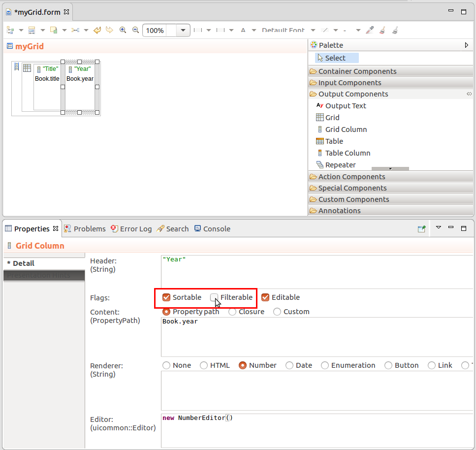
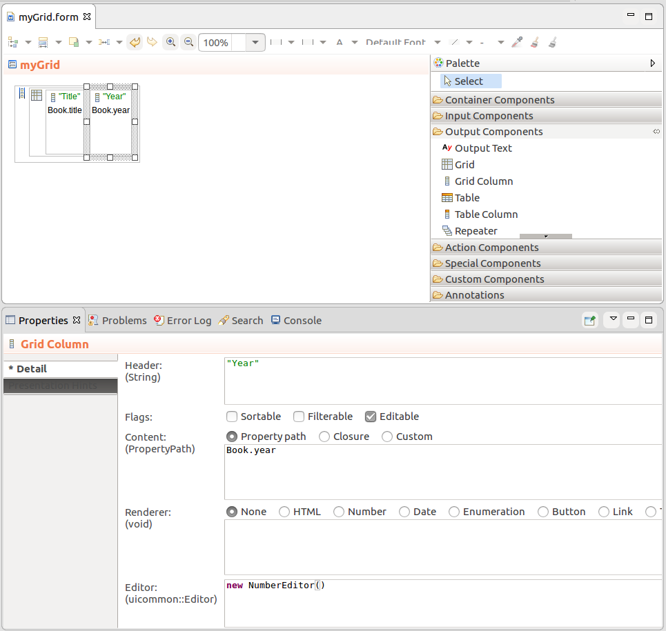
A Grid Column is the child component of the Grid which displays the data of the data set: The column defines the Value Provider property that returns the content of the cell based on the object of the row and the Renderer that defines how the Value Provider value is rendered.
For Grid Columns, do the following:
Content: content of the Column
It can be of the following types:
Number: renders the Value Provider value in the defined format
Define the format as a String following the DecimalFormat Java formatting rules, for example, "0000.00000"
Date: renders the Value Provider value in the defined format
Define the format as a String following the SimpleDateFormat Java formatting rules, for example, "EEE, d MMM yyyy HH:mm:ss" will result in formatting like Wed, 7 Sep 2016 14:33:00
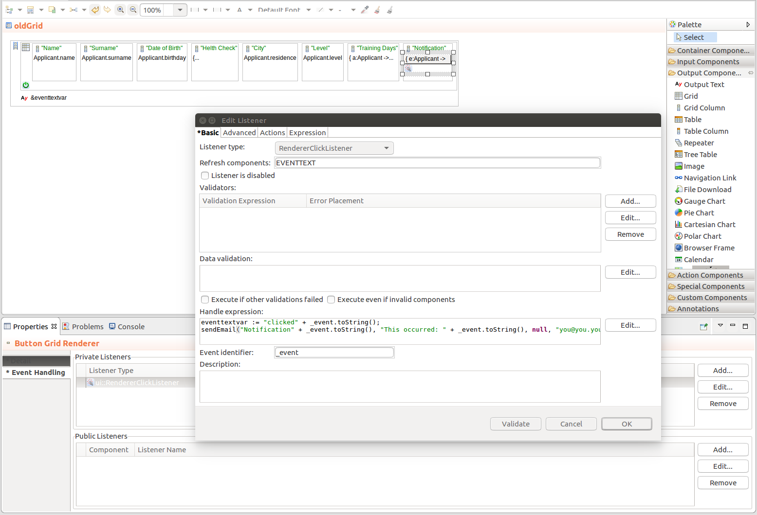
Button: renders the Value Provider value as a Button
The action that should be performed on click is defined as a closure with the Value Provider object as its input parameter.
{ clickRowObject:String -> varString := "The user clicked: " + clickRowObject.toString(); MyEditableGrid.refresh()}
Theme image: image from your Vaadin ThemeResource
To be able to use this option, the Value Provider must return a String with the path to the image. The path is relative to current Vaadin theme directory, for example, myapp-war/VAADIN/themes/lsps-blue so the String path could be "favicon.png".
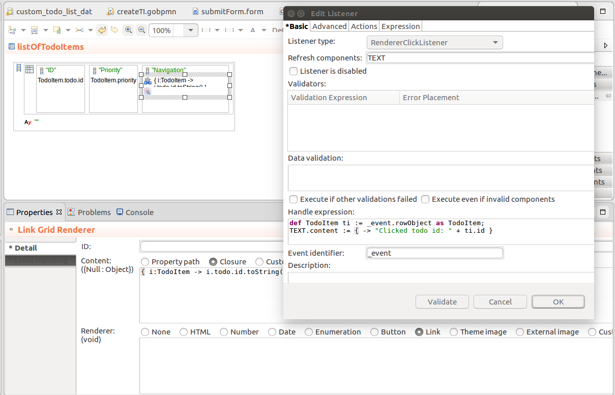
In a Grid, you can handle clicks on Grid Columns with Button, Link, Theme image, and External image renderers:
To hide a Grid Column, that is to display it collapsed, set the hidden presentation hint to true: this setting will be applied when the form is initialized.
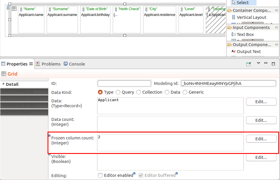
To freeze the first and any number subsequent columns of a Grid, set the Freeze column count property on the Grid to the number of columns to freeze. Frozen columns remain displayed when the user uses horizontal scroll,
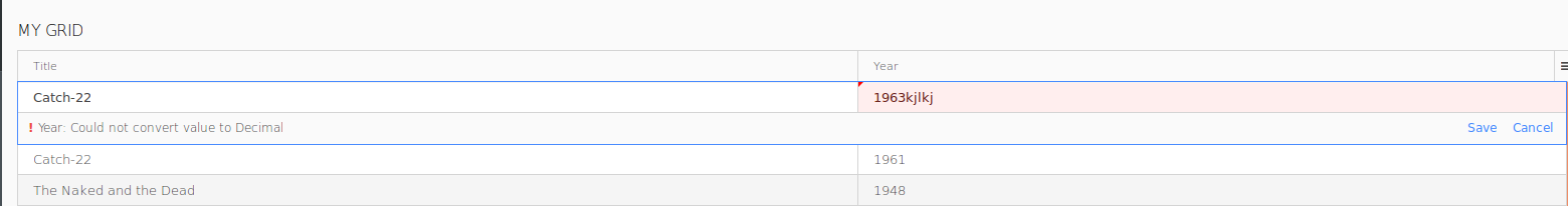
You can make cells of a Grid Column editable in the following case:
Important: If the underlying associated shared Record Property returns
null, the cell will remain empty and uneditable.
To enable editing of shared Record Properties in a Grid, do the following:
To save the changes when the user clicks the Save button in the edited row, select the Editor buffered flag.
If the Editor buffered is not selected, the changes are applied to the underlying Record instantly (on every change).
To enable filtering or sorting on a Column of your Grid, open the Properties view of the Column and check the Sorting or Filterable flag.