LSPS Documentation
The Grid component displays single-line text data in a tabular layout and enables editing of persistent data and row selection.
The data is lazy-loaded, which prevents potential performance issues when the grid is loaded.
Grid cells cannot hold further components. However, you can modify how the column content is rendered and render it, for example, as a button or a link, using renderers.
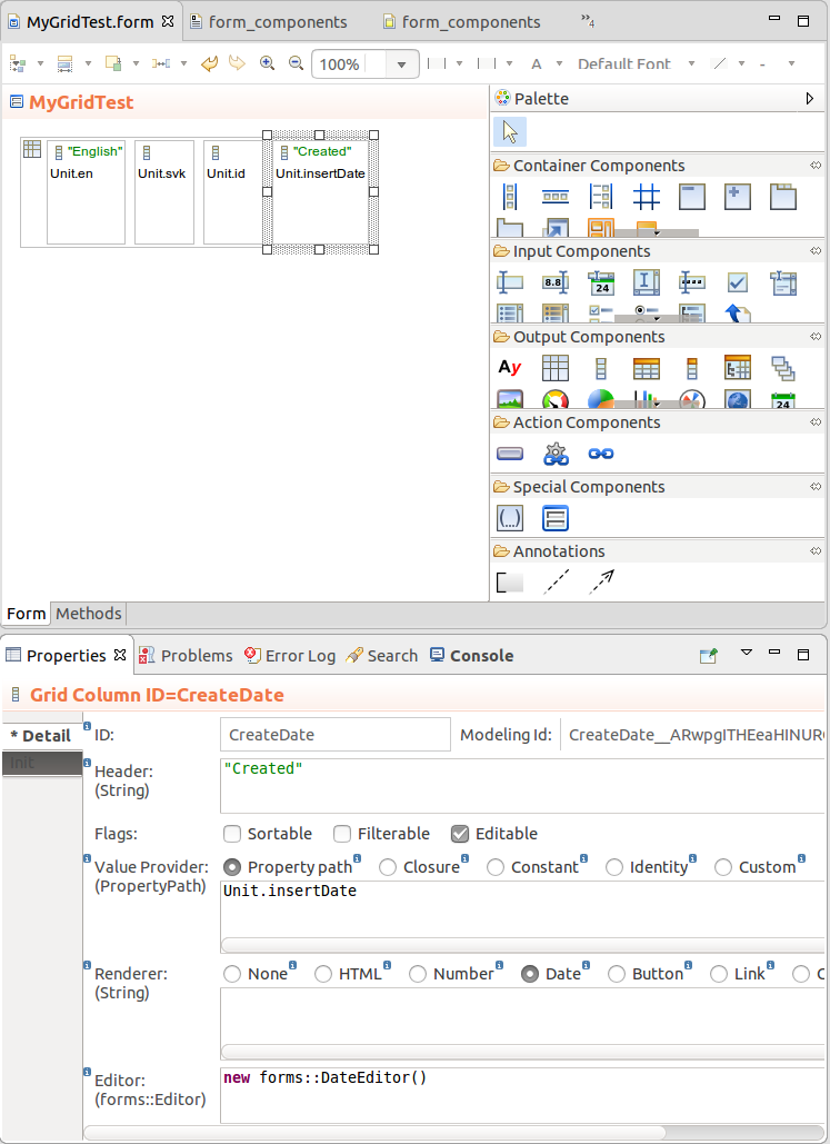
To create a Grid with your content, do the following:
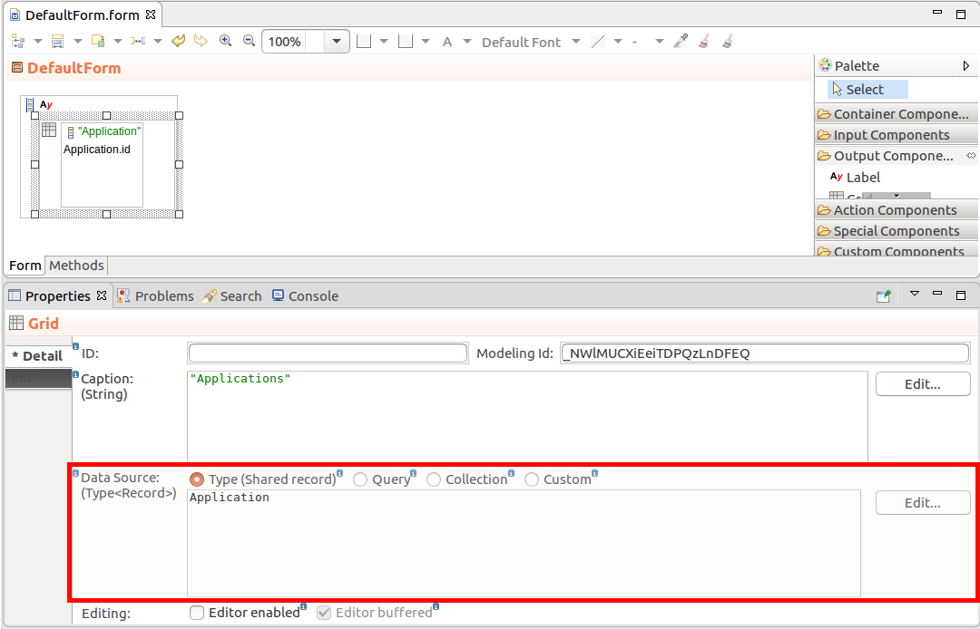
 ) into the Grid. You can insert grid columns dynamically with the
 addColumn() method.To create a column in your Grid, do the following:
) into the Grid.Property path: path to the property of the record used as the Grid's data source, for example, Person.idClosure: closure that returns the column item with the grid data object as its input argument, for example, { s:SavedDocument -> toString(s.id)}
Note that the renderer of the column (defined below) has the input argument of the closure as its input.
Identity: unchanged row objectCustom: custom implementation of forms::ValueProvidertoString() call.Number renders the value in the format defined below.
Define the format as a String following the DecimalFormat Java formatting rules, for example, "0000.00000"
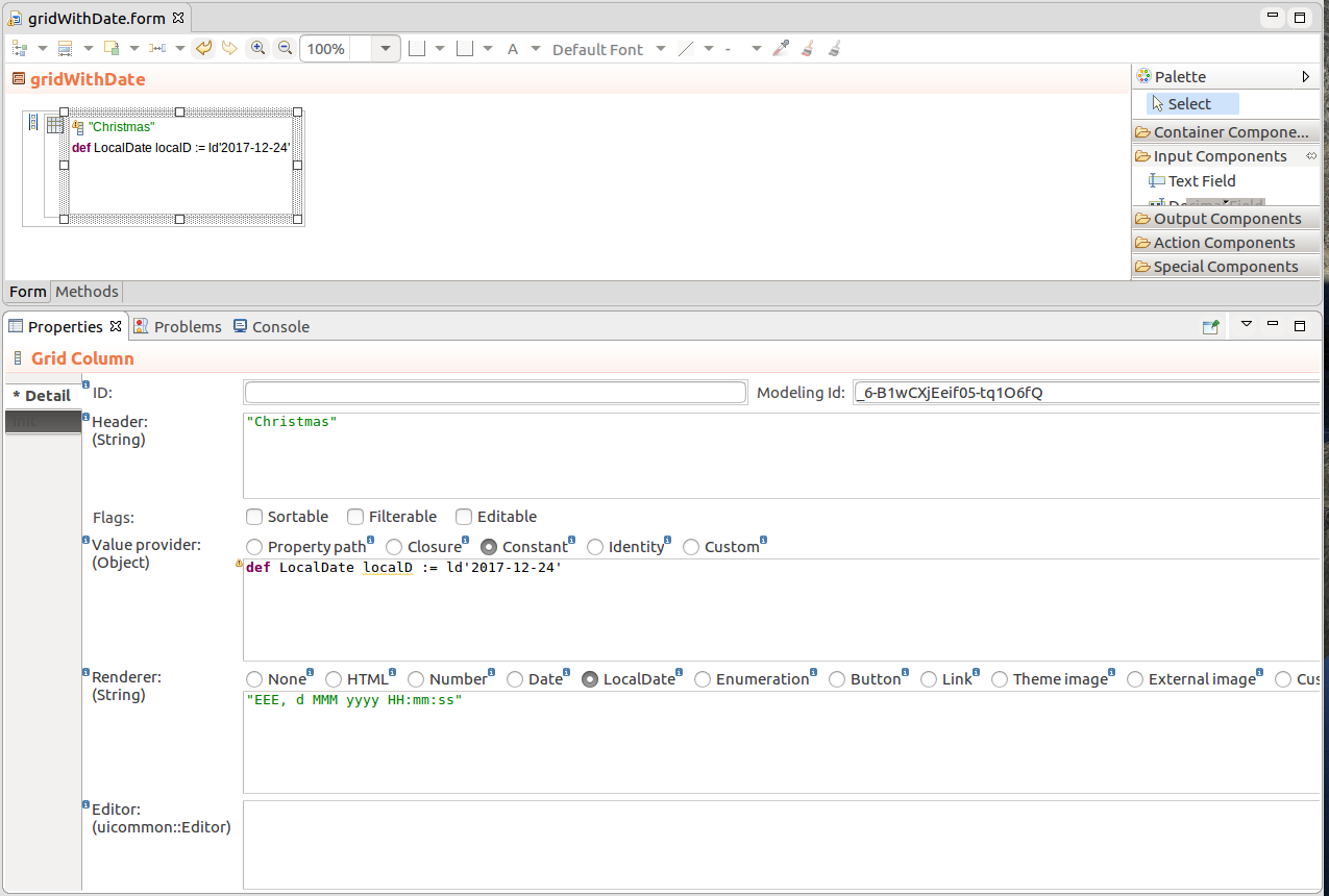
Date renders the value in the format defined below.
Define the format as a String following the SimpleDateFormat Java formatting rules in the text area below, for example, "EEE, d MMM yyyy HH:mm:ss" results in formatting Wed, 7 Sep 2016 14:33:00
LocalDate: renders the Value Provider value in the defined format
Define the format as a String following the SimpleDateFormat Java formatting rules in the text area below, for example, "EEE, d MMM yyyy" will result in formatting like Wed, 7 Sep 2016
Button renders the value as a Button.
The click action is defined as a closure with the value-provider object as its input parameter below.
{ clickRowObject:String ->
    varString := "The user clicked: " + clickRowObject.toString();
    MyEditableGrid.refresh()}
Link renders the value provided by the Value Provider as a Link
The click action of the link is defined as a closure in the field below. The input of the closure depends on the type of the value provider; for Property path, Constant, and Identity, the input is the return value of the closure; for Closure, the input is the row object:
{  clickRowObject:String ->
    varString := "The user clicked: " + clickRowObject.toString();
MyEditableGrid.refresh()}{a:Applicant -> "www.acme.com/images/" + a.pictureName}.Important: The component with its subtree components is generated for each column cell. In the case the component tree is complex, this can result in performance issues; Therefore, using the Component renderer is discouraged and other renderers should be used preferably whenever possible. It is provided primarily to allow full migration of Tables to Grids.
To add a column dynamically on runtime, for example, when the user clicks a button, call the addColumn() method on the parent component.
{e -> Vocab.addColumn(
    new forms::TableColumn(
        data -> null,
        modelingId -> null,
        filtrable -> false,
        generator -> null,
        sortable -> false,
        valueProvider -> new PropertyPathValueProvider(Unit.svk))
    )
}You can hide columns of tabular components can be collapsed from the front-end by the user as well as programatically. You can also enable or disable the feature.
By default, Columns can be displayed:
setHiddable(false) method on the Column.setHidden() method on the Column.To change the order of grid columns, call the setColumnOrder() method on the grid column ordered as required.
//restoring column order from an listener:
{ _ ->
  def List<GridColumn> allColumns := myGrid.getColumns();
  myGrid.setColumnOrder(
       allColumns.sort({
       a:GridColumn, b:GridColumn ->
         switch a.getHeader() > b.getHeader()
           case true -> 1
           case false -> -1
           default -> -1
         end
       })
  );
}
To allow drag-and-drop of grid columns, use the setColumnReorderingAllowed(true) call.
Sorting is defined per Grid Column. To enable it, do the following:
Alternatively, you can sort based on a grid column with the setSorted() method. The method ignores the setting of the Sortable option of grid columns.
You can check the status of the column sorting with the isSorted() and isSortAscending() call.
Important: When applying sorting on large collections (the Data Source is set to Collection), sorting actions might cause performance issues: consider using other data sources such as shared Type data sources.
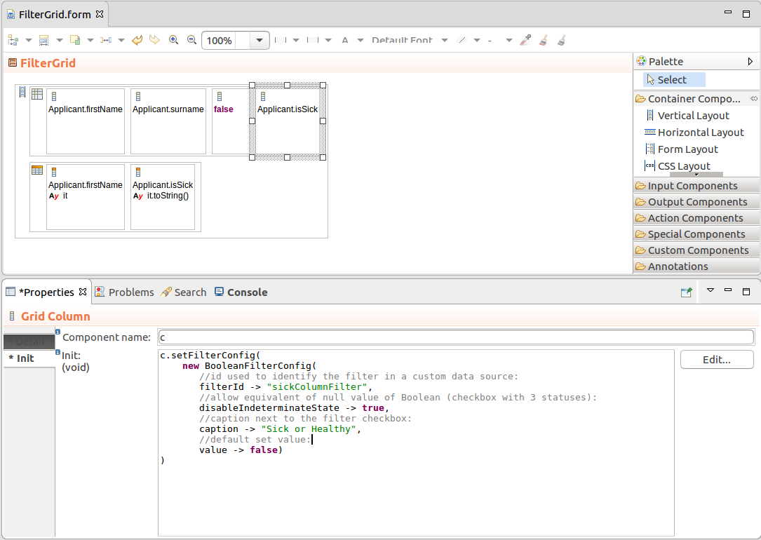
Important: Filters on Columns of Grids support only the Boolean, String, Integer, Decimal, Date, and Enumeration data types.
To enable filtering on a Grid column, do the following:
setFilterable(true) method and is enabled by default.setFilterConfig() method.def SelectItem adv := new SelectItem(label -> "Advanced", value -> Level.ADVANCED);
def SelectItem int := new SelectItem(label -> "Intermediate", value -> Level.INTERMEDIATE);
def SelectItem beg := new SelectItem(label -> "Beginner", value -> Level.BEGINNER);
c.setFilterConfig(
new OptionsFilterConfig(
multiselect -> true,
options -> [
adv, int, beg
],
selected -> [adv, int]
)
)new DateFilterConfig( resolution -> uicommon::DateTimeResolution.Month, formatPattern -> "YYYY MMMM" )
Also if you are designing a filterable grid with a custom data source, the filter properties (its id) will allow you to identify the filters with set values using the filter id.
Important: When applying filtering on large Collections (the Data Source is set to Collection), sorting and filtering actions might cause performance issues: consider using other data sources such as shared Type data sources.
If you need to perform an action on a cell with a component in a grid row, use the getComponentInRow() method: the method returns the component in the cell of the grid column.
//Closure value provider expression of a grid column
//which refreshes the value of the row object in another Columns
//whenever it is changed (renderer is set to Component):
{ mr:MyRecord ->
   def TextField tf := new TextField("caption", &mr.field);
   tf.setOnChangeListener({ e ->  myc.getComponentInRow(mr).refresh();myc3.getComponentInRow(mr).refresh();});
   tf
}
{ e ->
  def Object rowObject := myg.getDataSource().getData(0, 1, null, null)[0];
  check.setValue(myGridColumn.getComponentInRow(rowObject))
}
Important: When enabling editing of Grid data, make sure to consider the following:
- Since Collections are immutable, you can enable editing only on a Grid with shared Records and Grid Columns with the Value Provider set to Property path.
- If the underlying associated shared Record Property returns
null, the cell will remain empty and read-only.
To enable editing of shared Record Properties in a Grid, do the following:
To allow the user to select grid row and perform an action on row selection, do the following:
setSelectable(true) call.setSelectionMode(SelectionMode) call:SelectionMode.NONE: selection disabledSelectionMode.SINGLE: single-row selection on clickSelectionMode.MULTI: selection of multiple items using checkboxes in individual rows
In the MULTI mode, the user can select multiple rows directly under each other by clicking the selection checkbox of the first row, holding the click, and dragging the mouse across the rows below.
setSelectionChangeListener() method on the Grid component: its closure parameter defines how to handle the selection.select() method.//on the Init tab of Properties view:
//enable selection:
c.setSelectable(true);
//set selection mode:
c.setSelectionMode(SelectionMode.MULTI);
//select rows with first two items from the datasource:
c.select(c.getDataSource().getData(0, 2, null, null));
//you can also select a particular item in a Collection
//datasource (in SINGLE selection mode):
//c.select(mycollection[0]);
//display selected items in an output component:
c.setSelectionChangeListener(
{
v:forms::ValueChangeEvent ->
//set the content of an output component to the selected row:
labelComponent.setValue(
c.getSelection().toString());
}
);To enable the Select All option on a Grid, set the Grid as selectable in MULTI selection mode and display the Select All checkbox:
To enable the Select All option on a Grid, set the Grid as selectable in MULTI selection mode and display the Select All checkbox:
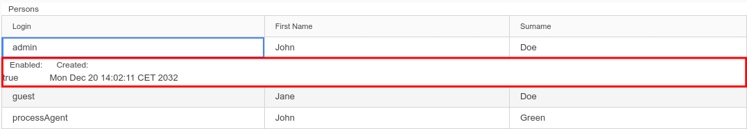
To display a row with data in a Grid when the user clicks a row, do the following:
PersonDetail {

  public PersonDetail(Person p) {
      person := p;
  }
}setDetailsGenerator() method to set the detail form to the grid rows. c.setDetailsGenerator({ p:Person -> (new PersonDetail(p).getWidget()) });c.setItemClickListener({ event:ItemClickEvent ->
def Object item := event.item;
c.setDetailsVisible(item, !c.isDetailsVisible(item));
});
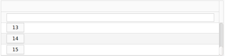
By default, the Grid defines a fixed minimum height. You can change the height using the setHeightByRows(), setHeightFull(), or setHeightWrap() method.
If the grid displays more row objects, the Grid height follows the height setting and a scrollbar is added:
If you want to wrap the Grid around its content so as to adapt the height of the Grid to its content, query the data source size and adapt the height accordingly, for example:
You can define a tooltip
on the Grid Column
A column tooltip takes precedence over the Grid tooltip.
on the Grid Column header
myGridColumn.setHeaderDescription(
   "Column header:" + #10 + myGridColumn.getHeader(),
   ContentMode.Preformatted)
A column tooltip takes precedence over the Grid tooltip.
If the content-mode argument is not passed, all methods use the Preformatted content mode.
To add a style class to grid rows, call the setRowStyleGenerator() method on your grid: the method has a closure parameter with the row object as its input and the CSS class that is added to the row /
element.
c.setRowStyleGenerator({a:Applicant -> "v-label"});
To remove the previously added styles, set the closure to return null, for example, grid.setRowStyleGenerator({a:Applicant -> null});.
To add a style class to the cells of a grid column, call the setCellStyleGenerator() method on your grid column: the method has a closure parameter with the row object as its input and the class.
c.setRowStyleGenerator({a:Applicant -> "v-label"});To remove the previously added styles, set the closure to return null, for example, grid.setCellStyleGenerator({a:Applicant -> null});.
To define horizontal alignment in Grid Columns, call the setAlignment() method on the column.