LSPS Documentation
Container components nest components and define the form structure.
They can fire only InitEvents with the exception of the Dashboard Widget, which can fire a WidgetChangeEvent as well.
The Vertical Layout component (  ) is a container component that can hold multiple form components, which are arranged in a vertical manner.
Specific Vertical Layout properties:
The Horizontal Layout component (  ) is a container component that can hold multiple form components, which are arranged in a horizontal manner.
Specific Horizontal Layout properties:
The Form Layout component (  ) is a container component that can hold multiple form components arranged in two columns. The child form components are rendered with their labels placed in the left column and any other component parts rendered in the right column.
The Panel component (  ) is a container component that serves for adding a frame and a caption to one, possibly a layout, component.
A scrollbar is rendered in panel child component automatically if applicable.
The Grid Layout component (  ) is a container component that can hold multiple form component elements, which are arranged in a grid manner, that is in a table-like way. You can add rows and columns to the grid using the Add (
  ) and Delete (
  ) buttons on the grid component.
The Tabbed Layout component (  ) is a container component that can hold multiple Tab components.
The Tab component (  ) is a component rendered as a tab. It that can contain one form component and its parent component must be the tabbed layout component.
A tab content and its children are initialized along with their parent. However, a tab produces an init event and is refreshed when displayed.
The Tab component has the following properties:
Visible: boolean expression defining the tab visibility
If the visible expression evaluates to true or undefined on init or refresh, the tab is displayed.
To focus a tab in a tabbed layout, use the selectTab() function, for example, .
To focus a tab on init, call the function from an InitListener on the first Tab or use dynamic tabs.
You can add, remove, and select a Tab component programatically from listener handle expression using the addTab(), removeTab(), selectTab() functions.
A Container component (  ) is a form component that allows you to define an interface for a form or a form component and its child components. The interface provides a mechanism for listening for events either on nested forms or on parent forms (for details refer to Container Interface).
The Popup component (  ) is rendered as a pop-up window with a maximize/minimize and close button in its caption. It can be modal: when a modal popup is displayed, you cannot work with the underlying form until it is closed.
Since Popups are included directly in the form, they are calculated when the form is initialized. For large popups with a lot of data, this can result in poor form performance since these popups are part of the form all the time even if you might not need them at all. In such a case, consider using a dynamic popup which is created only when requested.
For an example popup design and usage, refer to this tutorial.
Dynamic popups are created at the moment they are requested so that you can prevent existence of potentially unnecessary Popups in the form hierarchy. This can save you some headache over the performance of your form.
Mind that a dynamic popup component is created on the given screen or execution level unlike the other form components which are created on the screen level: if you create a dynamic popup in a view model, the dynamic popup component cannot be accessed from the screen level.
To create a dynamic popup from a Listener handle expression or as part of a reusable form, do the following:
new ui::Popup p; p.child := ...)createAndShow().clear() and merge() functions.
//This is a dynamic Popup (possibly created in a Reusable form or a component listener handle):
def ui::Popup p := new ui::Popup (
  visible -> { ->
    true
  },
  listeners -> {
    new PopupCloseRequestListener(
      handle -> { e ->
        hideAndDestroy(p)
      }
    )
  }
);
//p.visible := { -> true};
def TextBox tx := new TextBox(binding -> &varString);
p.child := new VerticalLayout(
children -> [ tx ]
);
createAndShow(p);
More dynamic functions are available from the dynamics.funcs file in the ui module, for example, to search for components higher or lower in the hierarchy, such as, findTopmostComponents(), findTopmostContainers(), getChildren(), etc.
You can close a popup by setting its visibility to false and refreshing it from any listener so it disappears or with the hideAndDestroy() function call on the popup.
If you want to close your popup with an X button in its caption, define the behavior in the popups PopupCloseRequestListener.
def ui::Popup p :=
  new ui::Popup (
    visible -> { -> true },
    listeners -> { new PopupCloseRequestListener(
      handle -> { e ->  hideAndDestroy(p) }
      )
    }
  );
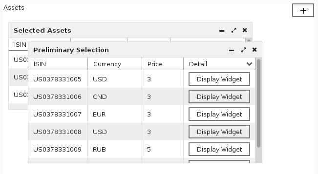
The Dashboard component  is a container component that can hold multiple widget components.
When working with a rendered dashboard in the client application, use the plus (+) button on the dashboard to display a widget. Visualized widgets can be positioned anywhere within the dashboard, resized, and visualized as necessary. Only one instance of the given widget can be visualized on the dashboard.
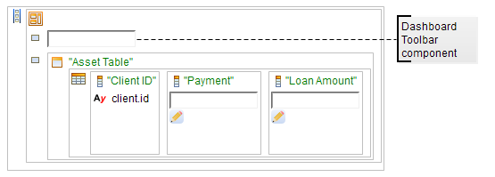
Note that dashboard has a toolbar, which can contain any form element apart from a widget.
Note: By default, dashboard size adapts to the requirements of the visualized widgets with the minimum size 650x490 px. To alter the size, use presentation hints on the dashboard (refer to the Standard Library document).
The Dashboard Widget component  is a form component that is rendered as a widget on a dashboard: Therefore it must have the Dashboard component as its parent. A Dashboard Widget can hold one form component.
It produces events of the following types:
WidgetChangeEvent when the user adds a widget to the dashboard, resizes, moves, or hides a widget
The event contains information on the widget properties in the WidgetConfiguration field.
By default, when a dashboard is visualized, it remains empty. The user can then add the available widgets to the dashboard using the plus (+) button on the dashboard. To visualize a widget immediately when a dashboard is displayed, define the widget’s Configuration property: the property is defined as its WidgetConfiguration property.
For example, if the Configuration property is set to new WidgetConfiguration(visible -> true, width -> 300, height -> 300, top -> 300, left -> 350). The widget will be visible when the dashboard is displayed; its size will be 300x300 pixels; the coordinates of the upper left corner will be 300:350 (its upper left corner will be positioned 300 pixels below the top of the dashboard and 350 pixels to the right).
The Dashboard Widget component has the following properties:
Configuration: WidgetConfiguration object defining the visualization properties of the widget when the dashboard is visualized
WidgetConfiguration defines the following:
visibility: boolean value that defines whether the widget is displayed by default when the dashboard is displayed
In the default Application User Interface, previously closed or invisible widgets can be visualized by clicking them under the + plus button of the dashboard.
width: default width of the widgetheight: default height of the widgettop: distance of the top widget border from the dashboard top borderleft: distance of the left widget border from the dashboard left borderzIndex: vertical stacking order of the widget
When the widget produces a WidgetChangeEvent, that is whenever it is clicked, moved, or resized, the zIndex is raised so that the widget is on top of any other widgets in the dashboard.
maximized: boolean value that defines if the widget is maximizedminimized: boolean value that defines if the widget is minimized
In the default Application User Interface, minimized widgets are available at the bottom of the dashboard.
Note: Note that widgets keep its last size value separate from its maximized and minimized status: if you set a widget to a particular size, then maximize it, and minimize it, when restored it will be maximized. If you then double-click the widget caption, it will be restored to the original size. If you want to move a widget to the foreground, click the widget.