LSPS Documentation
Container components can define one or multiple child components serve to organize the content.
On all container components, you can get do the following:
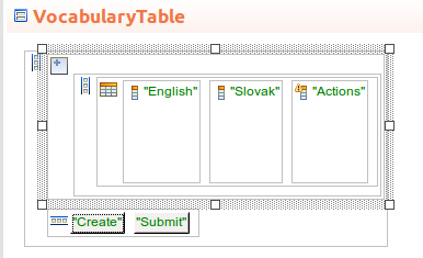
getComponentCount() method getComponents() method The method returns a list of components: the list items are returned as defined in their toString() method; getComponents() method, you will need to do so after the form was initialized: to do so, call the method in the postCreateWidget() method of the form. The call is pre-generated in the methods file of your form.All container components can define their style with the following methods:
setMargin(Boolean margin_enabled): sets a default margin of the container component
To change the margin size, use the properties file of the theme in the generated LSPS Application.
setSpacing(Boolean spacing_enabled): sets a default spacing between the child components
It is not recommended to customize spacing since it might result in a inconsistent UI presentation; consider changing font size to meet your requirements.
You can populate your container component as follows:
new FormLayout(textField, submitButton, navigateButton)addComponent method of the component record, for example, layout.addComponent(textField)Layout components can have multiple child components: by default the child components are allocated equal space within the layout, so if you have 3 child components in a layout, each will be allocated 33% of the available space. This space is referred to as the component slot. To change the size of component slots, use Expand Ratio on the child components. You can then call methods on the child elements to define their size in their slot.
The Horizontal Layout component (  ) arranges its children horizontally.
Mind that by default the layout wraps its components, so if the components overflow the layout and they are set to fill the parent, the overflowing content will not be visible. To remedy this situation, call setWidthFull on the layout component.

def forms::HorizontalLayout hl := new forms::HorizontalLayout();
hl.addComponents(
{
new forms::Button("Confirm", {e -> Forms.submit()}),
new forms::Button("Cancel", {e -> Forms.navigateTo(new AppNavigation(code -> "todoList"))})
}
);
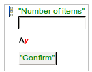
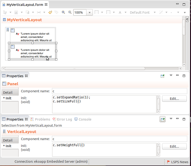
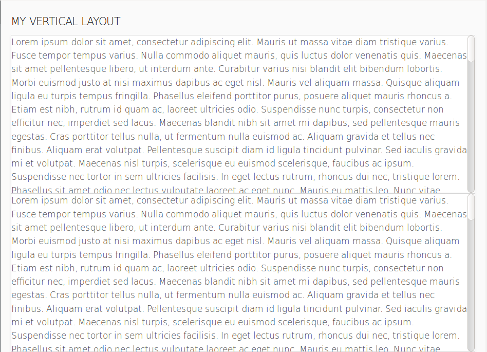
hlThe Vertical Layout component (  ) arranges its child components vertically.
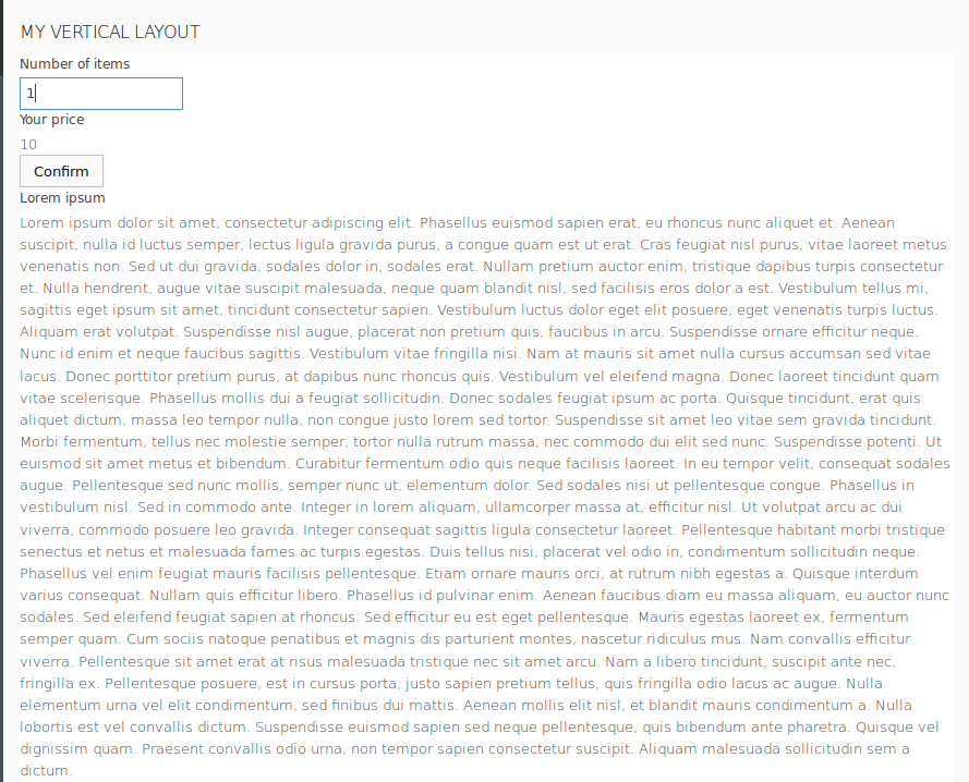
def forms::VerticalLayout vl := new forms::VerticalLayout();
def forms::Table t := new forms::Table();
t.setDataSource(new TypeDataSource(User));

t.addColumn(new forms::TableColumn
      (valueProvider -> new PropertyPathValueProvider(User.name),
      sortable -> true, filtrable -> true,
      generator -> { username:String -> new Label(username)},
      modelingId -> "87jlkjh",
      data -> null));
t.addColumn(new forms::TableColumn
      (valueProvider -> new PropertyPathValueProvider(User.note),
      sortable -> true, filtrable -> true,
      generator -> { note:Object -> new Label(note)},
      modelingId -> "87j98098jh",
      data -> null));

vl.addComponents([t, new forms::HorizontalLayout(new forms::Button("Create", { click -> openMyPopup()}))]);
vl;The Grid Layout component (  ) is a container component that can hold multiple form component elements, which are arranged in a grid manner, that is, in a table-like way. You can add rows and columns to the grid using the Add (
  ) and Delete (
  ) buttons on the Grid Layout component.
Important: We recommend to use Grid Layout only if it is not possible to solve the layouting of your form with the Horizontal and Vertical Layouts easily. Also, make sure not to use nested Grid Layouts since this may cause performance issues.
def GridLayout gl := new GridLayout();
gl.addComponentToGrid(new Label("row1,column1"), 1, 1);
gl.addComponentToGrid(new Label("row2,column1"), 2, 1);
gl.addComponentToGrid(new Label("row1,column2"), 1, 2);
gl.addComponentToGrid(new Label("row2,column2"), 2, 2);
gl.setRowExpandRatio(0,7);
gl.setColumnExpandRatio(2,2);
gl
The CSS Layout component (  ) is rendered as a
 <div> element that wraps the inserted child components. To set its style, use the setStyleName() method.
def CssLayout cl := new CssLayout();
cl.addComponent(new TextField("Name:", &name))
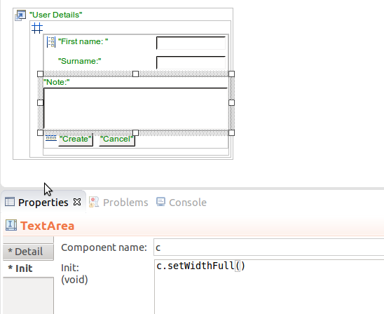
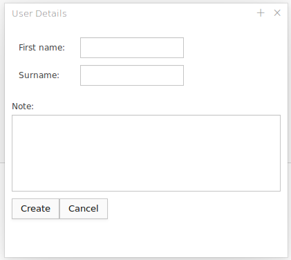
The Form Layout component (  ) arranges child components horizontally with their captions displayed on the left.
def forms::FormLayout fl :=
new forms::FormLayout(
new TextField("Name:", &name),
new Label("Please confirm:"),
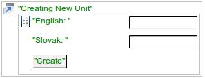
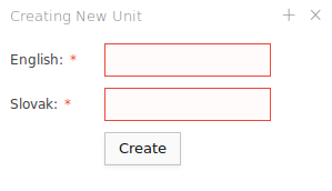
new forms::CheckBox("Do you agree with the conditions as stated in the consumer agreement?", &agreed))The Panel component (  ) adds a label and scroll to its child component automatically if applicable.
Note that to have the scrollbar displayed, the following must be true:
To set the scrollbar position on a Panel component, call the scrollToTop() or scrollToBottom() method.
The Collapsible component (  ) allows the user to collapse and expand its content.
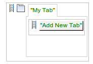
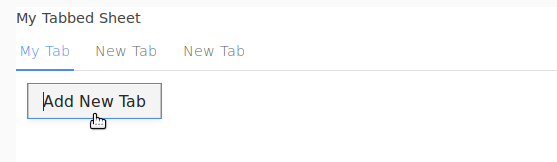
The Tab Sheet component (  ) holds only Tab components, which can then contain further content.
Expression that returns a tab sheet with one tab
def TabSheet ts := new TabSheet();
  ts.addTab(new Label("Label in a tab"), "tab name");
  //get the content of the first tab(Label):
  def Component tabRoot := ts.getTabs()[0].getContents();
  ...
ts
To add a new tab to a tab sheet, call the addTab() method of the tab sheet: the arguments represent the content of the tab, and that its caption and its component).
Tabs cannot be closed by default: to add the Close button to a Tab, call setClosable(true) on the Tab component.
To select a particular Tab in a Tab Sheet, use the setSelectedTab(<TAB_INDEX>) call on the sheet: To get the index of a tab, call getIndex() on the Tab.
When you select a Tab in the client, the system throws a TabChangeEvent. You can listen for the event on the parent Tab Sheet: call the setTabChangedListener() method with the appropriate handling on the component.
Note that if you want to get the Tab component selected when the Form is loaded, you need to do so in the postCreateWidget() method:
MyForm {

  private void postCreateWidget() {
      setResultContent();
  }

    private forms::Tab getCurrentTab(){
       myTabbedSheet.getSelectedTab();
    }

    private void setResultContent(){
       resultTextField.setValue("You have selected the " + getCurrentTab() + " tab.");
    }
}The Accordion component  is just like Tab Sheet but with Tabs arranged vertically.
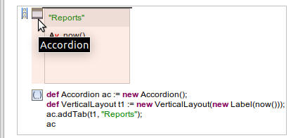
def Accordion ac := new Accordion();
def VerticalLayout t1 := new VerticalLayout(new Label(now()));
ac.addTab(t1, "Reports");
ac
The Dashboard component (  ) is rendered as the space for Dashboard Widget components. The widgets can be dragged-and-dropped, resized, minimized, and maximized. Whenever the user performs an action on a Widget, the system throws a DashboardUpdateEvent: the event contains information about the change and is processed as defined in the onWidgetUpdate property of the Dashboard.
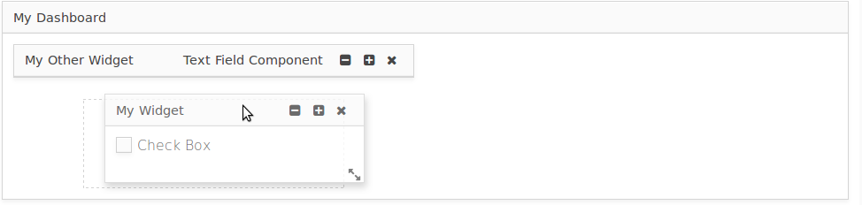
Note: By default, the Dashboard width is set to fill its parent, while the height adapts to the space required by its widgets (the dashboard height wraps the content dynamically).
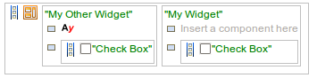
The Dashboard Widget component (  ) is a draggable, resizable component of a Dashboard: In the Form, it must be the child of a Dashboard component.
The Widget position are defined relatively to the Dashboard area: The Dashboard area is divided in implicit 12 "columns" and an unrestricted number of rows with a set height. When you define the position, you define in respect to the columns and rows with x referencing one of the Dashboard columns and y referencing a Dashboard row.
The Widget size is also defined with respect to the Dashboard columns and rows: width is defined as the number of column the widget spans over and analogously, height the number of rows.
If you don't define the size or position of a Widget, it is calculated automatically. You can disable this by setting the Autoposition property to false. When Autoposition is set to true, the x and y coordinates are ignored. By default, true is assumed. When Autoposition is set to true, the x and y coordinates are ignored.
You can add a Widget to a Dashboard in the following ways:
addWidget() method of the Dashboard.Adding a Dashboard Widget to a Dashboard on an event reception
myDashboard.addWidget(
    new Label("This is the content of my widget"),
    new Rect(x -> 2, y -> 2, width -> 3, height -> 4),
    true);
Apart from its content and generic component properties, a Widget can define the content of its toolbar, which is displayed next to its caption:
def GSDashboardWidget mw := MyDashboard.addWidget(
    new Label("This is the content of my widget"),
    new Rect(x -> 2, y -> 2, width -> 3, height -> 4),
    true);
    mw.setCaption("Caption");
mw.setToolbar(new Label("Toolbar label"));To remove a widget from your Dashboard, call the removeWidget() method of the Dashboard.
When the user changes the position of a Widget, resizes it, or closes it, the system throws a DashboardUpdateEvent: The event holds information on the Widget that caused the event, the new position of the widget, and the new state of the widget (Minimized, Restored in its widget size, Maximized, or Closed).
You can define how the Dashboard processes such events in its onWidgetUpdate() property: The property is of the Closure type with the event as its input. Define handling of the event in its body.
Example of handling a change of widget state
c.onWidgetUpdate := {
    e:DashboardUpdateEvent->
    if e.widget == myWidget then
       switch e.newState
         case WidgetState.Minimized -> myWidget.setCaption("Minimized");
         case WidgetState.Restored -> myWidget.setCaption("Restored");
       end;
    end;
}When you close a widget, the widget is discarded: if you want to re-display it, you need re-create it. Since when a widget is closed, the system throws a DashboardUpdateEvent with the relevant information (the Widget that caused the event, the new position of the widget, and the new state of the widget), you can handle such an event on your Dashboard.
Example of handling a closed widget by displaying a button that recreates the widget when clicked
c.onWidgetUpdate := {
e:DashboardUpdateEvent->
//checking if the event comes from the correct widget and whether it was caused by close:
if (e.widget == myWidget && e.newState == WidgetState.Closed)
then
//adding a Button that will recreate the widget:
myVerticalLayout.addComponents(
[new forms::Button("Add My Widget", { e ->
MyDashboard.addWidget(
new forms::CheckBox("Check Box", &myBooleanVar), new forms::Rect(width -> 6, height -> 2), true);
})]
);
end
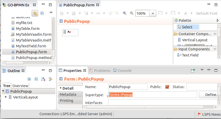
}Popup is rendered as a floating dialog box with all the usual features and actions, such as drag, close, resize, etc.
You can design a popup in two ways:
forms:Forms, public popup forms have their supertype set to the type forms::Popup so they can be inserted into another Form tree.Popups can be modal; each popup can define its popup variables.
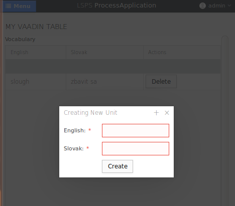
Private Popups can be instantiated only within their parent form and are also designed as its part; They cannot be reused in other forms.
To create a private Popup, do the following:
editPatientInPopup(Patient p). Do not implement the method: it is automatically added to the popup factory. 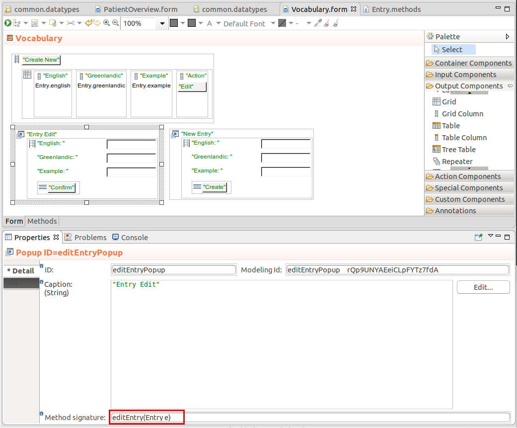
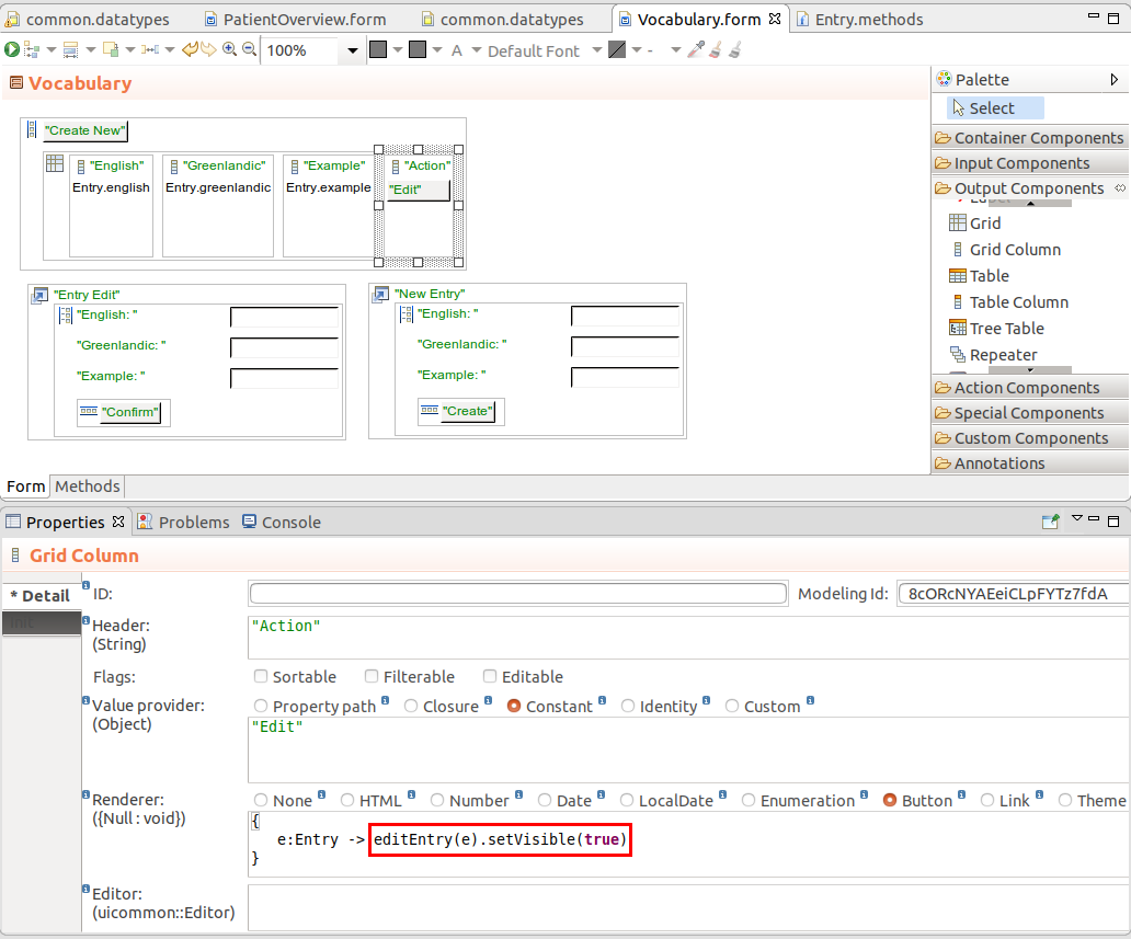
true to display it; you can use the show() or setVisible(true) call to do so.false or call its hide() method. the Popup is queued for garbage collection unless referenced somewhere in the form. 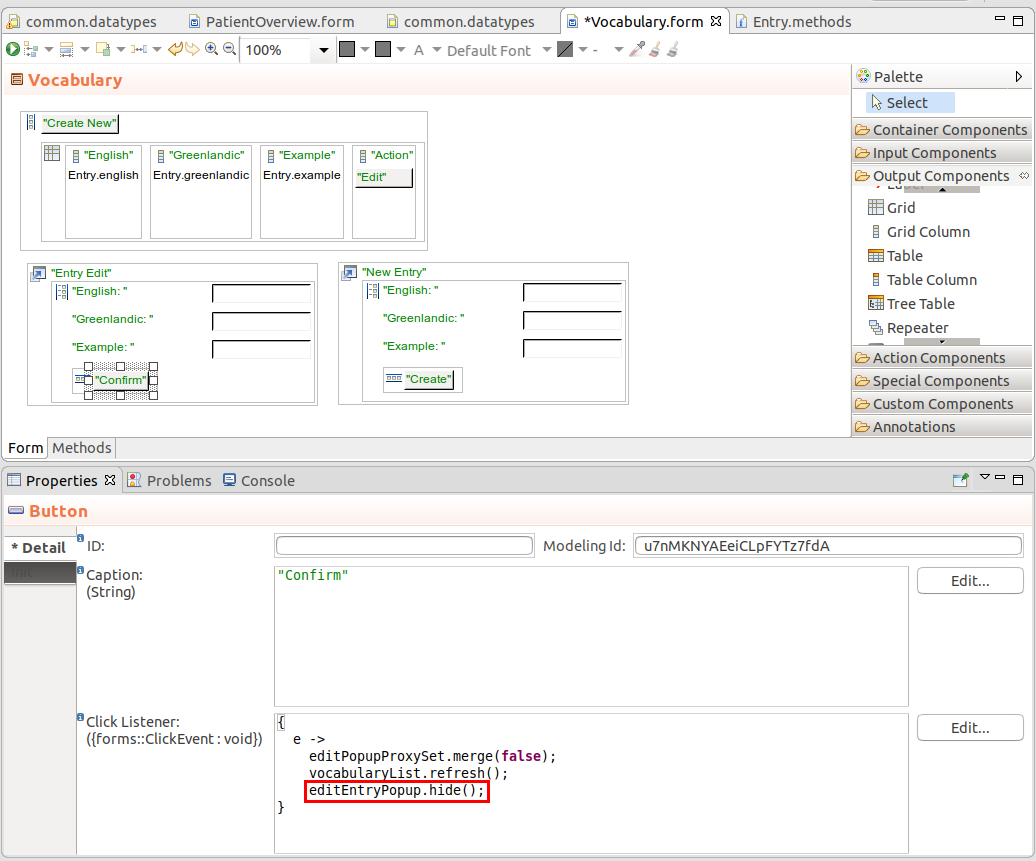
Public popups, unlike private popups, can be used by multiple forms: public popups are snippets with the Popup component that you can insert into another form.
To create a public popup, do the following:
//Constructor that takes a parameter and assigns it to a form variable of the public popup
//The popup variable is then used as the binding of its components
public PublicPopup (Unit u) {
  editedUnit := proxy(u);
}show() in the constructor and hide() when required; for example on a close button.show() and hide() on the variable when required.{ e ->
def PublicPopup popup := new PublicPopup(u);
popup.show();
popup.setPopupCloseListener(
{ e -> MyFormWithPublicPopup.refresh()};
);
}When creating a public popup, carefully consider:
which logic to encapsulate in the popup;
For example, if you are creating a popup with user details, the popup might be used by forms to create a new user as well as to edit an existing user: in such a case, you could define a popup parameter that passes the edited user. If no user is passed, the popup constructor creates a new proxy user object; otherwise, it creates a proxy over the passed user object.
*whether to display and hide the popup from within the popup or from the outside form;
In the example with the user edit and create popup described above, keep the displaying and hiding of the popup inside the popup since it is governed by events within it: display the popup from its constructor; hide it from a button in the popup.
Refer to the tutorial on editing Grid Data in a popup for an example of a public popup.
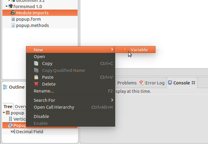
To create a variable on a public Popup, do the following:
To create a variable on a private Popup, do the following:
To make a popup modal, set its modality with the showModal() method; for example, {e -> createPopup(editedEntity, true).showModal()}
To close a Popup, set its visibility to false; you can do so with the hide() or setVisible(false) calls.
To perform an action when a Popup is closed, use the setPopupCloseListener() method, for example:
The Drop Zone component  allows you to drag-and-drop one or multiple files into the browser to upload it.
It renders as an area where files from desktop can be dropped where the wait it is actually rendered is defined by its child component.
The Drop Zone component defines the action on file upload in its upload-result listener closure. The closure has two input parameters: the first one with the list of uploaded files and the second one with a list of error messages:
You can restrict the number of files the user can insert into a drop zone in a single drag-and-Drop action with setMinFiles() and setMaxFiles() method calls.
If you insert a Drop Zone component into another Drop Zone component, the "highest parent" Drop Zone overrides its children.
While the files are being uploaded, the spinner is displayed and the application ignores user input.
Note: If the user drags-and-drops a file into the form in a browser but misses the drop zone the browser takes over and handles the drop, that is, opens the file. To prevent this behavior, consider using the Drop Zone component as the root component or at least as hight up in the component hierarchy as possible.
Expression that returns a Drop Zone
def DropZone dz := new DropZone();
dz.setUploadResultListener(
    {
    uf:List<File>, errorMessage:List<String> ->
          uploadedFiles := addAll(uploadedFiles, uf);
          //uploadedFile is initalized to []
    }
  );
dz.setMaxFiles(2);
//enabling the dropzone:
dz.setDropEnabled(true);
dz
To visualize the dropped files, for example, display a preview of image files, when they are dropped and uploaded, set the uploaded files as the content of the Drop Zone or of its child component.
Upload result listener that displays thumbnails of uploaded files in the given drop
The current batch is added to a new vertical layout, called imagesUplodedInThisBatch in the drop zone.
{
  uploadedFiles:List<File>, errorMessage:List<String> ->
    allUploadedFiles := allUploadedFiles.addAll(uploadedFiles);
    //allUploadedFiles is form variable and initialized in the form constructor.
    if(!allUploadedFiles.isEmpty()) then
      def List<forms::Image> thumbnails := collect(allUploadedFiles, { f:File ->
                  def forms::Image image := new forms::Image(new FileResource(f));
                  image.setWidth("100px");
                  image.setHeight("100px");
                  image}
       );
      def VerticalLayout thumbnailRoot := new VerticalLayout();
      thumbnailRoot.addComponents(thumbnails);
      mydropzone.setContent(thumbnailRoot);
    else
      notify("Failed upload", "Upload of the file failed.", NotificationType.Warning, null, 1000, null, null)
    end;
}
Upload result listener that displays thumbnails all uploaded files: The batch is added to a vertical layout, called allImagesUploaded, that is out of the drop zone.
{
  uploadedFiles:List<File>, errorMessage:List<String> ->
    if(!uploadedFiles.isEmpty()) then

      def List<forms::Image> fileImagesForAllUploadedImages := collect(uploadedFiles, { f:File ->
                  def forms::Image image := new forms::Image(new FileResource(f));
                  image.setWidth("100px");
                  image.setHeight("100px");
                  image}
       );
      allImagesUploaded.addComponents(fileImagesForAllUploadedImages);

    else
      notify("Failed upload", "Upload of the file failed.", NotificationType.Warning, null, 1000, null, null)
    end;
}
Split panels hold 2 child components and render a draggable split bar between them so that the space is divided into 2 areas.
You can use the Vertical Split Panel or Horizontal Split Panel: insert the component into your form and then insert the first and the second component: the split will be rendered between the two automatically.
def HorizontalSplitPanel hsp := new HorizontalSplitPanel();
hsp.setFirstComponent(new Label("First Label"));
hsp.setSecondComponent(new Label("Second Label"));
hsp
Expression that returns a Vertical Split Panel
def VerticalSplitPanel vsp := new VerticalSplitPanel();
vsp.setFirstComponent(new Label("First Label"));
vsp.setSecondComponent(new Label("Second Label"));
vsp
You can set the position of the split with the setSplitPosition() method: mySplitPanel.setSplitPosition(75, SizeUnit.Percentage) results in the split at 3/4 of the Split Panel area relative to the first component. If you want to use the second component instead, call the method with the additional true parameter: mySplitPanel.setSplitPosition(75, SizeUnit.Percentage, true). To the position of the split, call its isLocked() method.
To set the range within which the user can drag the split, use the setMinSplitPosition() method and setMaxSplitPosition() moethods.
To perform an action when the position of the split is changed, call the setSplitPositionChangedListener({SplitPositionChanged:void}) method.