LSPS Documentation
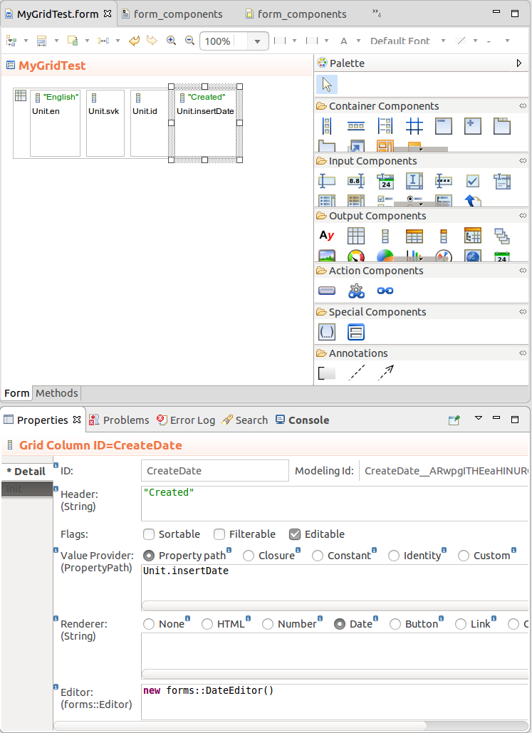
The Grid component displays single-line text data in a tabular layout and enables editing of the persistent data and row selection.
The data is lazy-loaded, which prevents potential performance issues when the grid is loaded.
Unlike in Tables, the content of cells does not result in any further components, so if you plan on using complex content, such as images, charts, multiple items per cell etc. consider using Table.
To create a Grid with your content, do the following:
Define the data-source type and the expression that returns the data source object below:
Collection: items of the Collection
The Collection is calculated only when the form is initialized: the data source remains unchanged on refresh: To reload the data, use the setDataSource() method on the component.
Note: When applying filtering and sorting on large collections, sorting and filtering actions might cause performance issues: consider using other data sources such as shared Type data sources or queries.
Custom: custom data source which realizes the forms::DataSource interface.
When creating a custom data source that realizes the DataSource interface, you will need to implement the following methods:
getCount returns the number of displayed entries; note that you need to take the filters applied on the data into account. The filters are passed as input arguments.getData returns the data for the grid;
Note that you will need to filter, sort, and page data. The ID of the filters in individual columns is set in the FilterConfig: c.setFilterConfig(new FilterConfig(filterId -> "nameColumnFilter"))
supportFilter called when the user enter the filter value;supportsSort called when the user sorts the sort value;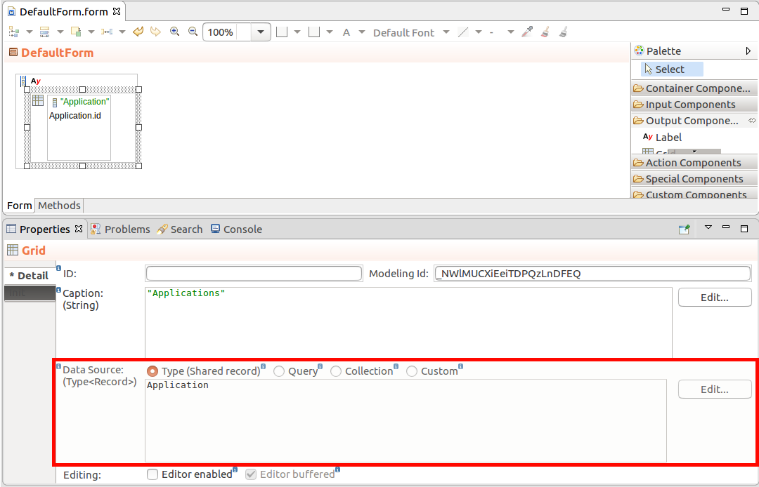
 ) into the Grid. You can insert grid columns dynamically with the
 addColumn() method.To create a column in your Grid, do the following:
) into the Grid.toString() call.Number renders the value in the format defined below.
Define the format as a String following the DecimalFormat Java formatting rules, for example, "0000.00000"
Date renders the value in the format defined below.
Define the format as a String following the SimpleDateFormat Java formatting rules in the text area below, for example, "EEE, d MMM yyyy HH:mm:ss" results in formatting Wed, 7 Sep 2016 14:33:00
Button renders the value as a Button.
The click action is defined as a closure with the value-provider object as its input parameter below.
{ clickRowObject:String ->
    varString := "The user clicked: " + clickRowObject.toString();
    MyEditableGrid.refresh()}
Link renders the value as a Link
The click action is defined as a closure with the Value Provider object as its input parameter below.
{  clickRowObject:String ->
    varString := "The user clicked: " + clickRowObject.toString();
MyEditableGrid.refresh()}{a:Applicant -> "www.acme.com/images/" + a.pictureName}.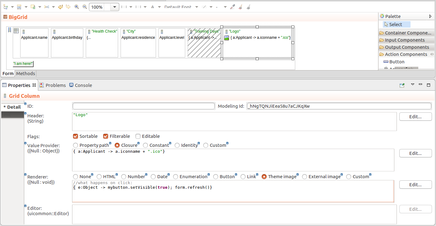
To add a column dynamically on runtime, for example, when the user clicks a button, call the addColumn() method on the parent component.
{e -> Vocab.addColumn(
    new forms::TableColumn(
        data -> null,
        modelingId -> null,
        filtrable -> false,
        generator -> null,
        sortable -> false,
        valueProvider -> new PropertyPathValueProvider(Unit.svk))
    )
}You can hide columns of tabular components can be collapsed from the front-end by the user as well as programatically. You can also enable or disable the feature.
By default, Columns can be displayed:
setHiddable(false) method on the Column.setHidden() method on the Column.Sorting is defined per Grid Column. To enable it, do the following:
Important: When applying sorting on large collections (the Data Source is set to Collection), sorting actions might cause performance issues: consider using other data sources such as shared Type data sources.
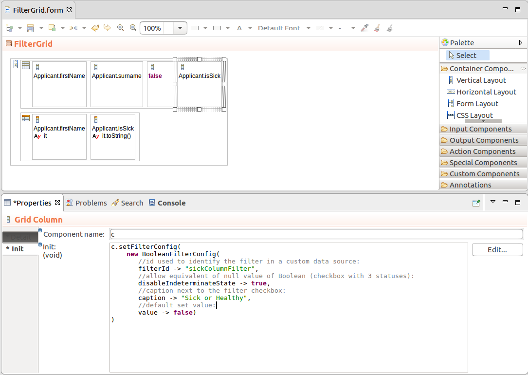
Important: Filters on Columns of Grids support only the Boolean, String, Integer, Decimal, Date, and Enumeration data types.
To enable filtering on a Grid column, do the following:
setFilteringEnabled(true) method and is enabled by default.setFilterConfig() method.def SelectItem adv := new SelectItem(label -> "Advanced", value -> Level.ADVANCED);
def SelectItem int := new SelectItem(label -> "Intermediate", value -> Level.INTERMEDIATE);
def SelectItem beg := new SelectItem(label -> "Beginner", value -> Level.BEGINNER);
c.setFilterConfig(
new OptionsFilterConfig(
multiselect -> true,
options -> [
adv, int, beg
],
selected -> [adv, int]
)
)// numeric filter with default values:
new NumericFilterConfig(equal ->50, moreThan -> 10, lessThan -> 90)
new DateFilterConfig(
  resolution -> uicommon::DateTimeResolution.Month, formatPattern -> "YYYY MMMM"
)Also if you are designing a filterable grid with a custom data source, the filter properties (its id) will allow you to identify the filters with set values using the filter id.
Important: When applying filtering on large Collections (the Data Source is set to Collection), sorting and filtering actions might cause performance issues: consider using other data sources such as shared Type data sources.
To enable or disable filtering on Grid, use the setFilterable(Boolean) call on the component: The method hides or displays the filtering row.
Important: When enabling editing of Grid data, make sure to consider the following:
- Since Collections are immutable, you can enable editing only on a Grid with shared Records and Grid Columns with the Value Provider set to Property path.
- If the underlying associated shared Record Property returns
null, the cell will remain empty and read-only.
To enable editing of shared Record Properties in a Grid, do the following:
To allow the user to select grid row and perform an action on row selection, do the following:
setSelectable(true) call.setSelectionMode(SelectionMode) call:SelectionMode.NONE: selection disabledSelectionMode.SINGLE: single-row selection on clickSelectionMode.MULTI: selection of multiple items using checkboxes in individual rows
In the MULTI mode, the user can select multiple rows directly under each other by clicking the selection checkbox of the first row, holding the click, and dragging the mouse across the rows below.
setSelectionChangeListener() method on the Grid component: its closure parameter defines how to handle the selection.select() method.//on the Init tab of Properties view:
//enable selection:
c.setSelectable(true);
//set selection mode:
c.setSelectionMode(SelectionMode.MULTI);
//select rows with first two items from the datasource:
c.select(c.getDataSource().getData(0, 2, null, null));
//you can also select a particular item in a Collection
//datasource (in SINGLE selection mode):
//c.select(mycollection[0]);
//display selected items in an output component:
c.setSelectionChangeListener(
{
v:forms::ValueChangeEvent ->
//set the content of an output component to the selected row:
labelComponent.setValue(
c.getSelection().toString());
}
);To enable the Select All option on a Grid, set the Grid as selectable in MULTI selection mode and display the Select All checkbox:
By default, the Grid defines a fixed minimum height. You can change the height using the setHeightByRows(), setHeightFull(), or setHeightWrap() method.
c.setHeightByRows(3)
If the grid displays more row objects, the Grid height follows the height setting and a scrollbar is added:
c.setHeightByRows(c.getDataSource().getCount([]))
To add a style to grid rows, call the setRowStyleGenerator() method on your grid: the method has a closure parameter with the row object as its input and the CSS class that is added to the row /
element.
c.setRowStyleGenerator({a:Applicant -> "v-label"});
To remove the previously added styles, set the closure to return null, for example, grid.setRowStyleGenerator({a:Applicant -> null});.
To define horizontal alignment in Grid Columns, call the setAlignment() method on the column.