LSPS Documentation
Input components serve to acquire input from the user. Depending on their type, they hold a certain value, which is stored in their binding; for example, an input field holds a string, so the binding must be able to hold a string value.
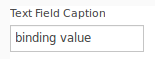
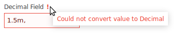
When the user enters an input or when they change the focus of the cursor, depending on whether the component is immediate, the component checks if the input value is correct; for example, whether the value in a Decimal Field contains a number. If the value is incorrect, the field is marked as invalid and no further processing takes place. If the value is correct the binding value is updated and the component produces a value-change event, ValueChangeEvent: when the event is produced, the closures defined by the change listeners of the component are executed (see Performing Action on Input in an Input Component).
addValidator() callTo get the value as entered by the user, that is, even if it is not valid, call getUserText(). The return value is always a String.
Note: To acquire the value in the target object of the binding that is the most recent valid value, use
getValue().
An input component produces a value change event when its input value changes. When the event is produced, the following is performed:
setOnChangeListener() methodsetOnValidValue() method if the value of the component is valid, that is, none of the validators (inferred, explicitly added, or validator of the format) returns a message (isValid() returns true); it is basically a shorthand for if myComponent.isValid() then ... end
Example
c.setNumberFormat("#km");
c.setOnValidValue({ e ->
  def String userText := c.getUserText();
  userText := userText.replaceAll("km", "");
  metersField.setValue(userText.toDecimal()*1000);
});
If you need to work with previous values of an input component, you can acquire these from the oldValue property of the ValueChangeEvent.
Input components hold a value and allow the user to enter a value: when this happens, the components executes the action defined by its value change listener. The input values are stored in the target object defined by their binding.
Text components, that is, Text Field, Text Area and Password Field, allow the user to enter free-text input with the following additional options:
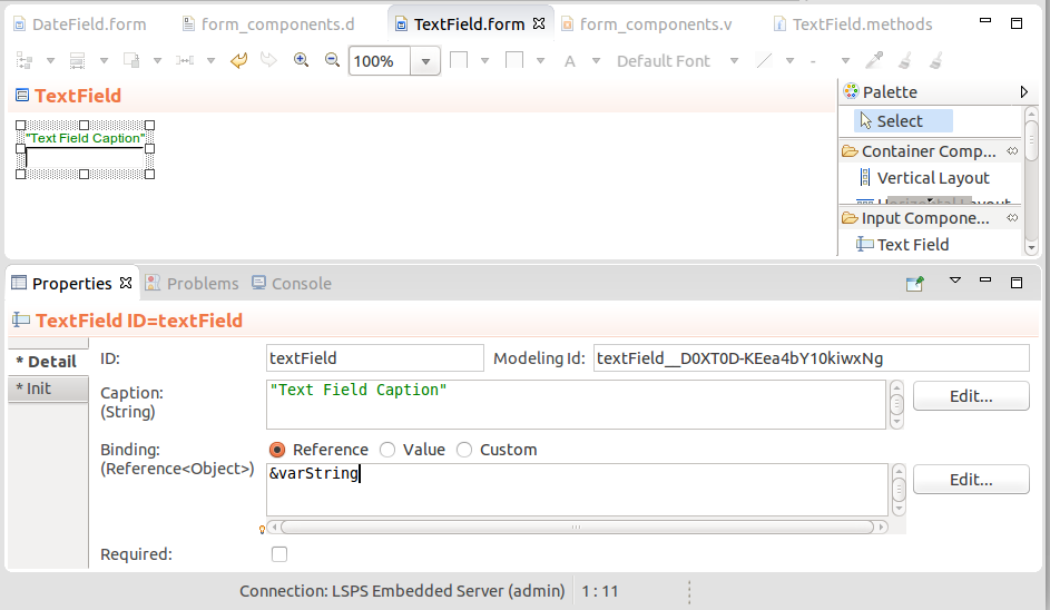
setExpandable(true) method callThe Text Field component (  ) is rendered as a single-line text field that allows entering text input.
Important: The caption of the Text Field is rendered by the parent layout component. Hence if you create a form with a sole Text Field component, the form will be rendered without its caption text. This is due to limits of the Vaadin framework.
The Text Area component (  ) is rendered as a multi-line free-text field. It is expandable by default: its length adapts to accommodate user input.
If you want to set the height, that is, the number of lines in the text area:
setMaxRows() and setMinRows().setRows(Integer rows) method.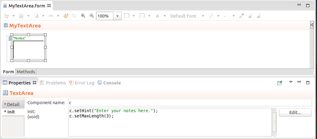
Important: The caption of the Text Field is rendered by the parent layout component. Hence if you create a form with a sole Text Area component, the form will be rendered without its caption text. This is due to limits of the Vaadin framework.
Expression that returns a Text Area
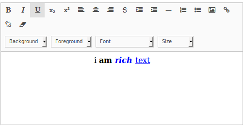
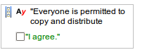
The Rich Text Area component (  ) enables the user to enter formatted text. You can also set the area to hold a formatted text from your form: use HTML formatting:
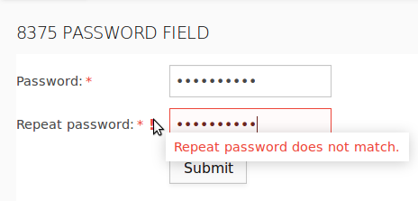
The Password Field component (  ) is a single-line text field that hides the input.
When implementing password fields the component only prevents the displaying of the input. To secure the provided data, make sure the form uses the HTTPS protocol.
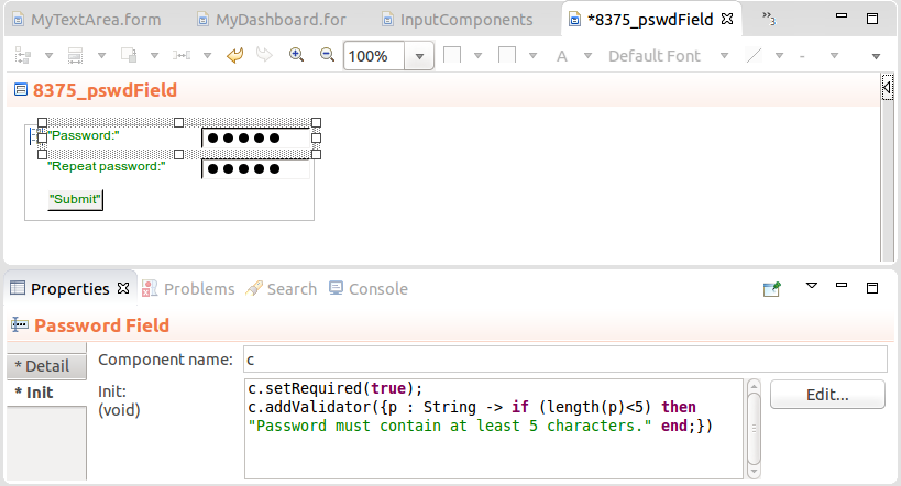
Important: The caption of the Password Field is rendered by the parent layout component. Hence if you create a form with a sole Password Field component, the form will be rendered without its caption text. This is due to limits of the Vaadin framework.
Expression that returns a Password Field
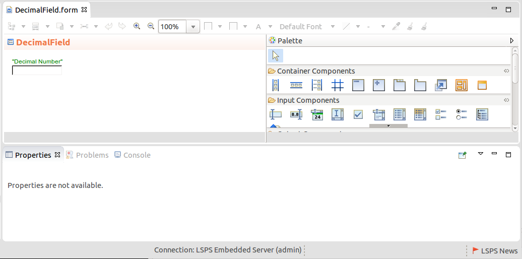
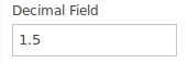
The Decimal Field component (  ) is rendered as a single-line field that allows the user to enter a decimal value. The format of the decimal value is by default set to user's locale: You can refine the allowed format with the setNumberFormat method.
Important: The caption of the field is rendered by the parent layout component. Hence if you create a form with a sole Text Field component, the form will be rendered without its caption text. This is due to limits of the Vaadin framework.
To define the format of the decimal value in a Decimal Field, use setNumberFormat():
def forms::DecimalField df := new forms::DecimalField("Value", &value);
df.setNumberFormat("#,##0.00;(#,##0.00)");
df.setOnChangeListener({
   changeevent ->
      def Integer rounded := roundUp((df.getValue() as Decimal));
      value := rounded;
      df.setValue(rounded)
    }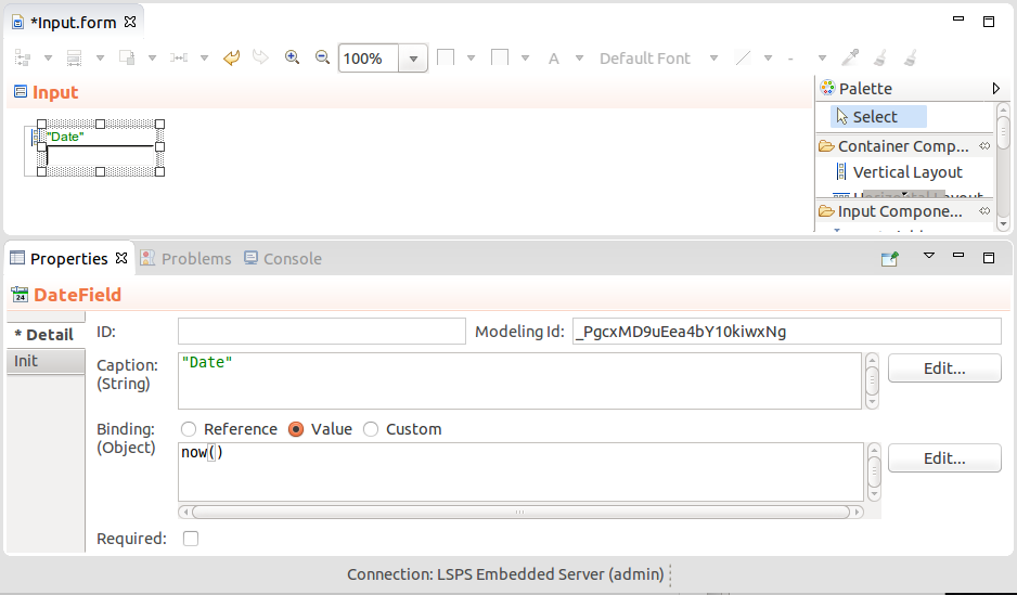
);The Date Field and Local Date Field  components are rendered as a single-line text field that allows the user to enter a date either using the calendar picker or by typing the date in one of the allowed date formats.
def Date meetingTime :=  now();
def DateField myDateField := new DateField("Meeting", &meetingTime);
myDateField.setDateFormat("yyyy-MM-dd' at 'HH:mm:ss z");
myDateField.addValidator(
  {
    dv:Date -> if (dv > date(2016,3,3))
    then
      null
    else
      "The meeting must occur later than March 2, 2016."
    end
  }
);
myDateField
Expression that returns a Local Date Field
def LocalDate meetingTime :=  now().toLocalDate();
def LocalDateField myLocalDateField := new LocalDateField("Meeting", &meetingTime);
myLocalDateField.setDateFormat("yyyy-MM-dd");
myLocalDateField.addValidator(
  {
    ldv:LocalDate -> if (ldv > date(2016,3,3).toLocalDate())
    then
      null
    else
      "meeting too soon"
    end
  }
);
myLocalDateField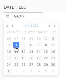
To define the format of the date the user can enter into the Date Field or Local Date Field, call setDateFormat() or setDateFormats. The format parameter is defined as a String with the possible values of the java SimpleDateFormat (refer to http://docs.oracle.com/javase/6/docs/api/java/text/SimpleDateFormat.html).
To use the date format of the LSPS Application, set the format either to date to use the dateFormat or to dateTimeFormat to use the default date-and-time format via the LspsAppConnector.getApplicationMessage().
To set the error message displayed when the entered date does not match the required format with the method setParseErrorMessage().
The Check Box component (  ) is a simple check box with Boolean Binding: its caption renders next to the check box.

Example Change Listener on a Check Box component
confirmationCheck.setOnChangeListener(
   { e ->
      if confirmationCheck.getValue() = true
        then c.setEnabled(true)
      end
    }
)The Select components provide the user options which they can select and include such component as combo box, radio button list, etc.
By default, the select components contain an option with no value the user can select: to disable this no-value option, call setNullSelectionAllowed(false) on the component.
You can define the options available in a select component either in the Properties view or with the component methods:
map(findAll(Region), { region:Region -> region.name })Objects: collection of objects
The labels are calculated by calling the toString() function over the objects, for example, findAll(Region).
The options set with the setOptionsDataSouce() or setOptions() method load the options from anywhere in the form and you can load it at the moment when the component is created. Options loaded in this way are lazy-loaded: they are loaded at the moment they are displayed.
Setting options with method calls
Important: If you set the options of a component in both ways, that is, using the Options property and the setOptionsDataSouce() or
setOptions()call, the one called later takes precedence: to identify the order of the method calls, right-click the form, select Display Widget Expression, and examine the code.
The Combo Box component (  ) renders as a single-line text field with a drop-down list of options: The user can select one option in the drop-down menu.
Options can be defined as a Map or a Collection, or an OptionsDataSource. To define an action when the user selects or unselects an option, use the setOnChangeListener() method.
The Search Combo Box component (  ) renders as a single-line text field with a drop-down list of options: The user can select one option in the drop-down menu and the options are filtered out once the user has entered the minimum amount of characters (3 by default).
The value set in the filter is passed as a SubstringFilter to the Options data source: if you are using a custom data source, make sure that the data source processes the filter value correctly.
//Example getData() method of a custom data source (record implements forms::DataSource):
  public List<Object> getData(Integer startIndex*, Integer count*, Collection<forms::Filter> filters, Set<Sort> sortSpecs){
     if filters.isEmpty() then
        getAll(startIndex, count)
     else
        //value in the filter:
        def String currentFilter := cast(filters[0], SubstringFilter).value;
        getMyDataFromMyDS(currentFilter)
     end
  }
Options can be defined as a Map or a Collection of objects or SelectItems, or an OptionsDataSource.
To define an action when the user selects an option, use the setOnChangeListener() method.
In addition, you can set the following:
setMinimalFilterLength() methodsetPageLength() methodsetFilterTimeout() method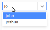
To allow the user to enter a value that is not available in the options in a combo box component, use the setNewItemHandler() method.
c.setNewItemHandler(
   {
     newValue:String ->
     newValue
   }
)
Note that the closure has void as return value, the user will not be able to enter a custom value:
c.setNewItemHandler(
   {
     newValue:String ->
     //The closure returns void so the user will be able to enter only one the option values:
     debugLog({ -> "User entered a new value: " + newValue}, INFO_LEVEL);
   }
)
If you enable this feature on a combo component, typically you will need to add the new option to the options of the combo component: use the setOptions() method to implement this behavior. Also, if you working with options that are persisted while new options are not persisted, consider defining the ValueProvider parameter: ValueProvider defines how to display the options and that possibly including your new option. For example, you could handle a new option as follows:
c.setNewItemHandler(
   {
     newValue:String ->
     options := add(options, new SelectItem(label -> newValue, value -> newValue));
     c.setOptions(options);
     //the value returned when you request value of the combo component:
     newValue
   }
);
To modify the added options, you can preprocess the options in the setOptions() method with a value provider:
c.setNewItemHandler(
   {
     newValue:String ->
     options := add(options, new SelectItem(label -> newValue, value -> newValue));
     c.setOptions(options, new ClosureValueProvider({ newOption:String -> newOption}));
     //the value returned when you request value of the combo component:
     newValue
   }
);The Multi-Select Combo Box component (  ) renders as a single-line text field with a drop-down list of options. The user can select multiple options in the drop-down menu.
Options can be defined as a Map or a Collection, or an OptionsDataSource. To define an action when the user selects or unselects a combo box option, use the setOnChangeListener() method.
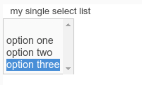
The Single-Select List component (  ) displays a list of options from which the user can select one option. You can set a limit to the number of displayed options using setRowCount(Integer): if more options are available that the set limit, the list of options becomes scrollable.
To define the action performed when select or unselect of an item, use the setOnChangeListener() method.
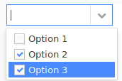
The Multi-Select List component (  ) displays a list of options from which the user can select multiple options.
It can define the number of displayed Options using setRow(Integer): if more options are available that the set limit, the list of options becomes scrollable.
To define an action when the user selects or unselects an item, use the setOnChangeListener() method.
Example expression that returns a multi select list
The Check Box List (  ) component is a form component that displays a list of options with check boxes and allows the user to select multiple options using the check boxes. To define an action when the user selects or unselects an option in the list, use the
 setOnChangeListener() method.
Example expression that returns a check box list
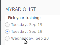
The Radio Button List component (  ) is a form component that displays a list of options and allows the user to select exactly one option by clicking a radio button. To define an action when the user selects or unselects an option in the list, use the
 setOnChangeListener() method.
Example expression that returns a radio button list
The Token Field component (  ) serves for selection of multiple options. It is rendered as a combo box by default with the options displayed based on users input in its drop-down box: the component searches for the options with labels that contain the entered characters. The user then selects the option by clicking the proposed option or entering the entire values and hitting Enter. They can remove the selected option by clicking the X icon in the option. Whenever the user selects or removes an option, the component fires a ValueChangeEvent.
The component is rendered by default as a combo box, so the user can click the arrow on the combo box to display the options. However, you can render the Token Field as a Text Field by calling its addStyleName("tokentextfield") method.
By default, selected Tokens are no longer proposed in the drop-down menu. You can deactivate and activate this behavior with the setExcludeSelectedTokens(Boolean excludeSelectedTokens) method and check the current setting with the isExcludeSelectedTokens() method.
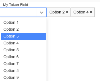
Example expression that returns a token field
Important: In the Vaadin 8 implementation, this component is not supported. For more information, refer to information on Vaadin 8 upgrade.
The Tree (  ) component serves as a picker of one item from an expandable tree hierarchy.
The tree hierarchy is defined by the data source and what is displayed as node labels for the tree objects is defined by the caption provider.
ClosureTreeDataSource: the input object of the closure is the clicked node and it returns a list of objects that represent the data source;
Example ClosureTreeDataSource:
new ClosureTreeDataSource(
  { node:Object ->
       def List<Object> result;
       if node == null then
         result := getAllApplicants();
       else
         if (node.getType() == Applicant and (node as Applicant).address != null) then
           result := [(node as Applicant).address];
         else
           result := [];
         end;
       end;
     result;
  }
)
SimpleTwoLevelTreeDS: two-level tree
Example SimpleTwoLevelTreeDS data source:
    def SimpleTwoLevelTreeDS tree := new SimpleTwoLevelTreeDS(
       [ "eva" -> ["climbing", "painting"], "juraj" -> ["reposing", "windsurfing"] ]
    )
The tree identifies the node based on designated IDs. Therefore an object can appear multiple times in a tree. The select(<VALUE>) call on the tree, selects the first occurrence of the object.
new ClosureValueProvider(
  { x:Object ->
    if typeOf(x) == type(Applicant) then
       (x as Applicant).name + (x as Applicant).surname;
    else
      if x != null then
       (x as Address).country;
      else
        null
      end
    end
  }
)
Where the selected value is stored is defined by the Binding property. To set and get the selected value programatically, use the setValue() and getValue() methods.
Setting a selected node in a Tree component
The Upload component  allows the user to upload a file to the server. Depending on its field style setting, it renders either as an upload button or as an input field for a file, a Browse and an upload button; Note that a file selected for download is not saved when calling
 Forms.save().
You can define the action performed when the file has been uploaded with the setUploadResultListener() method.
Example expression that returns an Upload component
def Upload up := new Upload();
//only presets the file type in the Browse popup:
up.setAcceptedMimeTypes("text/plain");
//render the upload button AND a "Choose File" button:
up.setFieldStyle(UploadFieldStyle.FileFieldAndButton);
//perform this action when the file is uploaded:
up.setUploadResultListener(
   { f:File, m:String ->
      if f==null then
      uploadOutcomeMessage.setValue("upload failed")
      else
        uploadedFile := f;
        uploadOutcomeMessage.setValue("upload success");
      end
   }
);
up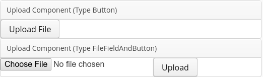
The Multi-File Upload component allows the user to upload multiple files at once.
You can define the action performed when the file has been uploaded with the setAllFilesUploadedListener() method.
Example expression that returns an Upload component
def MultiFileUpload mfu := new MultiFileUpload();
mfu.setAllFilesUploadedListener(
   { e:AllFileUploadsDone ->
      if e.files==null then
          uploadOutcomeMessage.setValue("upload failed")
      else
          uploadOutcomeMessage.setValue("upload success");
      end
   }
);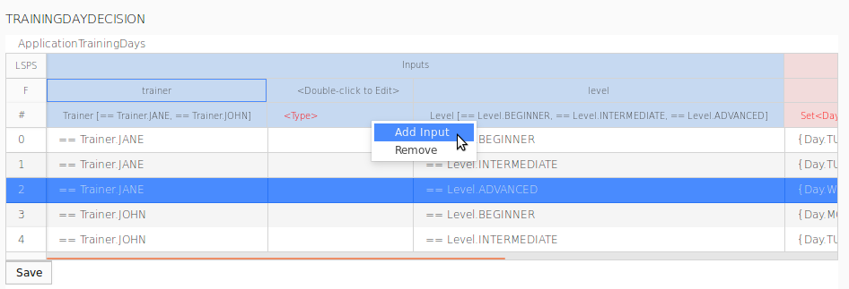
mfuThe Decision Table Editor component  allows the user to view and modify a decision table on runtime from the Process Application.
You can save the underlying decision table object with the save() method call and load it with the load() call, possibly called from a listener. Like this, your users can promptly adapt the rules used by already running model instances and adjust the execution in steps when the decision table is used to evaluate a rule.
Important: The Decision Table Editor component is part of the
dmnmodule of the Standard Library unlike the other components, which are provided by theformsmodule. Make sure to import thedmnmodule into your module before you use the component.
To add a decision table editor to a form, do the following:
Rights: the rights of the Process Application user over the decision table
By default, decision tables are read-only. To allow the user to work with the component freely, set Rights to [DecisionTableRights.CAN_EVERYTHING]. If the table is not read-only, make sure to save the changes to the table object with the <DecisionTableObject>.save(<StringIDOfTheTableObject>) method. Consider to attempt to load the decision table object, in case it already exists, as part of the form initialization, for example, in its constructor:
    public TrainingDaysForm() {
        //the form has the atd local variable of the type of the TrainingDays decision table:
         atd := new TrainingDays(false);
         //try to load it; if it is not loaded, create it and save it:
         if (atd.load("TrainingDaysDecisionTable") == false) then
           atd := new TrainingDays(true);
           atd.save("TrainingDaysDecisionTable");
         end;
    }
When rendered in the Process Application, an editable Decision Table Editor is edited similarly to its definition. Note that if you want to edit the rule description, single-click the description cell and the double-click the area displayed below.
The Slider component  serves to take a single input value of type Decimal from a value range. It is rendered as a bar with movable handle, with the bar representing the range and the handle the input value.
The bar range is set with the setMin() and setMax() methods. If unset, minimum is set to 0 and maximum to 100. Use getMin() and getMax() to get the set values.
The number of decimal places that the value is set to is set with the setDecimalPlaces() method.
The slider can be rendered horizontally or vertically: set the orientation with the setOrientation() method; for example, c.setOrientation(Orientation.Vertical)
Example expression that returns a Slider component